Part 1 – Part 2 – Part 3 – Part 4 – Part 5 – Part 6
And we’re back with part 3 of our coverage of the Threadless Sesame Street T-shirt Design Contest! We’ve reviewed the first 150 entries, and we’ve got the next 100 below. The contest is technically over, but we’ll keep on going with our reviews, because we keep our promises (unless we owe you money).
Now let’s keep going with our t-shirt design reviews! Happy reading, art lovers!
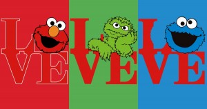
What is it about the letter O that makes it so replaceable with character heads? Of these three designs, Oscar is my favorite for his Boober Fraggle impression.
My rating: 2
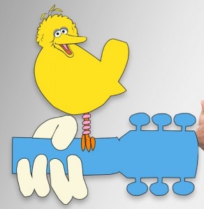
I hear that miniature, one-legged Big Birds are a delicacy. Just stick them to a guitar-shaped spit and rotate over an open flame. Frankly, I’d rather eat it than have to look at that mutant bird any longer.
My rating: 2
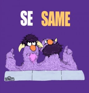
Fantastic. There really needs to be more Two-Headed Monster t-shirts out there, so why not make one with a meta reference? Shoot, they could be spelling out the word “Fluffernutter” and I’d think it was brilliant.
My rating: 5
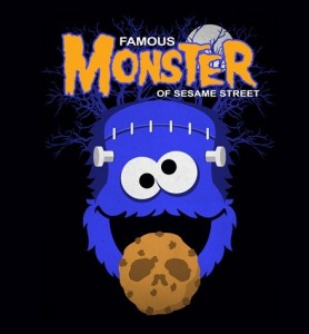
The skull imprint on the cookie is a nice touch, though I don’t know how I feel about Cookie Monster being a reanimated corpse with a removable brain. Or about the fact that his neck bolts are on his forehead. That’s just wrong, man.
My rating: 2
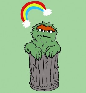
Oscar looks a little hung over here, doesn’t he?? There’s nothing like a persistent rainbow to really ruin the day after a good binge.
My rating: 4
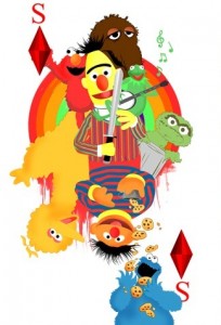
Making a design to look like a playing card isn’t a bad idea, but this execution is terrible. There’s way too much going on, the artwork is from several different sources in different styles and sizes, and it uses the Disney-owned Kermit the Frog, making it ineligible anyway. This design… has been trumped.
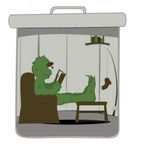
I have no doubt that Oscar leads a simple life. I’m sure he likes to shrink himself down, read a good book, and look at his fishing pole with a boot on it. But where is his swimming pool? Where does his pet elephant Fluffy sleep? Where’s the grand piano? Where, Oscar????
My rating: 3
You have two options: You can either vote for this design and hope everyone else votes for it so it might win and get printed, or you can just go to RedBubble.com and buy it right now. Come on, artist, let someone else have a turn.
My rating: 1
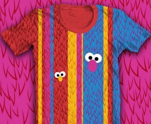
Yeesh, what a headache. Don’t you know that it’s a fashion faux pas to mix fur and stripes? And neon colors. And eyeballs. And migraines.
My rating: 1
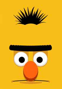
Bert will stare unblinking into your eternal soul, and he will know your true self. This is a nice, albeit slightly creepy, take on the “giant Sesame character face” t-shirts we’ve all seen before. The shadows really make the features pop, which only adds to the unsettling nature of the design. And now this image is etched into my corneas.
My rating: 4
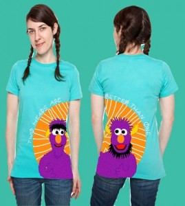
The idea of splitting the Two-Headed Monster onto the two sides of a t-shirt is inspired. But the ring around their heads looks a little too much like a halo. Perhaps it was divine inspiration! Or just an orange circle or something.
My rating: 3
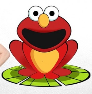 Transformation of Elmo to Frog
This is not the first time Elmo’s been froggified, but it may be the cutest. I honestly don’t know why anyone would want a shirt with Elmo as a frog, but hey, more to them. And today in missed opportunities: No Kermit-shaped pupils!
My rating: 3
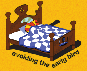
Again, it’s hard to imagine anyone clamoring for a t-shirt with a sleeping worm on it. But there are a few things I love about this picture: Slimey’s “S” headboard, the tiny, pointless sleeping cap, and the fact that it exists.
My rating: 3
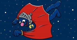
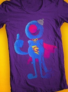
We’re seeing a lot of Super Grover pictures in this contest, so they really have to pop to make an impression. I’m not sure that seeing the back of his cape (which is strangely bat-like here) is going to do it. But props for pointing him downward, as if he’s just about to crash through someone’s ceiling while shouting for his mommy.
My rating: 3
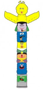
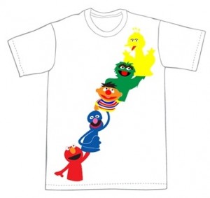
The totem pole motif doesn’t really do it for me, but I’m captivated at the cylindrical shape all of the characters have taken. Has anyone considered making Sesame Street brand soda? Don’t you just want to take a swig of some lemon-lime carbonated beverage from one of these guys??
My rating: 2
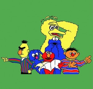
Bert is so angry at having to give someone directions! And everyone else looks so shocked or scared. What monster is asking how to get to Sesame Street? At least the Sesame gang is doing their part by trying to throw them off the scent. Oh, and bonus point for Elmo’s “Hubba Wha” face. Someone should submit a design of just that.
My rating: 3
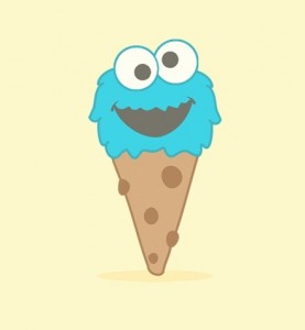
I can fool myself long enough to pretend that Cookie Monster ice cream is blueberry or blue raspberry flavored, but I have no intention of ever tasting one of those eyeballs.
My rating: 2
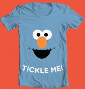
“Tickle Me, I’m Elmo” is the new “Kiss Me, I’m Irish”.
My rating: 1
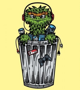 One Man’s Trash is Oscar’s Treasure
Wait, so people actually throw away their old Nintendos and Playstations rather than shove them under their beds and promise that they’ll play them all the time just as soon as they finish this one level in Super Mario Galaxy? Apparently I’m just as bad as Oscar.
My rating: 4
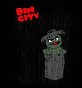
“The Street’s as hot as hell. It’s a lousy brownstone in a lousy part of a lousy town – I’m staring at a grouch. He’s telling me he loves trash. I’m not going to waste one more minute wondering how I’ve gotten this lucky. He smells like grouches ought to smell, the perfect hairball… the Muppet. Oscar. He says his name is Oscar.”
My rating: 1
Too many people have been submitting these pictures as entries to this contest (and those are the only ones I’ve been skipping in my reviews, because how many times can I really say that Elmo’s face is a boring idea?), but at least this person tried to tie a few of them together. It’s still pretty lazy, but at least someone put two seconds of thought into it.
My rating: 1
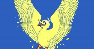
I’m usually okay with artists taking a little poetic justice in their designs, but for some reason, making Big Bird look more bird-like always weirds me out. It’s almost like he’s de-evolving into the form of his ancestors, having lost his opposable thumbs and a larger brain that allows him to learn cognitive skills and roller skating. But maybe that’s just me.
My rating: 3
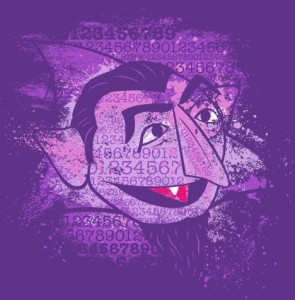
Yet another example of The Count with numbers on his face. Once is funny, twice is a coincidence, and three times brings the thunder and lightning. Uh, in the bad way.
My rating: 3
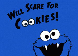
As we’ve seen before, Cookie Monster is intrinsically terrifying when he has teeth. But I’m not sure if we’ve ever seen him as a vampire before. It’s like Cookie Monster and The Count had a lovechild, who then began to crave the taste of chocolate syrup.
My rating: 1
This is sort of like the idea behind this t-shirt from Mighty Fine, except not as simple, and prone to giving people migraines.
My rating: 2
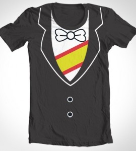
Here’s that other “Count costume” design I hinted at back in Part 1! They’re almost identical, except that this one has a bow tie, shows a little more of the sash, and has a more prominent collar. Other than that, I guess two people had the same exact idea. That probably happens a lot in this contest. So I guess I’ll give it the same rating as the last one.
My rating: 3
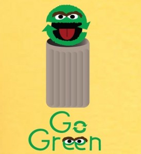
Let’s take a vote. Which is more unsettling: Two arrows taking the place of Oscar’s face or two letter ‘e’s as Oscar’s eyes? The loser will be recycled into something less distracting. And so will the winner.
My rating: 2
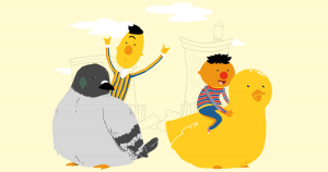 Adventures with Bernice and Duckie!
There is nothing in this image that doesn’t scream “fun”. Bert’s throwing up the devil horns while riding a giant pigeon! This is a thing that’s happening on the computer screen in front of you!
My rating: 5
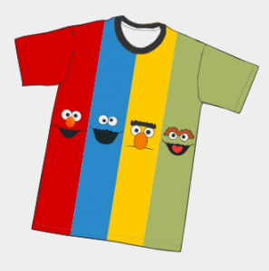
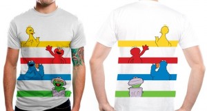
I like the front-and-back of the characters here, but that’s about it. Aside from that, it’s just four static images of the characters and some horizontal stripes, which would make me look fat. Yes, that’s my excuse for not wanting to wear this.
My rating: 2
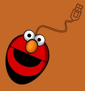
That is an awful short USB cord for the mouse! Though I do like the idea of poking Elmo in the eye every time I want to click on something.
My rating: 3
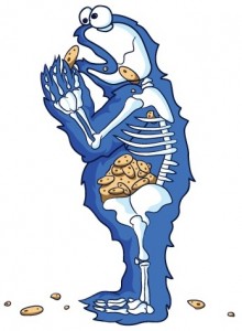
Ignoring the disturbingness (Disturbitude? Disturbution?) of seeing Cookie Monster’s innards, I’m bothered by the way he’s catatonically dropping whole cookies down his throat. Chew your food, man!
My rating: 4
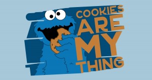
Y’know, in case you didn’t get that from the cookie in his hand. Or his name. Or the fact that he’s rarely seen not in the process of demolishing cookies as if he was The Hulk and they were Loki in that one scene in The Avengers.
My rating: 2
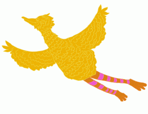
There are a few “Big Bird flying” pictures in this contest, but this might be the best one. I love how serene he looks, and how effortless his flight is. Then again, it could look like he’s plummeting, Mad Men-style.
My rating: 4
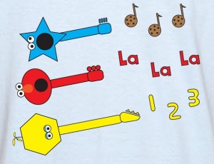
Hey, I’m all in favor of adding a little hard rock to Sesame Street. But this picture is a little too cutesy for that idea. It’s less “AC/DC” and more “The Wiggles”, if you know what I’m sayin’.
My rating: 1
This picture comes courtesy of our pal Michael De Pippo, who is responsible for the amazing Electric Mayhem posters we talked about late last year. Michael does a great job at finding the simplicity in his designs, which you can see above, as we get an idea of what Cookie Monster’s dental records might look like.
My rating: Withheld, since we know the artist personally.
Cookie Monster looks like an alligator after someone shoved a stick in its mouth to keep it from eating someone. I have nothing else to add.
My rating: 3
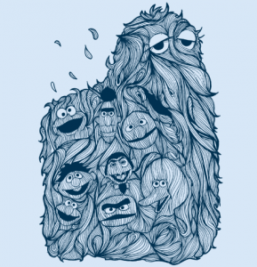
This one looks a little odd, but the more I look at it, the more I like it. There’s a sweet sense of motion to the whole thing, and it resembles a wood cut more than a mess of fur. It could use a few tweaks, like changing the character head sizes and making Oscar look a little less oval-y. But I dig it.
My rating: 5
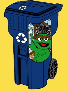
I don’t know if anyone told you this, Oscar, but recycling bins work a lot better when there isn’t a giant hole in the side. I mean, I’m no “garbage can scientist”, but you might want to just trust me on this one.
My rating: 2
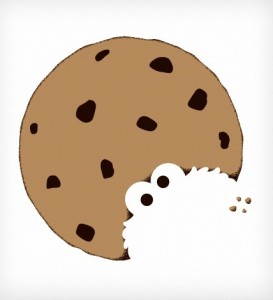
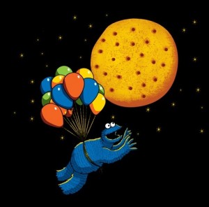
And this was how the movie Up led to Cookie Monster’s eventual asphyxiation. Or you can blame the giant floating biscuit in the sky.
My rating: 5
I admit, I used to watch Glee. But I stopped because, unbeknownst to me, it is a terrible show. But this design actually makes a lot of sense. The parody is spot-on, Elmo loves singing and dancing, and the spoof is subtle enough to work on multiple levels. I wouldn’t wear the shirt, but I’ll totally support your right to vote for it.
My rating: 5
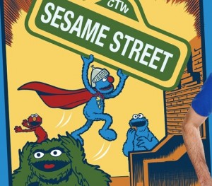
Yes. Yes yes yes. This might be the greatest Super Grover/Superman parody anyone has ever done. A million bonus points for Oscar as the guy freaking out in the bottom corner of Action Comics #1.
My rating: 5
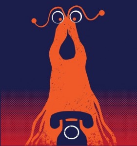
Never has an alien been so obsessed with a telephone since E.T. I really love that everyone gets the connection between the Yip Yips and the telephone after that one Sesame Street skit. It’s a pretty specific reference when you think about it, which is pretty dang neat. Brrrrring!
My rating: 5
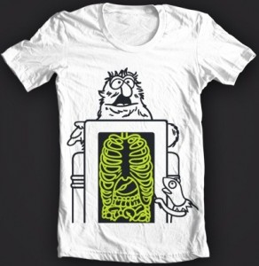
Speaking of specific references, this was one of my favorite sketches as a kid. I loved watching Herry behind the X-ray machine as we watched him eat a cracker and breathe in and out. This design has the added benefit of being glow-in-the-dark, which is a neato idea. But the bummer is that they put Kermit in there, thus making this shirt ineligible to win! But I’m going to pull a reviewers prerogative and give it a high rating anyway, if only for my own nostalgia.
My rating: 5
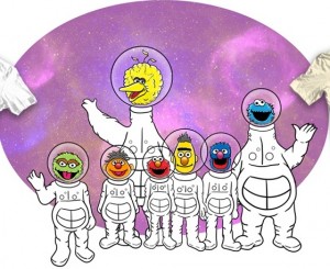
You know what the coolest part about seeing your favorite characters as astronauts is? Seeing them float around in outer space! You know what isn’t the coolest part? Watching them stand around and wave at no one in particular.
My rating: 2
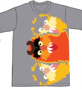
Why aren’t there dozens of Frazzle t-shirts available?? I know I’d buy one in a heartbeat. I’d even buy this three-headed, sideways Frazzle design, because that’s just how much I love the inarticulate guy.
My rating: 4
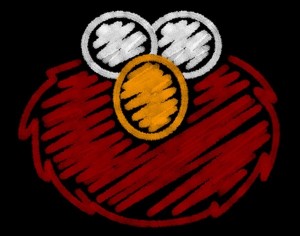
I like this simple Elmo doodle, as it has everything you need to identify the character and nothing extra. Then again, it leaves him blind and mute, but that’s just the sort of sacrifice he has to make in the name of art.
My rating: 4
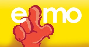
Guess what Elmo’s thinking about today! That’s right, Elmo’s wondering what your armpit smells like!
My rating: 2
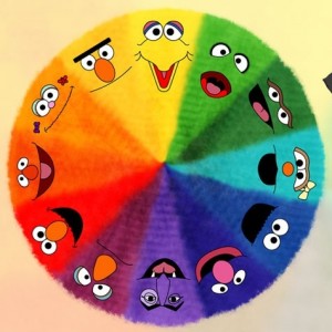
This is a pretty color wheel, but who is the lime green guy supposed to be?? The best I can figure is that it’s Kermit, with the eyes modified to do away with any copyright infringement. But it would’ve been smarter to just do away with that pie wedge altogether. It’s like being at a party with someone there who nobody knows, but you assume someone else brought them. But no, it’s just some homeless guy who wanted a free slice of pizza.
My rating: 3
I mentioned before that I own a shirt with this image on it, and although I have nothing new to add, I think that this should be on a piece of licensed apparel. Can someone get on that please and thank you??
My rating: 4
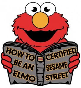
Why is Elmo reading a book about how to be an Elmo? What does it even mean to “be an Elmo”?? And why is there a light being reflected from either side of his eyeballs? Call it a hunch, but I don’t think that book (or this design) was certified by Sesame Street. Or by anyone.
My rating: 1
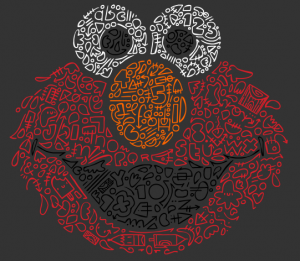
According to the artist, this Elmo is filled with “doodles, shapes, numbers, and letters”. The numbers, letters, and shapes I get, but the “doodles” sounds like an excuse to just draw whatever he wants in there. Whatever the reason, the final product actually looks pretty good, though I don’t think most people would bother trying to identify most of the shapes in there.
My rating: 3
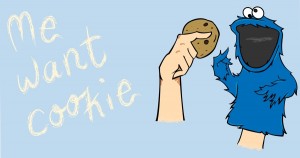
It’s interesting, we haven’t seen many designs that depict the characters as puppets. I’m not sure it’s exactly necessary for this idea, but the cartoony look to Cookie Monster’s face makes it worth it. But how is this giant hand performing Cookie’s arms?? How???
My rating: 4
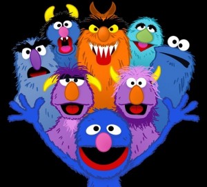
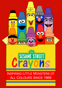
Perfect! I love the monster representation, from popular characters like Grover and Cookie Monster, to lesser-known like Herry and Frazzle, down to guys nobody knows the names of like Maurice and Harvey. It’s a great design, and I would proudly wear it on my person. Heck, I would proudly tattoo it on my person too!
My rating: 5
Elmo loves you so much he could explode!!!
My rating: 2
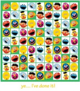
Tell me the truth. Did anyone out there actually look at this picture and think, “Oh, it’s a Sudoku puzzle! Congrats to the person who solved it!” Because you know what’s fun? Looking at finished Sudoku puzzles. And also recognizing that that’s what you’re looking at.
My rating: 1
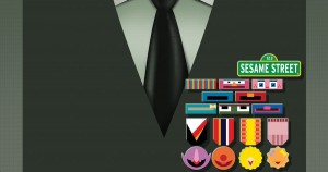 Sesame Street’s Badge Collection
“I got this badge for counting, I got this badge for paperclip collecting, and I got this badge for getting this badge!”
My rating: 2
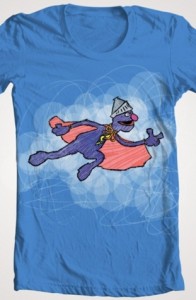 Super Grover Flying Through the Clouds
I guess it’s the coloring job that differentiates this one from its photographic counterpart, but that’s just inherently lazy. People need to stop cutting and pasting pictures onto dull backgrounds and start creating something new! You can do it, I have faith in you!!
My rating: 1
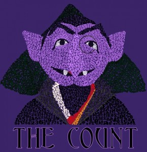
Ohhhh, I get it! He’s got numbers on his face because he’s The Count! And he looooves counting! I totally didn’t get that before. But now I do. Because I’m smart.
My rating: 3
Here’s the next design by our pal Mike Boon! There have been a lot of color-centric designs, but this is the only one that bothers to come up with a real reason for it. Two blues, two yellows, and two oranges??? What are we, Rockefellers?
My rating: Withheld, since we know the artist personally.
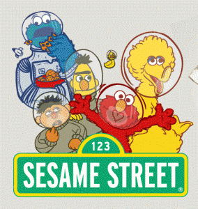
Oh good, we’re back to astronauts! It looks like the gang got off the ground this time, but they’re realizing the downside to space travel: Fogging up the inside of their goldfish bowl helmets. Ernie looks like someone cut off his air supply, and I may not be a NASA employee, but I think Elmo and Big Bird should be wearing some sort of suit while they’re in the cold vacuum of space.
My rating: 3
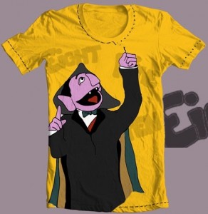 Counting Threads and Going Threadless
It takes a second to see what The Count is doing, but it’s totally worth the payoff. I mean, it’s worth it until your t-shirt falls apart in a heap of rags.
My rating: 3
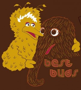
Call me crazy, but I like my Big Bird with a neck, and I like my Snuffy without an empty, soulless gaze.
My rating: 3
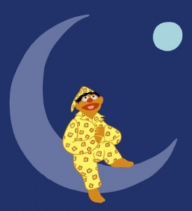 I Don’t Want to Live on the Moon
Wait. Is Ernie sitting on the moon, or is the moon off in the distance? Or are there two moons??? How did Ernie get to Tattooine???
My rating: 4
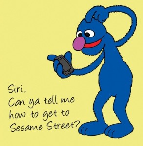
I don’t have Siri, but if I did, I’d imagine this is the very first thing I’d ask her. And if she didn’t know, I’d throw her in the East River.
My rating: 4
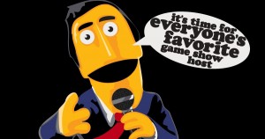 It’s Time for Everyone’s Favorite Game Show Host!
Here’s how you know when you’re looking at a picture derived from the same Guy Smiley photo everyone uses: His head is cocked slightly to the left, his hair isn’t yet unkempt, and he’s not blurry from screaming his head off on live TV.
My rating: 3
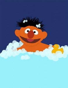
Want a t-shirt with a picture of naked Ernie on it? No? Okay, you don’t have to buy it.
My rating: 2
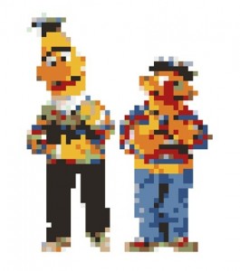
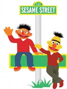
I want to complain about the random red sweaters that Bert and Ernie are wearing, but I can’t get over the fact that Bert is wearing Crocs. Crocs!!!
My rating: 2
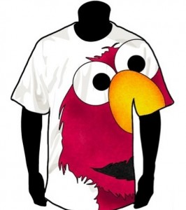
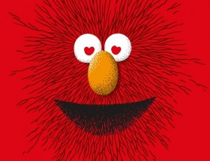
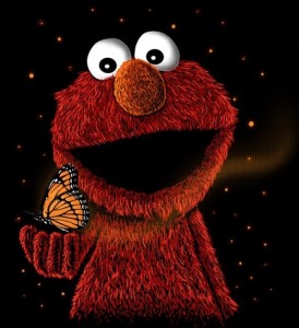
I love the amount of detail put into Elmo’s fur. He really pops, although only in the fur. His arm doesn’t quite look right, and his face is a little flat, but it’s still a nice example of Elmo drawn right.
My rating: 4
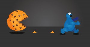
Cookie Monster meets Pac-Man again! But this time, the table is turned! A great idea, and a good execution, but I’m not really sure what those little piles are. Demolished cookies? Or was Cookie Monster really… really scared?
My rating: 4
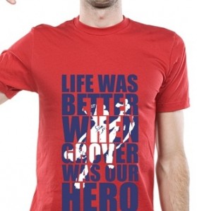
It’s so true. But then again, who says he’s not our hero anymore??
My rating: 3
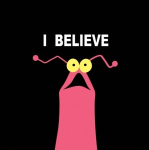
Simple, but effective! Keep watching the skies, true believers!
My rating: 5
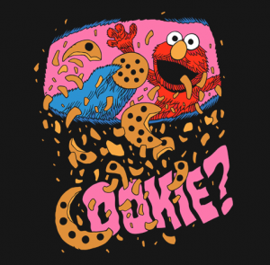
At first, I couldn’t figure out why Elmo and Cookie Monster were throwing cookies into a garbage chute. But now I see that we’re looking from the inside of of Cookie’s mouth, which is actually pretty brilliant. Though it does accent the fact that Cookie Monster chews his cookies without teeth.
My rating: 5
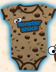
It’s hard to judge this one since it’s obviously intended for a onesie, but if I were the type to wear a onesie (and I’m not ruling it out), it would probably be one that looks like a big cookie.
My rating: 2
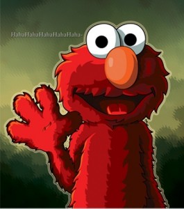
This is a nice picture of Elmo, but it turns creepy when you picture this calm, stone-faced monster laughing like a hysterical serial killer. I’m the only one thinking of it that was, aren’t I?
My rating: 3
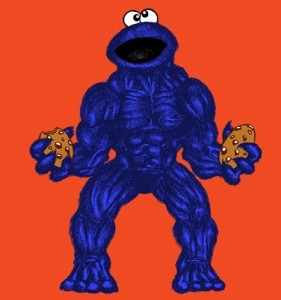
“Me getting hungry. You no like it when me get hungry. COOKIE SMAAAASH!”
My rating: 3
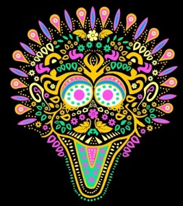
Looks like Big Bird fell into a barrel full of highlighters and then got electrocuted. Ummm… in Mexico.
My rating: 3
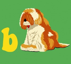
It’s a Barkley shirt!!! Vote for this thing! Why do I say that? Because it’s a Barkley shirt!!!!!!
My rating: 5
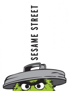
I always wondered what keeps Oscar’s trash can lid on. And now I know: It’s a bunch of letters stacked up on end. That’s logical, right?
My rating: 3
What flavor do you think the cookie cookies are? Probably something disgusting, since Cookie Monster isn’t in the process of rendering them unrecognizable.
My rating: 4
Why is Cookie Monster made up of all those “Wo Wou Wou”s?
My rating: 3
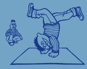
This is fantastic. I don’t care that Bert and Ernie are doing something uncharacteristic, I don’t care that they’re slightly off-model, and I don’t care that there are only two colors in this picture. It’s amazing and I love it.
My rating: 5
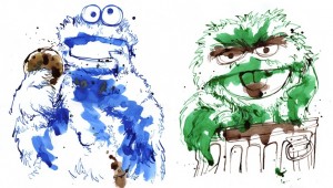 Muumm, Muumm, Muumm, Muumm / I Love Trash
Here are two entries by the same artist that employ a lazy man’s method of coloring (just slapping some watercolors in the middle). And y’know, it works. Neither of these guys should look neat and clean, nor would they advocate coloring within the lines.
My rating: 5
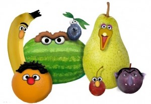
Fun Fact: Ernie is full of vitamin C! Bert is loaded with potassium! Oscar is full of seeds! That last one is oddly appropriate.
My rating: 3
I am not an Austin Powers fan, so my gut reaction is to dismiss this picture. But if you enjoy the wacky antics of Mike Myers, then this is a well-made spoof. The chair is a little distracting, but not overly so. So I guess this one might work for some of you, but not for me.
My rating: 3
Six mediocre ideas can sometimes turn into one pretty good design. I have to admit, this is clever, although maybe not meant for a t-shirt. Though it should provide some inspiration for aspiring graffiti artists out there.
My rating: 3
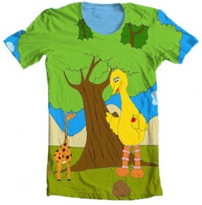
As much as I like the idea of Big Bird helping to feed a tiny giraffe (or a giant Big Bird feeding a normal-sized giraffe), this design is just a little too juvenile for the Threadless masses. If it were up to me, I’d probably call this shirt… Shirley.
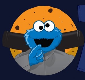
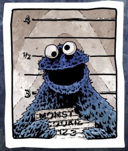
It was only a matter of time before someone called the cops on this guy. What with all the theft, destruction, arson (probably), insurance fraud (most likely), conspiracy, and grand treason, he’s finally being brought to justice. I wonder if they have cookies in prison…
My rating: 5
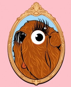
Wow. I always wondered what was up with Snuffy’s long, luxurious eyelashes. And now I see that it’s all a part of his morning routine. A little mascara goes a long way, Snuffy!
My rating: 5
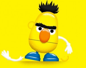
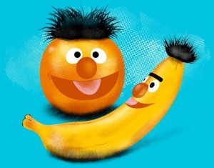
What is it about Bert that makes people think “Mr. Potato Head”?? This one is much better than the first one we saw, mostly because most of his pieces are actually in place. And it also gives a good explanation for why he looks so upset. You would be too if your arms and ears were falling off.
My rating: 4
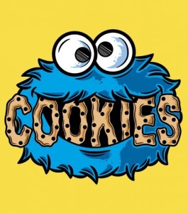
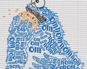
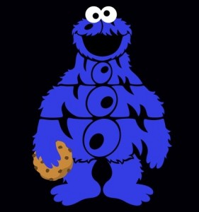
It’s a cute idea to make Cookie Monster full of Noms, but I really like how the artist invoked the image of Cookie’s eyes in the “O”s. It’s almost as if he’s been full of Noms this whole time and we never knew it!
My rating: 4
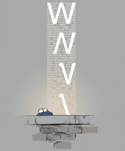
Wow. I love a good design based on a single sketch, and this one takes the cake. It’s a little obscure, a pretty design, and a flash back to one of the earliest Sesame Street episodes. These are a few of my favorite things! Also, be sure to zoom in and read the text in the background, which covers all of the dialog from the sketch!
My rating: 5
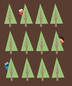
I’m almost a little sad that the artist didn’t keep going with this idea. It’s cute to have Elmo, Ernie, and Cookie Monster hiding out, but it would’ve been great to make it a real challenge to find them. Or to go even further, how about a Where’s Waldo-style picture? Without the topless lady on the beach, of course.
My rating: 2
Okay, that’s kind of adorable. I like it when the characters take a turn for the cartoony. Giant nose, tiny helmet, and knobby knees and all.
My rating: 4
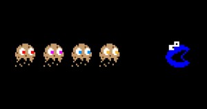
Okay, so we’ve seen Cookie Monster as Pac-Man, we’ve seen a Pac-Man cookie chasing him, but we haven’t seen cookie ghosts chasing the Pac-Man Cookie Monster. We’re running out of combinations here! Also: Someone make this video game now!
My rating: 4
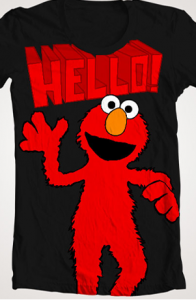
Hello, Elmo. Yes, I see you there. Hello. I’m waving now, see? Can I stop now? No? Okay. Hello.
My rating: 1
This is a cute one. I like the idea of the color outside-the-lines, but I wish there was a little more variety in the styles, and not just a little messiness in the crotch areas. I immediately regret typing that sentence.
My rating: 4
The funny thing is, this is also how the US Government works.
My rating: 4
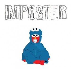
Okay, I think I’ve got this one. A baby has dressed up like Elmo, who then dressed up like Cookie Monster. So even if you haven’t bought into the delusion that Cookie has shrunk down to infant-size and found a penchant for pacifier-suckling, you could be convinced that it’s just Elmo playing some sort of prank. It’s the perfect storm.
My rating: 2
When your fruit starts to grow thick black hair, it’s probably time to throw them out. Even if they have little smiley faces on them. Ain’t nothing happy about food poisoning.
My rating: 3
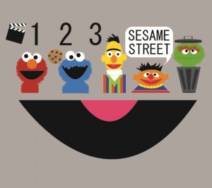
Man, that show is totally hahaha. The smiley face on the bottom looks a little like a half of a record, and the production clapper and numbers are a little unnecessary, but I like these depictions of the characters. I’d like to see this one simplified, and then maybe add a few more Muppets in there. Because I like Muppets.
My rating: 4
Phew! 100 more down, and we’re about halfway there! Stay tuned for part 4, coming soon!
Click here to draw Cookie Monster as Pac-Man… again… on the ToughPigs forum!
by Joe Hennes – Joe@ToughPigs.com
