Part 1 – Part 2 – Part 3 – Part 4 – Part 5 – Part 6
Since our last “Threadless-ame Street” entry, all of the submissions for the Threadless Sesame Street T-shirt Design Contest have been entered and eligible for voting. And while we expected a few hundred entries to review, we ended up with a whopping 532 submissions. Wow. So, it might take a little longer than expected to review them all, but we promised! So they’ll all be here.. eventually.
In the meantime, here are the next 100 entries! Remember to keep voting!

Being a New Yorker, I’m a sucker for NYC-centric Muppet stuff. So I really dig this design, which has potential for the hordes of hipster commuters. Unfortunately, to those of you who walk or have cars, this is just a picture of Big Bird sitting down, looking bored. Yet another reason why living in New York is the best: We can appreciate silly t-shirts.
My rating: 4

At first glance, I thought this Venn diagram was trying to say that mixing Elmo and Grover’s character traits results in The Count, or that Zoe is half-Elmo and half-Big Bird. But now I see that it’s all about the mixing of colors, and that’s pretty clever. The kicker is really the Snuffy in the middle (which I think was the original title for that Frankie Muniz sitcom).
My rating: 4

Of course Oscar would be proud of a recession! That’s joke got the biggest laugh out of me in this contest so far. The “Obama Hope” poster references are getting a little old though. Maybe there will be a new artsy poster for Oscar to parody in 2012.
My rating: 4

We had a “Bird on Wire” design in the last set of entries, and I’m torn as to which one I like more. This one has the happier Big Bird, as well as the random crows. The other one had Big Bird on a sagging wire with some comically undersized telephone poles (or a comically oversized Big Bird). I think this one may have the edge, and I’m not just saying that to avoid what he might do to a passing car.
My rating: 5

A while back, I sketched out some potential t-shirt designs. This was one of them. Now, I’m not saying that this artist stole my idea. But I am saying that a lot of people had it at the same time. Including this Cafe Press store. And this officially licensed shirt from 80sTees.com. Maybe if Threadless began selling capes and helmets too… Hmm…
My rating: 1
 Han Elmo and the Wookie Monster
If the artist responsible for this image is reading this article, then I have a message for you: Keep going! Let’s see the whole Sesame Street cast as Star Wars characters! Bert and Ernie as the droids! Zoe as Princess Leia! Grover Skywalker! Obi Wan Hooper! Darth Oscar! This thing practically draws itself!
My rating: 4

I’m admittedly a little tired of the “minimalist” craze. To make one stand out, it has to be something really amazing. Making Bert really thin and Cookie Monster really fat isn’t going to cut it. And making Elmo and Big Bird almost the same height is going to clinch the low rating from me. Nor is Big Bird’s orange beak. If you’re gonna go for minimalist, you might as well get those precious few details correct.
My rating: 2

Is Elmo in 3D or just blurry? Either way, he might make you throw up.
My rating: 2
 Cookies… Cookies… Cooookies!!!!
If this image had a picture of George H.W. Bush off to the side, it could be a reenactment of the destruction of the Berlin Wall. I’m just sayin’.
My rating: 3

That fur is getting a little out of control! He’s got a Justin Bieber thing going on up top, and he’s bound to get a mouthful of fur every time he tries to eat soup. It must be so inconvenient to be a monster.
My rating: 2
 Yip Yip, the Martians are Here!
I like how the artist chose to give the Yip Yips rounded tentacles, rather than the velvety ones the normally have. It suggests something slightly more squid-like in their ancestry. But as much as I love a good octopus reference, and as pretty as this image is, it’s a little lifeless compared to most of the other entries. But that doesn’t mean I wouldn’t buy this shirt. Nope nope nope.
My rating: 4

It’s our second entry by ToughPigs’ pal Mike Boon! Although I haven’t seen all of his designs yet, this might be his best one. Everyone remembers Mr. Hooper and what he meant to us. I honestly can’t think of a better, simpler homage to his memory. Well done, Mike.
My rating: Withheld, since we know the artist personally.

According to the artist, this image is a parody of old wood carvings of Vlad the Impaler. So if you got that without having to look it up, this is probably hilarious. And if not, it’s still wonderfully Gothic. This might be one of the best “The Count is a vampire” pieces I’ve ever seen, right after this one.
My rating: 4

Screw being “on model”, this artist knows what he wants. And he wants giant round heads, beady black eyes, and rosy cheeks, dammit!
My rating: 3

Oh boy, I don’t know what to complain about first! Could it be the abundance of negative space? Or the fact that not every character’s eyes are instantly recognizable? Or that ugly, ugly green background? Or just the fact that this idea is pretty boring and uninspired? Why not complain about all at once?? The negative eyes aren’t recognizably green and uninspired! That didn’t work at all.
My rating: 1

Cookie Monster looks like he’s saying, “Surprise! Me used your cookie jar as a toilet!” And now I’ve ruined this design for everyone.
My rating: 2

Yes, we get it. The Count is a vampire. He has little vampire teeth and a cloak and a scary, bat-infested castle. But that joke doesn’t really go too much farther when you stand him next to Dracula. Unless it’s supposed to look like Dracula is performing the Count puppet. Which is… slightly better. But not much.
My rating: 3

If you can detach the words from the song in your brain, you can read this as if you just remembered that Rubber Ducky [sic] is the one. Like, “OH YEAH! Rubber Ducky! You’re that guy! ‘Sup?”
My rating: 3

Not enough attention has been paid to The Count’s monocle. Has he ever actually used it to see things more clearly? Did he ever count it? Or even take it off? I have so many monocle-related questions!!
My rating: 3

Cookie Monster as Pac Man is a cute idea. They’re both hungry and aggressive fellows. But Oscar as the ghost (let’s say… Blinky) is a little lame. Especially when you’ve got two perfectly good Pac Man ghost stand-ins already with the Yip Yip Martians. Opportunity: Squandered!
My rating: 2

I’m going to guess that this image wasn’t made with one of those automatic “Hope” poster websites, if only to give the artist a little credit. But the fact that just about anyone can make the same picture takes a lot away from the idea. And that is truly something to mope over.
My rating: 3

Even looking beyond the fact that this idea has been done officially, unofficially, and officially again, I’m predicting that nobody will get the “Snufflin'” reference in a couple more years. And I like a t-shirt that I can wear for the rest of my foreseeable young adulthood.
My rating: 1
 Super Grover – Exciting Adventures of
For a shirt that uses the term “Exciting”, this isn’t quite that. But it is adorable. Which Grover always should be.
My rating: 5

It’s the perfect shirt for fans of Sesame Street AND shapes! I love a good oval as much as the next guy. But this design loses a zillion points for not making Telly the triangle. That’s a bush league mistake right there.
My rating: 1

I was originally going to write this one off for being a little bland, but now that I look at it, it’s actually pretty clever. Rosita’s and Telly’s colors need to be tweaked, and a few of the characters aren’t instantly recognizable, but it’s a cute, simple design. I’m tempted to start using these in my text messages. The Amazing Mumford agrees. ({>|)
My rating: 3

I am floored by the boringness of this design. No, it’s not boring, it’s predictable. Big Bird is yellow! Cookie Monster is blue! The art is the exact same art we’ve seen on a million different Sesame products! I’m using a lot of exclamation points!
My rating: 1

Now this is a design I wouldn’t mind taking into the bath! It’s well drawn, makes a good reference without being too subtle or obvious, and I don’t think I’ve ever seen it before. Oh Rubber Ernie, you’re the one!
My rating: 5

Our pal Mike Boon’s next entry! I’m not sure if I’d want a tiny grouch in my pocket. I’d think he would make my shirt smell funny. Then again, if it’s anything like Oscar’s trash can, the inside could be bottomless. Just imagine the convenience of carrying all your stuff in that little pocket! Wallet, cell phone, books, groceries, swimming pool, pet elephant… Yeah, I could probably deal with the smell. Good tradeoff.
My rating: Withheld, since we know the artist personally.

Another Cookie Monster/Pac Man design?? Don’t you guys know that you’ll only end up splitting the vote? It’s too bad there’s no game board, making the characters and cookies float in white space. But props for making better use of the ghosts, creating a little more balance between the characters. I wonder how many more variations on this idea we’ll see in this contest…
My rating: 2

What is keeping those books up??? Elmo’s obviously not holding them. Could it be dark magic? Or something far more disturbing, which I’d rather not speak of on a Muppet-themed website? And now your imagination went there too. Sorry, folks.
My rating: 1

Okay, this is beyond brilliant. “The Monster at the End of This Book” is one of the best Sesame books ever printed, and we’re long overdue for a t-shirt homage. But going the extra mile in having Grover talk about the shirt, rather than the book, is genius. Totally worth Grover’s crippling embarrassment.
My rating: 5

Now this is how you do a Sesame Street/old school video game crossover. Can someone please make this a playable game?? Or maybe don’t, since the Sesame fanatic and Mario fanatic in me might explode from the awesomeness.
My rating: 5

I’m calling shenanigans. Sure, this is a beautiful and brilliant Sesame Street parody, and the comic book fanboy in me is pleased as punch to see it here. But this was already a t-shirt, as sold by TeeFury.com, which only sells one shirt at a time for 24 hours. And the artist is currently selling it on RedBubble.com. So come on, give someone else a chance. It’s what the Sesame Six would do.
My rating: 1

The Muppetized letters and numbers are truly the unsung stars of Sesame Street. So I’m glad to see one of them finally break into the spotlight. Unfortunately, the Sesame reference would probably end up getting lost on, well, just about everybody. It takes just a little more than eyes and a mouth to truly make this a contender for “#1”.
My rating: 2

Some of these designs would be perfect for other products, but not so much for t-shirts. This one would make for a great set of nesting dolls, but there isn’t much out there to prove that people want a shirt with nesting dolls printed on it. So, somebody make this please. Just not as a shirt.
My rating: 3

Is Elmo doing that thing where you pretend your hands are binoculars? Stop pretending to look far away, Elmo! Your blocks are right there in front of you! Right there! Just look down… oh come on! Nevermind.
My rating: 1

When I was in middle school, I had a t-shirt that changed colors depending on the temperature. This shirt reminds me of that: Cool colors in theory, but pretty lame in practice. Maybe it’d be better if you kept a black light shning on your torso whenever you wore it. You’d need a long extension cord though. And maybe a few extra bulbs, just in case. I’m putting way too much thought into this.
My rating: 1

This is a nice little Oscar spotlight. I don’t think the toilet seat-shaped background is intentional, but it kinda works. There’s not much else to say about it, which is both good and bad. So I guess my score will celebrate those same principles.
My rating: 3

Go ahead and Google “Sesame Street” and “Angry Birds”, and you’ll see a whole mess of parodies out there. Thankfully, this one doesn’t tread on the same ground, which is a relief. And it has some really clever uses of perspective, as well as a nice excuse for the front-and-back views. I can’t say I’d be excited about wearing this one, but I can totally see it selling. People sure do love those Irate Avians.
My rating: 4

HAHAHAHAHA! Oscar the Couch! I don’t even need the visual, I’m laughing at the name. Just perfect.
My rating: 5

The Cookie Monster I know wouldn’t stop to think about it, he’d just dive head-first into the free samples pile. Maybe he’s thinking hard about the best way to go about that. Swan dive or cannonball? Start chewing before he hits the cookies to save time? Come up with a strategy to deal with the inevitable “floor crumbs”?
My rating: 5

Any self-respecting Sesame Street fan knows that Big Bird does not smile when he’s painted blue. But looking past that (which is difficult, believe me), I can’t get over how TINY he must be under that sign! Look how little his feet are! Who is this miniature blue bird, and why is he so intent on being followed??
My rating: 2

I’m not sure this straightforward design is the best way to go, but I think the idea of a shirt with all the international Sesame Street logos is an inspired one. And maybe slip a few fake ones in there. I mean, who would know? As far as I know, “Susam Sokagi” was totally made up!
My rating: 2
 Ax3 + Hx3 = 1 Unforgettable Laugh
Even next to all those “The Count is a vampire” designs, this one is still the creepiest. That isn’t a laugh that comes from the joy of counting, it’s a laugh that begins in the deep, dark recesses of one’s soul, where pain and suffering and doom are conceived, culminating in a chant to celebrate the utter agony and unrelenting torment of another human being. Or maybe he just really likes the number 4.
My rating: 4

I feel like some of these artists are just picking random pictures and slapping some eyes into them. This actually isn’t a bad looking picture, but what’s the point? Why does Sesame Street lend itself to the works of Piet Mondrian? Or did they just see the squares and think that they wouldn’t be complete without a little Grover? Please show your work on a separate sheet.
My rating: 2

I’m curious as to what’s going on on the other side of that pole. Is Cookie Monster precariously perched on Bert’s back? Is Big Bird really that much taller than Ernie? Am I just grasping for straws for something to talk about in regards to this picture???
My rating: 2

Oscar looks so naked without his can. Thankfully he has so many fashionable options for a night out on the town!
My rating: 4

I can’t even tell you guys how terrifying the idea of a giant Cookie Monster who can shoot lasers out of his eyes is to me. No carton of Oreos would be safe from his gaze, no tub of Edy’s Cookie Dough ice cream would make it out alive, not one of the nine ingredients required for the Tollhouse cookies recipe (or ten, including the optional chopped walnuts) would remain over the scorched earth left in his wake. Anyway, I dig this design.
My rating: 5

Oh hell yes. This is beautiful. So very, very beautiful. Notice how each puppeteer is drawn in the color of their signature Sesame Street character. Also note how freaking brilliant it is. Did you note that?? Well, note it again!
My rating: 5

Mike Boon already did the Sesame Street alphabet better than anyone else ever will, so this design just leaves me wanting more. That’s not the fault of the artist at all, just the fact that Mike’s talent makes a lot of other people look bad. It’s his fault, really.
My rating: 2

Brilliant. Not only are the “Where the Wild Things Are” characters inherently Muppety, but Maurice Sendak has a long history with Sesame Street. He sat on the National Board of Advisors in the early years of the show, and he provided some cool animation spots too. It’s like he invented the “friendly monster” concept, so this design is both appropriate and well-made.
My rating: 5

This design does raise some interesting questions. Where did Oscar’s can really come from? They’re usually property of the city, but Oscar has not only moved in, but created a hammerspace for all of his belongings, pets, and a boom tube to Grouchland. Could the city reclaim their property? Well, they could probably try, but Oscar’s elephant Fluffy might prove to be quite the opposition.
My rating: 3

Elmo’s hands taste like peanut butter! But Elmo doesn’t remember eating peanut butter today…
My rating: 1
 One of These Things is Not Like the Others
I really dig this sort of simplistic style (as opposed to the eyes-and-nose thing that a lot of these contest entries contain). The essence of the characters are solidified, and there’s a sense of motion and fun to them. Except for Oscar, who I guess is taking a little nap. But it’s okay, he’s an old man. He deserves a rest.
My rating: 5

In the early days of the internet, there was only one picture of Guy Smiley that anyone ever saw. So it pleases me that we not only get to see a lot more of him these days (thanks mostly to the Muppet Wiki), but people are even creating fan art of everyone’s favorite game show host. This design mostly ignores the manic side of Smiley, but it still captures his look nicely. And yes, I will gladly take one of your business cards. I’ll call you if I ever find myself in need of a game show host.
My rating: 5

This video is quite possibly the best Grover/Yoda crossover that will ever be made. But that doesn’t take away from the fact that this design is subtly hilarious for both Sesame and Star Wars fans. Oh, and Frank Oz fans. And fans of scratchy voices. And small, mysteriously insightful characters.
My rating: 4

I’m not thinking about the fact that this scene takes place in someone’s sexual fantasy. Uh uh, not thinking about that at all. Not one synapse in my brain is firing at that thought. Nope nope nope. Ah crap, I thought about it!
My rating: 4

This isn’t Grover’s first time parodying Spider-Man, but it’s definitely the most clever. It’s especially interesting since we usually see the Super Grover/Superman spoof, but this is a really clever use of Grover’s costume as well as the iconic(?) trash can. I’m calling it now: This will be one of the big contenders by the end of the contest.
My rating: 5

I’ve seen this art style on official Sesame merch before (around the 40th anniversary, I think), and while it lends itself to a sense of play, watercolors, and imagination, it also teeters on the edge of just plain ol’ “messy”. I’m not saying these sets of eyeballs are one or the other, but they definitely don’t pop enough to get me to commit to an opinion. Except for Big Bird. Dude looks like he’s been awake for a week and a half.
My rating: 2

This is what happens when Elmo wants to ask a baby, but is really impatient.
My rating: 3

What a nice picture of Big Bird’s back. Now I understand why he moved from the forest to a back alley behind 123 Sesame Street. That branch is not going to hold out very much longer!
My rating: 5

Ernie’s Rubber Duckie has a very specific look to him. Any changes, and he suddenly because any old duck you can buy at Bed Bath and Beyond. Simplifying him and adding some strange lines to his wings only makes it look less like the bathtub toy we all like to sing about, and more like a real duck. And nobody likes real ducks.
My rating: 1
 It’s a Bird, It’s a Plane, It’s…
There’s something inherently “South Park”-ish about this design. Maybe it’s the blocky shapes or the solid colors, but I’m half expecting this Super Grover to be the butt of one of Cartman’s jokes. This is a cute rendition of Grover’s alter ego, but not quite bold enough to make a statement.
My rating: 3

Elmo looks like he’s peering into the abyss and seeing for the first time that it’s full of stars. And maybe, if he’s lucky, those stars will sing him a lullaby before he falls asleep!
My rating: 3

Hey, it’s another Monster Cookie! This one seems to be in the process of ripping Cookie Monster’s arms and legs off. Makes sense though. I hear the neck is the tastiest part.
My rating: 2

Bert and Ernie’s Big Adventure!
Hey, remember that time Bert and Ernie found a chicken who laid a giant egg? Okay, here’s a better question: Remember that time there was a chicken who laid a giant egg, and then Bert and Ernie were there for some reason? The answers to both are “no”, and the addendum is that there is no reason for Bert or Ernie to be present for this miracle of animal husbandry, nor does their attendance add anything to the tableau. Just leave the chicken alone, guys. Go home and put a banana in your ear or something.
My rating: 3

This Cookie Monster/Pac-Man crossover is a bit more subtle than the last few. I like the 3-D rending of Cookie’s head, and that it works both as a Pac-Man reference and a Sesame design. It also works in making me want a floating cookie.
My rating: 4

Wow. I have no words. Why this person decided to slap a picture of The Count in front of “The Persistence of Memory” is beyond me. Maybe it’s because the clocks have numbers on them? Or The Count likes things that are melty? The title is “Dali Confuses the Count”, but it should be called “This Design Confuses Everyone”.
My rating: 1

I recently watched this episode of Sesame Street, which features Cookie Monster as “King Cookie” (with an unleashed and ad-libbing Frank Oz as Cookie Monster), and it was one of the funniest Sesame episodes I’ve seen in a long time. (It’s also available on iTunes, if you’d like to see for yourself.) Cookie Monster is the uncontested King of Cookies, whether it be a pile of cookies like this design or an entire country like in the episode. It’s good to be the King.
My rating: 4

I know this is supposed to be a picture of Elmo coming out of a phonograph record, but it looks a lot more like he’s being fed into a wood chipper. And now you can’t unsee it.
My rating: 1

This is it. Everyone else can just go home. This is the single most brilliant t-shirt idea I’ve ever seen in my years as a t-shirt design reviewer. If this doesn’t get printed, I will personally ink this onto a shirt with my own blood. Or better yet, I’ll get it tattooed across my chest. And next time, Cookie Monster can sing with you; I’m leaving.
My rating: 5

Oh no! The eyeball aliens are stealing the world’s tennis balls! Someone call the Men in Black!
My rating: 2

This is a clever use of the fictional pocket. I kinda wish Threadless would consider making shirts with real pockets in them. Can you imagine wearing something that was both funny and could hold your spare change??? I’m getting sweaty just thinking about it.
My rating: 3

Sometimes someone will create a design, and the rest of us will slap our heads in frustration at the obviousness of it all. I’ve never noticed how the Yip Yip Martians’ tentacles look like dripping paint, but it almost makes too much sense. The shirt is artsy, and the Martians are a little messy and illogical. And this is a design I’d totally consider buying.
My rating: 4

This is what happens when Oscar the Grouch makes fun of the Transformers movie. (We know this would never happen. Oscar loves trash!)
My rating: 3

It’s nice that some people still remember Telly’s origin as the “Television Monster”. His TV obsession doesn’t come up much, but it’s always interesting to see how it manifests itself. (See “Trianglebob Trianglepants” for the best, and most hilarious, example of this.) The outline of the Sesame Street gang in the background is a great touch too. And we need more Telly merchandise, dammit!
My rating: 4

If the Street really did give you your education, you’d know that the proper grammar would be “I got my education from the Street.” And then the Cookie Monster head.
My rating: 2

If you type “Sesame Street” into the search bar on DeviantArt, several of the most popular results are from this artist‘s “Sesame Street Fighter” series, merging the Sesame Street characters with their Street Fighter counterparts. It’s a clever and popular concept, and it most certainly can’t be duplicated or piggybacked by a design with just the words from someone else’s idea. It’s pretty lazy, and not even a good design. But mostly lazy.
My rating: 1

Didn’t someone do this exact same design for one of last year’s entries, but with the Muppet characters instead? I’m sure they did, but it’s hardly worth my time to go back and find out. In any case, this person forgot to swap out one of the boxes, as Kermit (owned by Disney, and ineligible for this contest) is still in there. Whoops.
My rating: 1

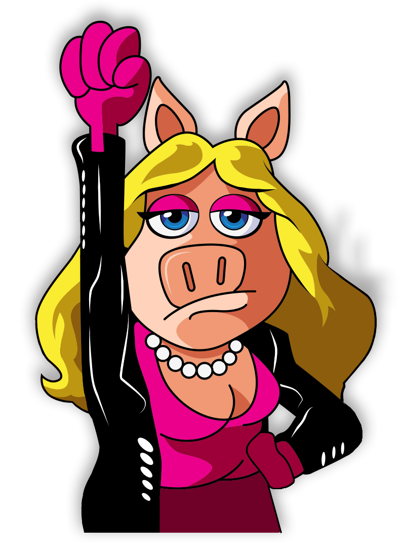
Speaking of which, I have no idea how this got into the contest. For those of you keeping track, Miss Piggy is not a Sesame Street character, and only Sesame Workshop-owned characters are allowed in the designs. So unless there are some big changes in character ownership in the next few days, this one’s over and done.
My rating: 1

I don’t know which is more disturbing: The fact that Cookie Monster has been swallowing cookies whole, or the fact that he apparently ate a microwave.
My rating: 2

Nice design. The “Yips” around the shirt are what make it interesting to look at, especially since the Martians are just photoshopped from a stock image. It’s a little unmemorable though. But quite agreeable. (“Yip yip yip yip…”)
My rating: 3

This artist came so close (accidentally, I assume) to recreating the Sesame Road album cover! At least they got it right by making Grover barefoot, giving us a clue into the fact that he died in a car crash and was replaced by Billy Shears.
My rating: 5

I love the vintage look to this design! More shirts should do that, I don’t care if it’s out of style. Bert’s pretty out-of-style, and I’d wear pretty much anything with him on it.
My rating: 4

What a terrible idea! Two minutes after buying this bike, Cookie Monster will be seen carrying a tire-less bicycle frame on his shoulders, with the trace of cookie tire crumbs on his face.
My rating: 2

Yet another “Nosferatu” reference, but this one has the numbers in the stairway, which is a great touch. It’s easy to make The Count look like a scary vampire, but it’s more difficult to do that while staying true to his character as a number-obsessed educator.
My rating: 3

Oh god, it’s so obvious. Even the typewriter seems to be saying, “See? Anyone could’ve come up with this idea!” He also seems to be saying, “Noo nee noo nee noo”.
My rating: 5

This is what Guy Smiley looks like when he wears a blue suit on a clear day. Or visits the weather studio’s greenscreen on the news. Or gets his head and arm cut off by an angry game show contestant who just lost last night’s championship game.
My rating: 3

I think this is a clever way to show Bert and Ernie in one compact design. It might’ve been enough to just show their faces (or half-faces), but the vertical lines really adds a lot to the texture and motion of the piece. I dig it.
My rating: 4

Not only would I jump at the chance to own a t-shirt with this design on it, but I’d pay good money for someone to write and illustrate a comic book with this cover. Brilliant ideas like this should not be ignored! Someone get on this!!!
My rating: 5

When Woodstock says, “|| | ||| || |”, do you think he’s really singing “What’s the Name of That Song”? I’m just gonna assume so from now on, if that’s cool with all of you guys.
My rating: 4

With no real connection to Men in Black, this design falls completely flat. The only thing I really like about it is their choice in pocket squares. I hope Will Smith and Tommy Lee Jones wear them in the next MiB movie.
My rating: 2

Does someone out there think that these guys are Cookie Monster? Not only are there two of them (an obvious tip-off), but to my knowledge, they have never shown interest in cookies or said “Om nom nom.” It’s just like illegal aliens to come to our home and try to steal the job of a proud American!
My rating: 1

Zoe looks like Ernie and Animal had a daughter and then left her in the wilderness to be raised by tree nymphs. But hey, bonus points for the return of Rosita’s armpit wings!
My rating: 2

I didn’t realize Mr. Hooper had his own brand of bird seed! I guess he’d have to manufacture his own, what with all the milkshakes Big Bird orders (and never pays for).
My rating: 5

Has Elmo been deputized?? Uh oh, we’re all in trouble. Tickling will be prohibited. Fines will be doled out for anyone not speaking in the third person. Marshall Law will be declared in Elmo’s World.
My rating: 2

I don’t know what the impetus of this design was, but it ended up being a nice design. It’s a little subtle, but subtle can be good. I especially like how it just flat-out tells people how you feel about cookies. No beating around the bush, those things are freaking great.
My rating: 3

Elmo Wants Big Bird’s Ice Cream
What should I complain about first? The fact that Elmo is being greedy by demanding some of Big Bird’s ice cream, despite the fact that he’s holding ice cream right there in his hand? Or should I ask why Big Bird needed to order nine scoops of multicolored dessert? Or shall I bitch about the fact that Big Bird is using a spoon to eat ice cream on a cone?? Just lick it before it melts! It’s not rocket science, Big Bird!!!
My rating: 2

I don’t like the Tron-esque colors of this design, but man, I want this on a t-shirt so badly. It’s one of the most iconic Sesame Street behind-the-scenes photos ever, and I want to proudly display it on my person, please and thank you.
My rating: 5

We don’t see Mumford and The Count together very often, for obvious reasons, but they really do seem to compliment each other. Especially as superheroes. Mumford can use his magic to thwart evil, while The Count can use his vast wealth and keen accounting skills (it’s like being a detective, right??) to solve crimes. Evildoers beware!!!
My rating: 4
Another 100 entries down, only a billion more to go! Part 3 of our Threadless coverage will be online shortly!
Click here to look at a lot of t-shirts with Cookie Monster on them on the ToughPigs forum!
by Joe Hennes – [email protected]
