Part 1 – Part 2 – Part 3 – Part 4 – Part 5 – Part 6
Here we are, finally at the end of the Threadless Sesame Street T-shirt Design Contest! With over 500 entries, I am absolutely pooped, and I’m proud to have made it to the end. And I’m sure you are too.
Read on for the final batch of submissions, and then keep reading for some interesting stats!
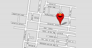
The thing about designs with extremely tiny text is that the stuff you can’t see needs to be the bonus to the overall joke. In this case, that’s the only part of the design that really works (with gems like New Way To Walk St. and Near Far Rd.), while the rest of us who refuse to squint are left with a pointy Elmo head on a street map that looks nothing like Sesame Street.
My rating: 3
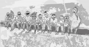
I am not a fan of illustrations that put Muppet heads onto human-proportioned bodies. It weirds me out. You know what else weirds me out? Bert’s six-pack. Also the fact that Oscar’s trash can lid is most definitely going to fall off his head and kill some innocent passer-by.
My rating: 3
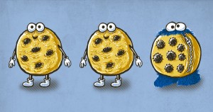 One of These Things is Not Like the Others…
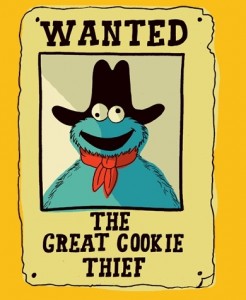
The proverbial wolf in sheep’s clothing has got nothing on Cookie Monster. And the cookies are probably much tastier than any lamb out there. (I hear the cookies’ arms are the best part.)
My rating: 5
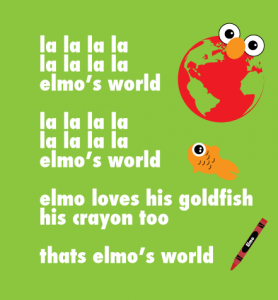
I like the literalism of “Elmo’s World”, with the red seas and moon-sized eyeballs. The end result is a little kiddie, but I guess that’s sort of the point. But this one goes down a notch for the missing apostrophe in “thats Elmo’s World” [sic]. This is educational TV, folks!
My rating: 2
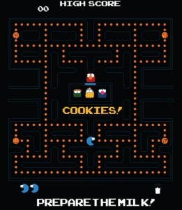
It’s been a while since our last Cookie Monster/Pac-Man mashup! This one probably looks the most like a playable game, and I’d imagine that it wouldn’t take too much for an experienced video game hacker to modify Pac-Man to make this for me. Um, I mean for us. For everyone.
My rating: 4
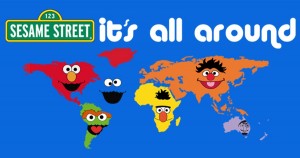
I grew up in Elmo’s nostril, but my great-grandparents are from Ernie’s ear. I”ll never forget the time I swam in Cookie Monster’s face, and my heart goes out to all the people suffering in Bert’s nose. Oh, and kangaroos live in The Count’s monocle.
My rating: 3
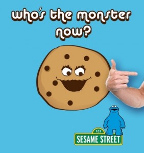
Wow, such aggression from the giant cookies in this contest! Don’t they realize that Cookie Monster loves cookies?? His love just has the unfortunate side effect of ending with demolishing the object of his love with his jaws of death.
My rating: 2
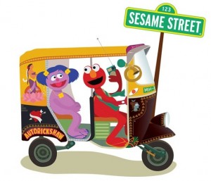
Ignoring the fact that Elmo is obviously too young to have a license to drive a rickshaw, I’ve spent (far too much) time trying to figure out who that is in the back seat. The artist mentioned the Indian connection, but I don’t recognize her as any of the Galli Galli Sim Sim characters. She looks a little like Rechov Sumsum’s Abigail, but I don’t know what she’d be doing in India. Could she be an original character? Or just someone I don’t recognize? Obviously this is very important to my appreciation of this design.
My rating: 3
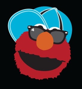 “Yea That’s Right Imma Hipster”
Funny, Elmo looks less like a “hipster” and more like a “douchebag”. Not that those aren’t mutually exclusive, of course.
My rating: 2
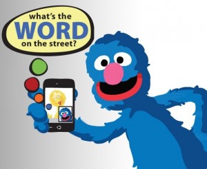
I can see Grover being among the first to adopt new technology on Sesame Street. I can also see him being the last to fully understand how it works. For example here, where he has figured out how to Facetime with Big Bird, but is using it to try and discover the Word on the Street. That’s what the Dictionary.com app is for, Grover!!
My rating: 3
Here’s another one that doesn’t have any Sesame Workshop-owned images, so it should be safe for anyone to print. Even still, I like the simplicity of the design. I don’t know if non-fans would recognize it as Oscar right away, but who cares? It’s a homeless guy diving head first into a trash can. It works in any language.
My rating: 4
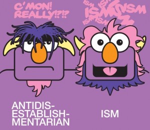 I Need to Speak to My Union Rep!
The Two-Headed Monster is such a visually appealing character design, I don’t know why he doesn’t show up on more merchandise. The design here works perfectly, highlighting the alternating ups-and-downs of the hair, beard, and horns, without trying to be too photo-realistic. The text needs a tiny tweak though. The bottom text is funny, but would work better if it looked more like the words from the show (just matching the font and putting them in the sky would do it). The text at the top is also funny, but doesn’t fit the characters’ voices at all. But those are minor quibbles for a great design.
My rating: 5
I’m picturing Cookie Monster as a Batman villain, with cookie dough covering half of his face, and the bottom of his cookie completely burnt from the oven. I believe in Cookie Monster.
My rating: 3
We saw another Where the Wild Things Are parody back in part two of our coverage, which I like a little more because the artist mimicked Maurice Sendak’s style. But on the other hand, this one skews more toward the Sesame style, which makes it work on a non-homage level as well. I gave the last one a 5, and while I still like it more than this one, it’s close enough to give it the same vote.
My rating: 5
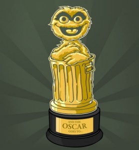
Every year when I write our “The Other Oscars” Academy Award coverage, I scour the internet looking for good pictures to use. Unfortunately, there are only so many photos of Kermit at the Oscar ceremony or Oscar the Grouch in a tuxedo out there. I’m happy that this exists, if only so I can steal it and feature it again next awards season.
My rating: 4
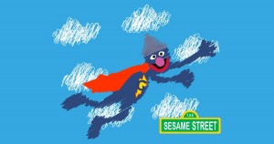
I like the scribble-style of this one, but it’s just a little too close to the original photo for me. I’d like it if the artist went a lot further, making Grover, his costume, and the clouds behind him look like a mess. A recognizable mess, but a mess nonetheless.
My rating: 2
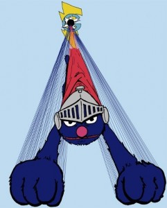 Dynamic! Heroic! And He’s Cute Too!
Now that’s how you do a stylized Super Grover. This image, drawn by our friend Noel Schornhorst, takes a cue from Superman, as well as the classic intro where Grover bursts through the “G”, you really get a sense of motion and perspective here. It’s also one of the few times we’ve ever seen Super Grover look decidedly bad-ass, and I think it looks good on him.
My rating: Withheld, since we know the artist personally.
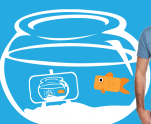
Here’s a philosophical question for you: Is Dorothy without Elmo still Dorothy? Or is she just a goldfish with an overactive imagination? Because I guarantee that almost no one will get that this is Dorothy without a bright red furry face next to the bowl.
My rating: 2
Ooooh, this is lovely! What a great use of the rainbow motif while taking advantage of the recognizability of the characters’ fur, feathers, or forehead. And it doesn’t hurt to have some beautifully detailed texture to the art.
My rating: 5
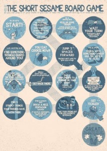
(Note: I had a little trouble with this screengrab, so click on the link above to view the original entry to be able to read the text more clearly.) I don’t think I’ve ever seen a playable game board on a t-shirt before. Would the wearer have to lie down on his or her back to let people play a game on their midsection? I’ve always wanted to eat sushi that way.
My rating: 4
There’s Kermit again! Disney is the needle in the balloon of fun Sesame Street t-shirt designs.
My rating: 2
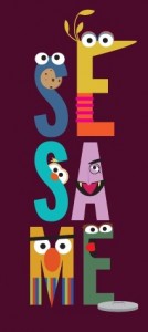
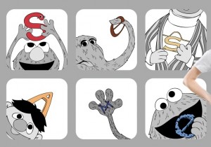
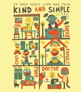
I really dig this style! The characters look more like paper cutouts than illustrations, and they all accurately portray both the characters’ personalities and the letters. Big Bird and Bert are my favorites, and I’d like The Count a lot more if he had a second eye.
My rating: 5
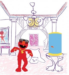
At first, I rolled my eyes at this picture, thinking it was another person putting Elmo under a bunch of bling because it’s “cool”. But now that I look at it, it’s actually pretty hilarious. This is totally what Elmo’s World would look like if he grew up a little and got a little more of an ego. Dorothy’s luxury fish tank is what puts it over the edge for me. That’s brilliant.
My rating: 4
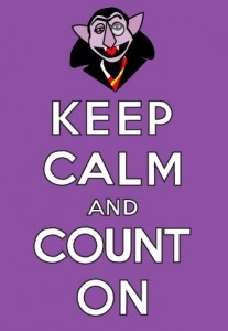
These “Keep Calm…” posters are really in right now, so it makes sense to make one with a Count spoof. Unfortunately, there’s no way The Count could follow his own advice. He can count on all he wants, but we all know he’ll never be calm about it.
My rating: 3
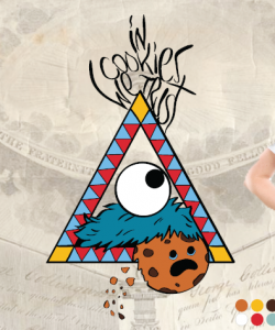
I admit, I’m a little fascinated by bizarre religious imagery, so I’m loving this Cookie Monster-themed Eye of Providence. It’s the next logical step toward creating a cult of Cookie Monster, or uncovering the cookie-eating habits of the Illuminati. Scientology ain’t got nothing on this.
My rating: 4
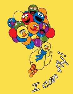
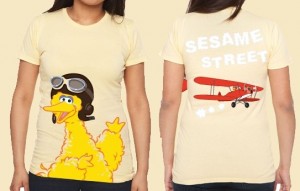
Cute, but it’s so hard to get excited over Big Bird in a hat, “flying bird” reference or no.
My rating: 2
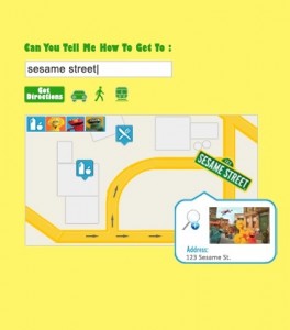 Directions: Can You Tell Me How to Get to Sesame St?
I guess this design is far enough away from Google Maps that it can’t get sued, but if it’s not instantly recognizable as an online map, it just becomes a mess of shapes and bright colors. I could see a Google Map of the Sesame Street cul-de-sac, with pinpoints showing Hooper’s Store, the Furry Arms Hotel, and of course, 123 Sesame Street. As it is, this design is just a little too far from what it’s trying to be.
My rating: 2
I don’t have anything new to add that I haven’t already said about these Pinball Number Count designs, all of which have been great so far, and all of which would look great on me.
My rating: 5
The artist said that he opted to desaturate the characters so the letters will pop more, but it really makes the entire image look bland. Either the characters need to be front-and-center or the letters need to be enlarged (or at least thickened so they’re not so thin that they’d fade into the line work) so we know where our eyes should focus first. Usually the answer to that is “Focus on the Muppets.”
My rating: 2
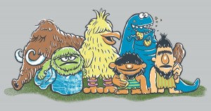 A Prehistoric Street Discovery
We already knew what Bert and Ernie would look like as cavemen, and Snuffy was obvious enough, but I’m loving the designs for the others, especially when they’re all together like this. Oscar’s stone trash can is a nice touch, and I’m glad Cookie Monster’s arms aren’t too short to keep him from eating cookies. That’d just be cruel.
My rating: 5
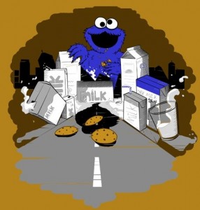
You have to admit, this is some pretty poor city planning. You also have to admit that if a town made of milk and cookies existed, you’d try and find a way to make yourself grow to a Godzilla-like size in order to ravage the village too.
My rating: 3
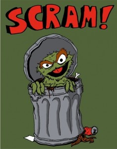
Our buddy Noel Schornhorst is back with a great depiction of Oscar doing what he does best: Sneering. Now that’s the look of a guy who wallows in garbage.
My rating: Withheld, since we know the artist personally.
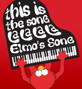
Normally, this would be a so-so idea, but I am really loving the vantage point of Elmo and his piano from overhead. Have those words been there the whole time?? Is that how Elmo remembers the words??
My rating: 4
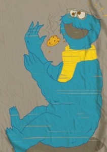 Hipster Cookie Monster, Eating Cookies Before They Were… Cool
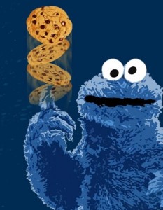
I had no idea hipsters could make cookies levitate! I’m finally starting to understand how Ramona Flowers’ ex-boyfriend Todd Ingram got his super vegan powers.
My rating: 2
I like the iconography of this piece, making the warning a subtle nod toward Sesame Street, rather than a blatant Cookie Monster reference in your face. And it’s good advice too. You really should keep your hands away from Cookie Monster’s mouth at all times.
My rating: 3
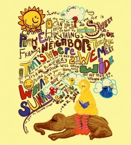
I feel like I should be complaining about the fact that this piece is too busy, but I’m captivated by the creative way the artist drew the lyrics. There’s so much going on, my eyes don’t know where to look next. And I like that, since it keeps the design interesting and full. Big Bird and Snuffy look a little sleepy, which seems to go against the theme of the picture, but it still totally works.
My rating: 4
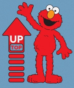
Don’t leave Elmo hangin’! No seriously, give Elmo a hi-five. Elmo’s arm is getting tired. Elmo can wait here allll day. Elmo’s starting to get stabbing pains in his shoulder. Elmo’s hand is numb. Is Elmo having a stroke? Someone call Elmo an ambulance. Maybe the EMTs will give Elmo a hi-five.
My rating: 1
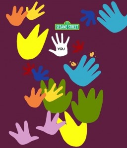
Cute, cute concept. It doesn’t really scream “Sesame Street” though. But didn’t your heart melt just a little bit when you saw that there’s a place for your hand??? Sorry, I just… I have a little something in my eye.
My rating: 3
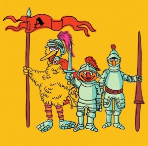
It’s interesting that Big Bird would be so concerned as to armor his feet, while the rest of his vital organs are unguarded and ready to be speared, gored, or otherwise disemboweled. I guess that’s just the risk you run when leading your Sesame brethren into battle.
My rating: 2
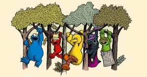
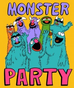
Sometimes I think about the Sesame Street monsters having a big party, and this is exactly what it’s like. All of my dreams are coming true! In fan art form. (Also: Oscar is not a monster, but it’s not inconceivable for him to be invited to the Monster Party.)
My rating: 5
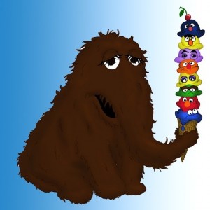
Oh no, Mr. Ice Cream Cone Man! You gave me a Cookie Monster-Elmo-Oscar-Big Bird-Ernie-Count-Bert-Grover ice cream cone, but what I really wanted was a Grover-Bert-Count-Ernie-Big Bird-Oscar-Elmo-Cookie Monster ice cream cone!
My rating: 3
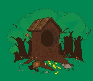
That tree stump is hardly big enough for Big Bird. Maybe that’s his tool shed, tucked away in the yard behind his pool house, which is situated next to the manor, which sits in front of his nest (off panel).
My rating: 3
My eyes are having trouble focusing. If I need laser eye correction, I’m sending the bill to the artist behind this picture.
My rating: 1
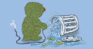
I’m always thrown off when I see a full-bodied Oscar outside his can. It’s like seeing him in his birthday suit, or something taboo like that. But looking beyond all that, why is Oscar washing his can? You’d think that would be the last thing he wants! Unless he’s just trying to flood it to up the amount of mold. Yeah, let’s go with that.
My rating: 3
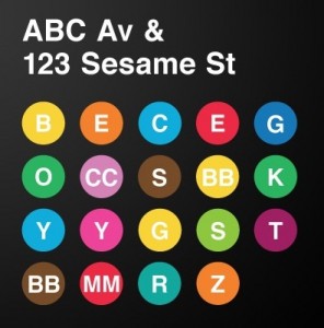
I guess this is the only way an artist can slip Kermit in without getting sued. The humungous flaw here is that some of these take a little too long to figure out. For example, it took me a minute to get the brown “BB”, the yellow “G”, and the purple “CC”. And the subway gag just isn’t good enough to justify all that confusion.
My rating: 2
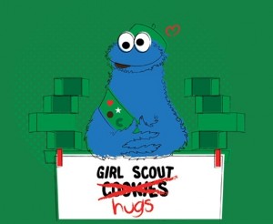
Everything about this picture is hilarious. The “hugs” joke takes the cake, but I also like seeing Cookie Monster in the Girl Scout getup, thinking about how he got it (oh no… he didn’t eat the Girl Scout, did he?), and that guilty half-burp look on his face. Which supports my “eaten Girl Scout” theory, actually.
My rating: 4
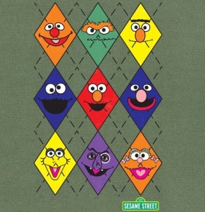
Only one of these characters really deserves to be on an argyle pattern, and that’s the argyle sock-wearing Bert. The way it is, it’s just a bunch of faces in diamonds, with no real reason for them to be that way. Except Bert, that fashionista.
My rating: 1
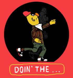
I wonder why The Pigeon never caught on as a dance craze. It was hip and cool, you got to wear a jaunty hat, and it was taught to you by the king of swing himself, Bert. Forget that dubstep nonsense, Doin’ the Pigeon is where it’s at.
My rating: 5
I think he’d eat a lot of cookies.
My rating: 3
Wow, beautiful. I love the mix of popular and classic characters, the artwork is crisp, and the whole image pops. If you’re going to use stock images, this is how you put them together into something lovely.
My rating: 5
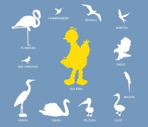
According to Big Bird, he’s actually a lark. Or a homing pigeon. Or a golden condor. Or a canary. Or part emu. Or part turkey. I guess he’s just a confused mutt of a bird. But he can talk and read and roller skate, so he’s already miles beyond any other species, evolutionarily speaking.
My rating: 3
I’m giving this one a great rating, not because I love the design, but because I love the idea behind the design. If it gets printed, I hope they just go ahead and use the artwork from the cover of the book. Because that thing’s classic and beautiful and I love it.
My rating: 5
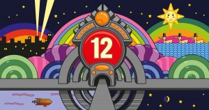
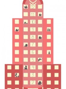 Floor 12! Please Bring the Luggage to Mr. Telly at Floor 12!
Cute concept, but WAY to hard to see. Without clicking on the image to enlarge it, I can’t identify any of the characters. And if I can’t do that on my computer, why should I expect anyone to see it on my t-shirt?
My rating: 2
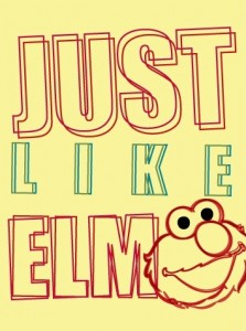
Oh no, all my symptoms from the Just Like Elmo shirt are coming back! It’s like I’m underwater, upside down, and riding a horse! It’s like I’m floating in outer space having a conversation with an invisible banana! It’s like my brain is inside out and I can’t remember who the killer was in that episode of Murder, She Wrote!
My rating: 2
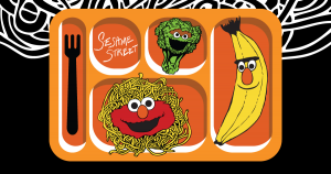
It took me a second to realize that Elmo is supposed to be a dollop of tomato sauce, and not just a really lazy way of putting his face on a scoop of pasta. One point off for no dessert. What’s a meal without dessert, I ask you!?
My rating: 2
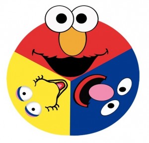
It’s like all three characters are looking directly into your soul in three different ways!!! I can’t break eye contact with Elmo. I’m afraid that if I do, he’ll jump out of the computer screen and hug my face.
My rating: 1
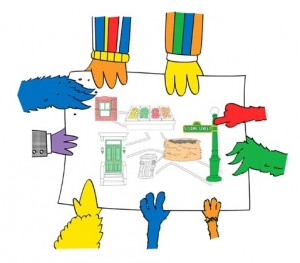 Where are the People in Your SS Neighborhood?
Funny, I remember the Marauder’s Map being a lot more detailed than this. At least now they’ll know if Alan is coming while The Count prepares his secret numbers potion. Or something.
My rating: 3
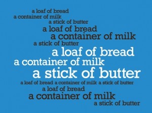
Great, now I’ll never get that out of my head! Oh wait, that was the point. Nevermind.
My rating: 3
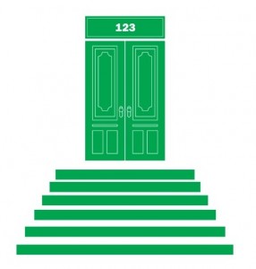
Perfect. This is just about as simple and iconic as you can get without slapping an Elmo face on there. I guarantee that every single person who sees this shirt will immediately get a sense of “home”, because that’s exactly what it is for us.
My rating: 5
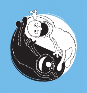
Aside from the black-and-white motif, this one looks more like synchronized swimming than the yin-yang symbol. Maybe it would make more sense if Grover and Elmo were anything like polar opposites. Which they most certainly are not. Or are they? Have I been watching the right show?
My rating: 2
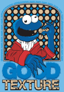
There are a million things to love about this. Alistair Cookie. The “Om Nom Nom” around the edges. The snazzy smoking jacket. The “good texture” quote. The “good texture” fonts. The fact that I want it right now please.
My rating: 5
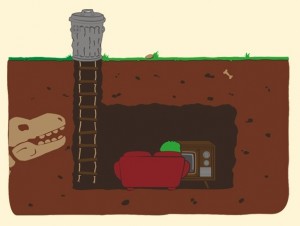
Is it bad that I dislike this image because it’s too realistic? Like, of course Oscar has extra space under his can to keep his couch and TV and dinosaur skeleton. But of course, that’s part of the brilliance of it all.
My rating: 3
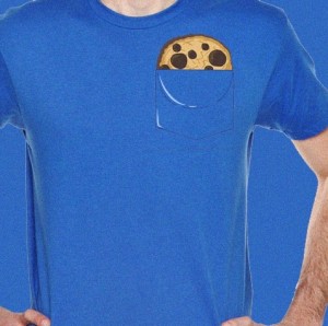
What does this even have to do with Sesame Street? It’s a cookie in a pocket. No monsters, no Om Nom Noms. No characters who wear shirts with pockets. No thinly veiled lesson about the letter ‘W’. No funding from the Viewers Like You.
My rating: 1
Recently, I drew a picture of Ernie on the moon for a round of Draw Something, and I have to admit, I failed miserably. My Ernie sketch was fine, but I stupidly drew yellow-with-blue-spots pajamas and not yellow-with-orange-dots. I am ashamed, and I will be turning in my badge and gun at the end of the day. So my whole point is this: I like it when people get it right.
My rating: 5
Some of these guys are really off model, but I think that’s kind of the point. It’s sort of an old school style, from before the Children’s Television Workshop set a stricter style guide. Again, it might be a little kiddie for Threadless voters, but I really love the charmingness of it all. (Yeah, “charmingness” isn’t a word, but it’s so apt!)
My rating: 4
Buy the non-faded version of this t-shirt right here! Or you can vote for this inferior version and buy it later. It’s up to you.
My rating: 1
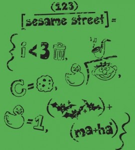
Man, I would’ve done so much better in math class if these were the equations I needed to study. Calculus suddenly seems so easy!
My rating: 5
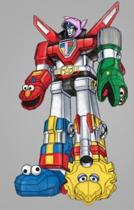
Okay, seriously. Is anyone from Sesame Workshop’s licensing department reading this? Because I want to buy some Sesame Street Transformers and have them fight Megatron. I want that so, so bad.
My rating: 4
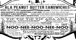
Fantastic! What a great love letter to all the memorable Sesame Street quotes. And I love the vintage style. It makes me want to zoom in and read them all, then go to YouTube and watch all the old videos. That’s a good feeling to have.
My rating: 5
And here we are at the very last entry! And it’s another Count made out of numbers. It’s pretty and all, but I am officially out of things to say. Sorry to the final artist, you probably expected more from me. But man, I am totally checked out.
My rating: 3
For fun, I wanted to see how many appearances each character made. Not counting group scenes (four or more characters), this is the final tally:
- Cookie Monster – 88
- Elmo – 53
- Bert and Ernie – 52
- Oscar – 40
- Big Bird – 38
- The Count – 30
- Super Grover – 19
- Grover – 13
- Yip Yip Martians – 13
- Snuffy – 12
- Guy Smiley – 4
- Two-Headed Monster – 4
- Kermit the Frog – 4
- Alice Snuffleupagus – 3
- Telly – 3
- Abby Cadabby – 3
- Frazzle – 2
- Mumford – 2
- Zoe – 2
- Rosita – 2
- Slimey – 2
- Mr. Hooper – 2
Wow, people sure do like Cookie Monster! Here are some more stats, based on a few trends I noticed during my reviews:
- No Muppets – 21
- Characters made up of smaller letters, numbers, cookies, etc. – 12
- Giant cookie attacking Cookie Monster – 6
- Comic book parodies – 6
- Pac-Man parodies – 6
- Big Bird as an actual bird – 6
- Cookie Monster trying to eat the moon – 5
- Characters as food – 5
- Pinball Number Count – 4
- Hipsters – 4
Thanks to everyone who submitted pictures to the Threadless contest, and thanks to all of you who’ve stuck with us through this long review process! I hope you liked it, and if I gave your image a bad review, I hope you can find it in your heart to not murder me in my sleep.
Click here to eat the moon on the ToughPigs forum!
by Joe Hennes – Joe@ToughPigs.com
