Part 1 – Part 2 – Part 3 – Part 4 – Part 5 – Part 6
Welcome to the penultimate entry in our Threadless Sesame Street T-shirt Design Contest coverage! We’ve barreled through hundreds of submissions, and we’re getting close to the home stretch. Read on for the next batch, and then come back in a few days for the final round, along with some interesting stats and final thoughts.
But for now, let’s see what the next 80 artists have to say for themselves!
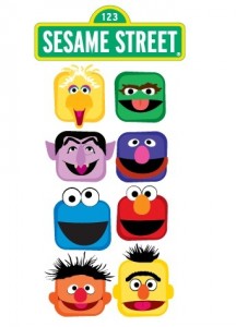
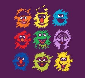
Funny, this is what my ideal iPhone screen would look like. This is my Grover app, this is my Big Bird app, and this one is my Bert app.
My rating: 3
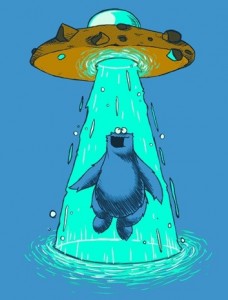
Cookie Monster is the best chance we’ve got against any alien invasion. Especially the ones from the more decadent planets.
My rating: 4
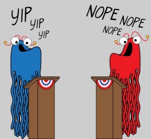
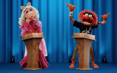
Perfect. And topical, since we’re bound to see this exact scene later this year. I know I’ll be voting for the one on the left. The other Martian obviously opposes gay marriage.
My rating: 5
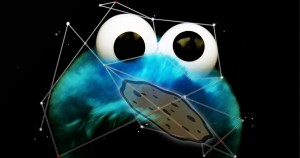
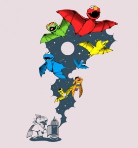
I’m not entirely sure what’s happening here. Is the Cookie Monster constellation trying to eat a cookie that’s trapped in the Phantom Zone? I think I’d like it even more if that’s what was really going on in this picture.
My rating: 2
Like I said earlier, I’m done with this “minimalist art” craze. It’s the lazy artist’s way to depict characters they can’t draw. At least this one has the added benefit of symmetry. Zoe looks like just an orange rectangle, and Bert looks like he’s naked, so even for minimalist art, this piece needs details.
My rating: 2
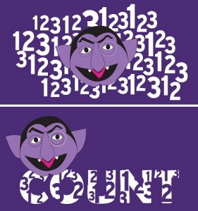
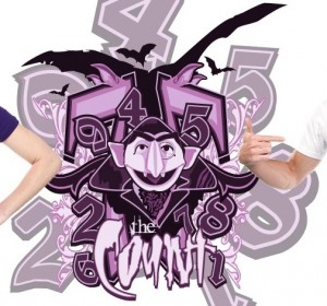
Here’s two very similar submissions from the same artist. Why they chose to do two baffles me. The Count’s head is exactly the same, there’s a bunch of numbers, and there’s an over abundance of purple. And neither of them are particularly good.
My rating: 2
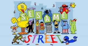
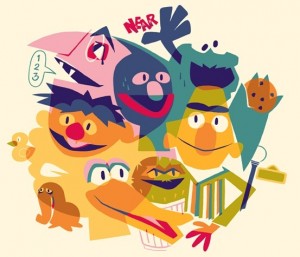
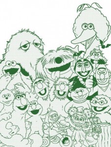
The best Sesame Street character drawings aren’t the ones that replicate the way they look perfectly, they’re the ones that manage to accentuate their personality traits. Bert’s curmudgeon-ness, Herry’s strength, the Honker’s, uh.. standing around. Anyway, this artist got it all so very, very right.
My rating: 5
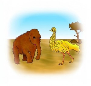
It always seemed pretty obvious that Snuffleupaguses were just modernized, long-eyelashed wooly mammoths. So de-evolving him to this form makes sense. But add in the emu-like Big Bird, and I’m suddenly intrigued. I wonder what the other Sesame characters would’ve been like. Just imagine a primate Grover, a Rosita pterodactyl, or a Telly sloth. Of course, we already know what Bert and Ernie would be like in caveman days.
My rating: 4
Oh, hey Kermit. Glad you could stop by. Does Disney know you’re here? No?? Well, hide here in this mediocre t-shirt design. They’ll never find you!
My rating: 2
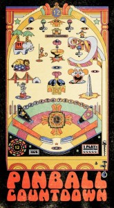
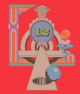
There have been some great Pinball Number Count t-shirts in this contest, but this is the most elaborate, showing as much of the pinball board as a t-shirt will allow. Not only do I need to own this shirt, but I need to own a replication of the pinball game too.
My rating: 5
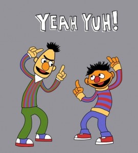
Cartoony versions of Bert and Ernie having fun? Context be damned, I love this design. Yeah yuh, I do!
My rating: 5
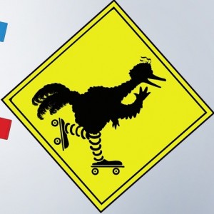
Forget the street sign parody, I’d happily take a picture of a roller skating Big Bird. It’s one of those little details about him that is so unique to the character, but mostly missing from merchandise. I say we get a roller skating Big Bird shirt, and we get it now! Who’s with me?!
My rating: 4
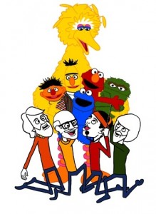
Fantastic. I mean, it’s easy to love a design with a respectful homage to the Muppeteers. It doesn’t hurt that the design itself is pretty fun. I especially like the fact that the puppets look just like the real ones, while the puppeteers are caricatured versions of themselves. It’d oddly appropriate.
My rating: 5
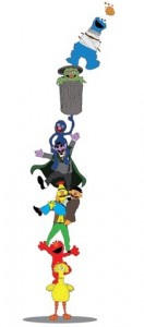
Oh boy, I’m gonna have fun complaining about this one! Starting at the bottom: Big Bird is WAY off model, Elmo is huge, Ernie looks creepy with a human-proportioned body, Bert has bright orange hair, The Count looks like he’s wearing sunglasses, there’s no way Grover can balance Oscar’s can on one finger, and why the eff is Cookie Monster in a straight jacket??? Oscar’s okay, I guess.
My rating: 1
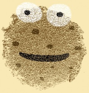
I don’t have very much artistic talent, but I do like drawing Cookie Monster. He’s hard to get wrong: Just draw a blue blog with googly eyes. If you’re drawing a picture of him as a cookie, the blue fur gets lost, but then there’s only one other thing you can screw up: The googly eyes!!! Without them, you’re just an anthropomorphic biscuit without any ties to the Sesame Street franchise.
My rating: 1
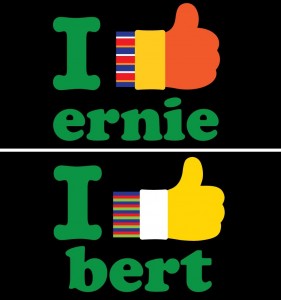
I normally haven’t been digging designs of this simplistic nature in this contest, but these piece look great to me. Maybe it’s the retro font, or the fact that they obviously put some thought into the characters’ hands rather than just replacing the colors in one to make the other. And the fact of the matter is, I really do like Ernie and Bert! Thumbs up, gang!
My rating: 4
I wonder if non-Sesame fans would have any idea what this is. Slimey isn’t the most recognizable character on the Street, and the layout of the design keeps the images looking too small to be identifiable. Still, I totally support the idea of a Slimey Yoga interstitial on Sesame Street.
My rating: 3
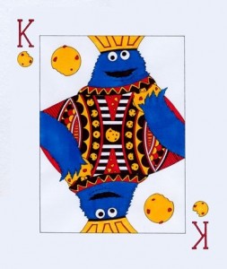
Compared to the last “playing card” design, this one is great, if only for the sense of symmetry. But Cookie Monster does not look good with that thick head. I’m also getting mixed references. Are we playing with the idea that he’s a king? Or that he has something to do with playing cards? Stick to one spoof, or justify having them all in one picture.
My rating: 2
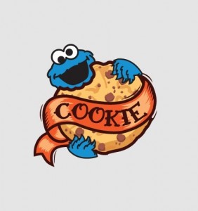
If I was the type to get a tattoo… well, it probably wouldn’t be this one. But I’d definitely consider it for tattoo #2 or 3.
My rating: 3
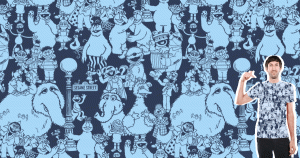
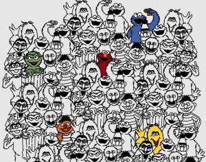
I’m torn. On the one hand, this is a cool design, and it looks better when it completely covers the shirt. I also like how the repetition is so seamless. But on the other hand, I’d much rather see a bigger tableau than the same block of characters over and over again. It makes the pattern look like it would fit a bed sheet better than a t-shirt. Now that I would buy.
My rating: 4
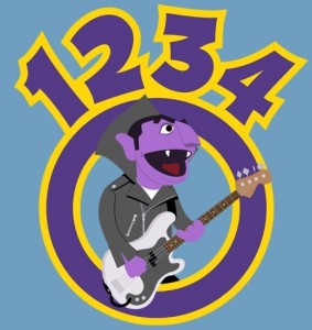
This t-shirt works a lot better if you shout it. And then rock it. And then count it.
My rating: 4
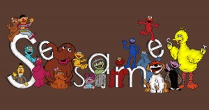
Nice design, but it looks like it’s made up of pre-existing stock art. And while it makes the characters look great together, that’s sort of the idea behind having stock art in the first place. The layout makes me think of the Sesame Street Google logo. That thing was awesome. What were we talking about again?
My rating: 3
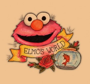
I suppose it’s only a matter of time before one of the young Elmo’s World viewers grows up to get this tattoo. Or possibly Mr. Noodle. He owes a lot to the little red guy and his fish!
My rating: 3
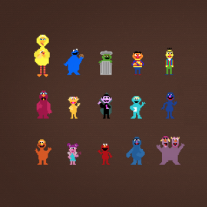
There’s a little too much empty space here to make this a great t-shirt, but as a child of the 8-bit generation, I love the character designs. Especially the Two-Headed Monster. I want to make him jump on some Goombahs and save a princess.
My rating: 4
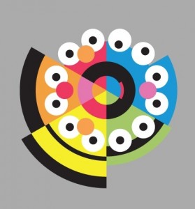
Now this is minimalist done right. The characters are all instantly recognizable, there’s a great sense of symmetry and flow, and the geometry makes me dizzy. In a good way.
My rating: 5
The late, great Paul Benedict surely deserves to be immortalized in t-shirt form. Though I’m not sure most people would get the Mad Painter reference. Then again, I’m not sure I care about people who don’t remember the Mad Painter.
My rating: 4
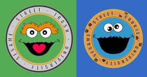 Oscar Green Varsity Team / Cookie Monster Blue Varsity Team
I love the idea of an Oscar or Cookie Monster university (much like Grover’s), but they don’t really look enough like college logos to be instantly recognizable as such. You’d have to get pretty close to read the text, and I don’t like strangers all that much. I’d like these a lot more if they were parodying an existing college logo. The way they are, they’re just way too dull with not enough payoff.
My rating: 2
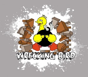
And that was how Big Bird single-handedly destroyed 123 Sesame Street. And managed to mangle half of the bones in his body.
My rating: 2
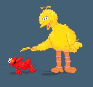
I had no idea that all it took was a single feather to convince Elmo to show off his breakdancing skillz!
My rating: 3
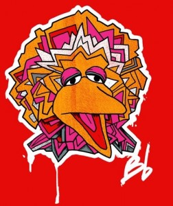
I know how you feel, Big Bird. I get pretty sleepy when I turn into graffiti too. *Yawwwn*
My rating: 3
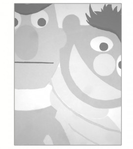
Here’s another one of my favorite designs. There’s something delightfully 1950s about it, and the overlapping colors works beautifully. Just look at how Bert’s hair doubles as Cookie Monster’s mouth! This is what I want to dream about every time I fall asleep.
My rating: 5
Another great Pinball Number Count homage! I don’t even care that so many artists had the same idea in this contest. I want to buy them all.
My rating: 5
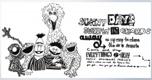
The simple black-and-white sketch of this piece reminds me of the old TV Guide advertisements for some reason. Unfortunately, I don’t think the style is quite up to code. I actually like the text half of the image a lot more than the characters. Can I get a t-shirt of just that?
My rating: 2
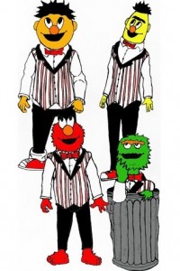
Okay, I can do this. Elmo is the tenor, Oscar is the baritone, Ernie sings lead, and Bert is the bass. Am I right?? Guys? I guess I’m not as interesting as whatever it is they’re looking at on the ceiling.
My rating: 1
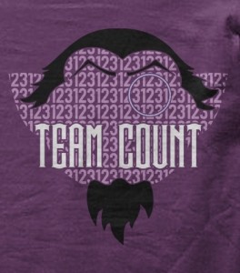
The words “Team Count” suggest that this is a Twilight parody, but it doesn’t look like much of one to me. (Then again, I don’t really know much about the Twilight world. Maybe someone can prove me wrong?) Beyond all that, this is some solid design work, with the numbers filling The Count’s head. Just like in real life, if you think about it.
My rating: 3
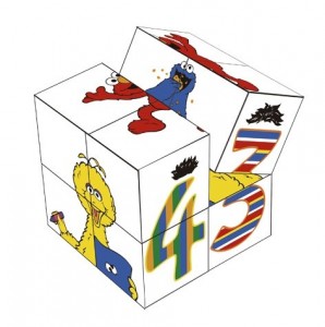
I used to love those cube toys. And this is some solid design work, with some believable 3-D rendering. It’s a little kiddie for this contest, and it would definitely make for a better cube toy than a t-shirt, as this artist has proven.
My rating: 3
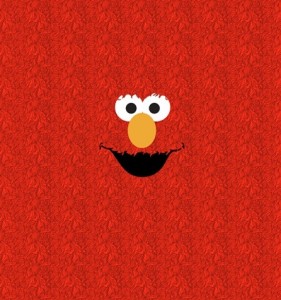
Elmo’s eyes perch on top of his head, not in the middle of his face. So it’s a little odd to see his fur brushing over his eyes, Justin Bieber-style. The fur is really the only thing separating this from the Elmo head t-shirts already available everywhere, and I’m not sure it’s enough to make this design stand out.
My rating: 2
People seem to love those Sesame shirts with the giant character faces on them, so why not start going for the more obscure characters? I know I’d proudly wear Frazzle’s face on my torso. Wouldn’t anyone?
My rating: 5
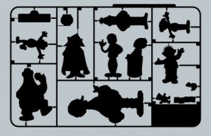
Here’s another example of a t-shirt design that would work much better as the product it’s supposed to look like. Now I just want to play with some cheap plastic Sesame Street figures, with little sharp edges where they were connected to the frame.
My rating: 3
Oh man, yes. This makes for a fantastic t-shirt design. And comic strip. And poster. And mug. And banana koozie.
My rating: 5
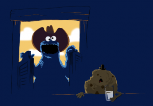
This is like an alternate beginning to The Great Cookie Thief. Now we know why everyone in that old west town was so concerned about the missing cookies. They weren’t stole, they were murdered!!!
My rating: 5
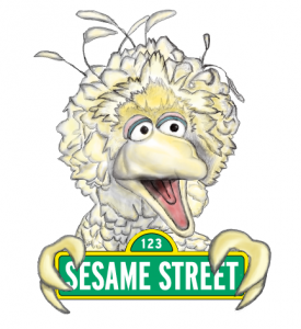
I’m so glad Big Bird’s hands don’t really look like that, or else they would probably fill my nightmares with visions of lightly colored claws tearing at my eyes and teaching me the alphabet.
My rating: 2
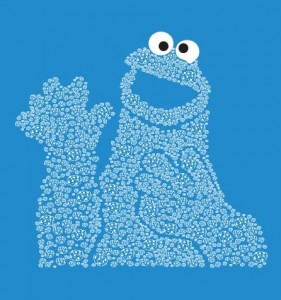
Didn’t we already see one or two of these already? Or more? I can’t even keep track. I have lost all my appetite for cookies. Okay, maybe just one.
My rating: 2
Hey, it’s more stock Sesame Street art! I’m pretty sure each of these character drawings came directly from a coloring book. Available in stores! Go buy it! And not the t-shirt!
My rating: 1
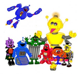 Sesame Street – “The Next Generation”
There’s actually a lot of potential in this idea. Oscar is a recycling machine, The Count is a giant calculator, and Rubber Duckie has a built-in GPS. My favorite is the Frankenstein-looking Bert robot, mostly because it gave me the opportunity to type the phrase “Frankenstein-looking Bert robot”.
My rating: 4
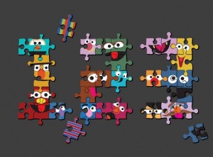
I’m tired of people just slapping faces onto puzzle pieces. But I’m real happy to see Don Music and Forgetful Jones included in there. So I guess they can’t all be losers.
My rating: 2
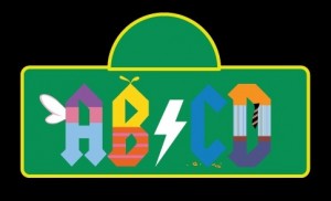
A is for Abby Cadabby, B is for Big Bird, C is for Cookie Monster, and D is for Dat Guy With the Tie and Pants. Some research tells me that D is for Don Music, but come on. Not only is Don a terrible character to try to minimalize, but he’s unrecognizable without his glasses, unkempt hair, and piano.
My rating: 2
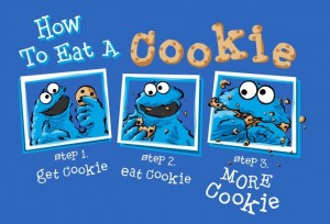
Cute concept. I like how the artist turned cookie eating into a three-part comic strip. Also, I feel like I learned something today.
My rating: 4
I’m not sure why there are so many “Hipster” versions of Sesame Street characters in this contest, but I think this is the only one that really works. And it’s all because of the beard. The Count was a hipster this entire time, and we had no idea!
My rating: 4
Yep, this needs to be a thing. It’s about time we raise awareness of The Amazing Mumford, and we can start with a kickass t-shirt design. Do it for the children.
My rating: 5
I wonder why The Count has such trouble staying inside the lines. Okay, it’s probably pretty obvious what’s distracting him. But this is a great idea that lends itself well to stock artwork. I’ll allow it.
My rating: 3
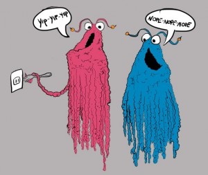
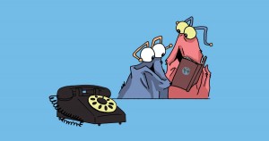 Yip Yips Discover the Telephone
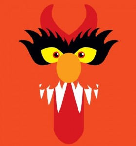
Don’t feel bad, Martians. Most people wouldn’t recognize a rotary phone these days either.
My rating: 5
This is a nice one, but it’s pretty similar to so many other designs in this contest. I can’t hate on it for that, but it’s definitely keeping me from getting excited about it.
My rating: 3
I think I see what the artist was going for, but the end result comes across as bland and hard to see. That’s not exactly what Bert and Ernie represent, is it??
My rating: 2
Circles! Faces! I’m falling asleep!
My rating: 1
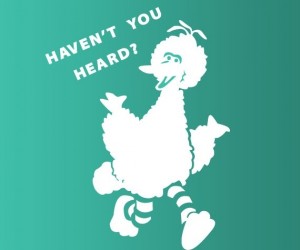 Everybody’s Heard About the Bird!
I kinda like this style for Big Bird, but the “Haven’t You Heard?” text seems out of place. Yes, I’ve heard of Big Bird. He taught me how to read, and then he asked me a ridiculous hypothetical question.
My rating: 3
Amazing, this artist managed to replicated Jack Davis‘s style almost perfectly. And if anyone needed their work put on more t-shirts and stuff, it’s Davis.
My rating: 5
It’s about time Oscar upgraded. I’m not talking about the dumpster, I mean those kickin’ shades. What a cool dude.
My rating: 3
This is an interesting mix of interesting and sloppy. The pattern is seamless, and I like that only one of each character is in color. But the designs are somewhere in between stock images and poorly drawn imitations. Of course, I’m leaning more toward the “sloppy” end. And I hope to never repeat that statement in my life.
My rating: 1
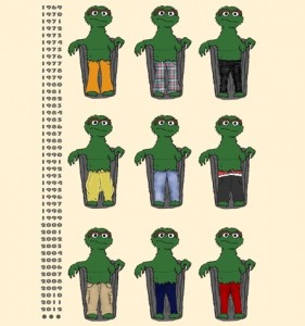
This is hilarious. I always wondered what Oscar had on under there. Actually, I didn’t. But now I wish I had. I also want those plaid pants in the top row.
My rating: 3
Is it so easy to forget that even though adults would be buying these t-shirts, they’re still depicting characters from a kid’s TV show? I don’t think Sesame Workshop would approve of a shirt with one of their characters about to put a fork into an outlet. Call it a hunch.
My rating: 4
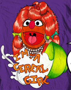
I love love love designs that are based off of one sketch or song. And “Cereal Girl” was a pretty big deal for a parody way back when, and it’s mostly forgotten today. It’s about time we bring it back! Ammiright??
My rating: 4
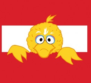
In case you were wondering what it would look like for Big Bird to cut a rectangular hole in your chest, then peek out like the baby alien out of Ripley’s stomach, then you should totally get this shirt.
My rating: 4
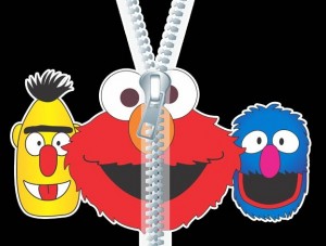
Let’s try and look beyond the fake zipper (which is difficult enough), and I’m thrown off by the mix of the copy-and-pasted Elmo head with the crudely drawn Bert and Grover. I’m not entirely sure what the thesis statement is. Is there a reason we’d want to see Elmo’s head unzip down the middle? Beside the obvious, of course.
My rating: 2
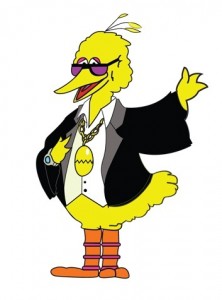
So 43 seasons of a children’s television show, and suddenly Big Bird is a pimp? Or a record executive? Your choice.
My rating: 3
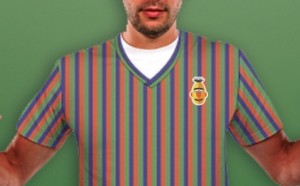
I admit, I really would want a Bert-striped sweater like this, but I can’t imagine it looking nearly as good printed on a t-shirt. And the Bert head just takes away from the entire thing, sort of like the old Sesame Street Halloween costumes with the characters’ names on the chest, as if you had no idea who the blue monster with the googly eyes was supposed to be.
My rating: 2
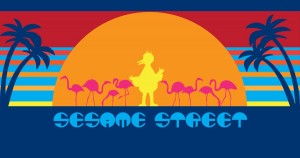
I had family that lived in southern Florida in the 1980s, so I saw a lot of t-shirts with similar designs. Adding a little Big Bird to it (or anything, really) instantly makes it cooler.
My rating: 4
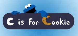 “C” is for Cookie! (Om Nom Nom!)
Oh that sneaky Cookie Monster! He’s stealing the cookie from the sign! Which… he already took a bite out of. So he started the cookie, left it on the sign, and then took it back…? I’ll never truly understand his dietary habits.
My rating: 4
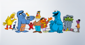
Is it safe to say that the characters, from biggest to smallest, are in the order of current popularity? I bet that’s true, and it makes me love/pity Bert all the more.
My rating: 4
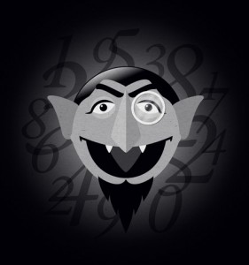
Wow, people really do like taking a picture of The Count looking straight on, and filling the rest of the space with numbers! That guy really needs another personality trait. He’s starting to be typecast.
My rating: 4
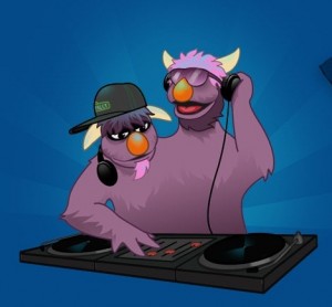
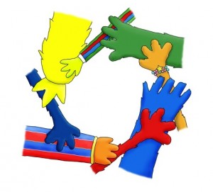
Talk about modernizing Sesame Street characters! I could totally see the show doing something like this today to teach cooperation. And hip hop. And ethics surrounding music sampling.
My rating: 5
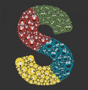 Brought to You by the Letter ‘S’
I’m glad this artist didn’t try and fill the entire image with the same character face. That’s been done enough in this contest. Using four characters, with different sizes and colors, really makes this piece stand out. It’s all very deliberate and clean, and I feel like I should hate it, but I don’t. So that’s worth something.
My rating: 4
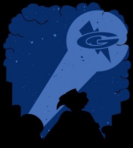
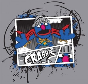
I’m not sure where Super Grover 2.0 is supposed to be, but I like to think that he just crashed through some unsuspecting victim’s apartment wall, and now has to leave to answer the Super Grover signal without exchanging insurance information.
My rating: 4
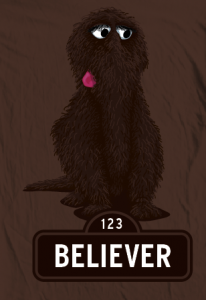
Poor Snuffy. Almost 30 years of no longer being “imaginary” and that’s still one of the most known things about him. Still, there’s a real sense of pride for those of us who remember believing in Snuffy before the Sesame Street adults. So why not wear your belief with pride on your t-shirt?
My rating: 4
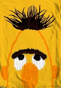
This is another interesting take on the Giant Sesame Character Face t-shirts. I like the squiggly-lined Bert, but isn’t it a little unsettling to have him constantly staring at your chest?? I’d say “My eyes are up here”, but I don’t think he can look any higher.
My rating: 3
Creepy! And I like the creepiness of it all. There’s something oddly satisfying about The Count acting villainous, as if it was in his nature all along. It’s like he’s finally tired of the lonesomeness of immortality, and has converted his Sesame pals into vampires, with the unfortunate side effect of mind control. I’ve obviously put a lot of thought into this.
My rating: 4
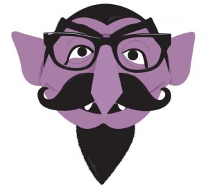
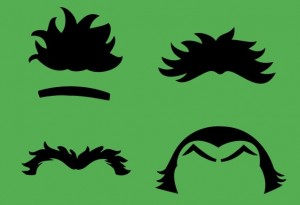
I know, this is supposed to be four sets of hair and eyebrows, but all I see is Bert and Ernie with killer ’70s mustaches. And now you can’t unsee it!
My rating: 2
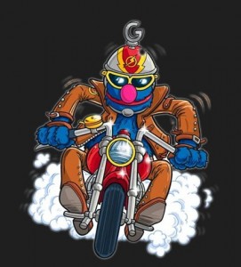
I’m so glad Grover Knover has the chance to be immortalized on a t-shirt like this. Or whoever Grover’s “Easy Rider” counterpart is, I guess.
My rating: 3
Why hasn’t anyone ever printed a Super Grover comic book?? As evidenced by this piece, it’s obviously a natural for the medium. I know I’d buy a copy! And then polybag it, board it, and safely store it away so it might be worth something in 20 years.
My rating: 5
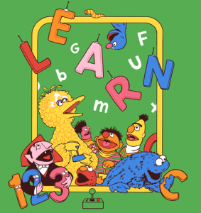
The flying remote controlled letters are odd, but this piece makes it work. The amazement on all the characters’ faces is priceless, and the whole landscape is fun and colorful. This design might skew a little younger than the rest, but it’s still pretty great.
My rating: 4
I’m always happy when artists remember that Cookie Monster has five fingers. My joy stems from the details.
My rating: 3
Thanks for reading, folks! Stay tuned for the final batch of t-shirt entries, coming very soon!
Click here to rock your own ’70s mustache on the ToughPigs forum!
by Joe Hennes – Joe@ToughPigs.com
