Part 1 – Part 2 – Part 3 – Part 4 – Part 5 – Part 6
Last year, t-shirt companies Threadless and Mighty Fine both held contests asking people to submit designs for Muppet-themed shirts. The entries would be voted on, and the winners would get to see their design on a piece of official Muppet merchandise (among other prizes). And because we’re suckers for great (and not-so-great) Muppet fan art, we painstakingly reviewed every single design. It wasn’t easy, but it sure made for good readin’.
Threadless has once again deemed the Muppets worthy of another contest, but this time they’re focusing on the Sesame Street family. As of this writing, there are over 260 entries, so we’ll be tackling them with some reviews a bunch at a time. With a little luck, we’ll get them all online before the contest ends! (Click here for contest and entry rules.)
Just like last year, I’ll be talking up (or down) each of the entries. Apologies in advance if I end up dissing your design. These are just my opinions, and everyone is allowed and encouraged to disagree with me. Some notes about how I vote: I love originality in theme and design. Catering to my “Muppet Fanatic” side will get you bonus points. I generally despise the theft of others’ ideas and when I can blatantly tell where you took an image from. Also, my ratings hardly matter.
So let’s get to it! Remember to click on the images to embiggen, and then click on the links below to cast your own vote!
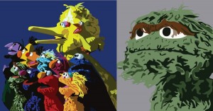
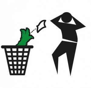
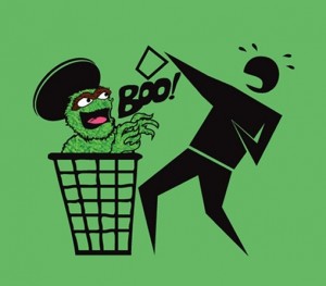
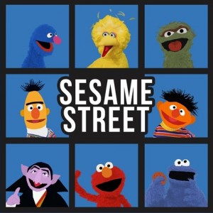
These two entries were made by the same person, so I bunched them together. They’re also the ones that helped kick off this contest, and already I’m torn. One of my biggest rules is that the stealing of images is wrong and should be punished. And both of these pictures are stock photos of the Sesame gang and Oscar, with just a little Photoshop filtering. But I’ll be damned if they didn’t come out looking good. I’d buy a t-shirt of either of these designs. Still, it’s getting a low rating from me, if only because it takes away from some of the talented and creative artists we’ll be seeing later in this contest.
My rating: 2
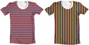
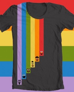
The Sesame references are subtle in these designs, which is exactly what I love about them. Ideally, I’d rather have an actual Bert or Ernie striped shirt, rather than a t-shirt with striped screen printed onto the front. Also, I’d want the Bert shirt to come with a pair of saddle shoes. It just wouldn’t work without them.
My rating: 3
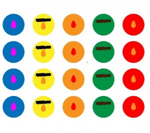
Right foot Elmo? The Twister motif gets a little lost here, but we can ignore the design titles in this contest since no one will know the titles when they see you wearing the shirt. I want to say this is a cute idea, but the end result is a little dull. Then again, I can see a set of coasters like this. Can someone at Sesame licensing get on that??
My rating: 3
Wait, Oscar is throwing trash away?? This design loses points for inaccuracies!!! Except that it doesn’t, because I think it’s hilarious.
My rating: 4
Strangely enough, this design was entered by someone different from the one above. Coincidence?? Or a sneaky move by a desperate artist? In any case, I don’t like it as much as the previous one. It’s a lot less subtle, and nobody thinks of Oscar as being scary. He’s a grouch, not a monster!
My rating: 3
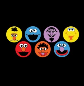
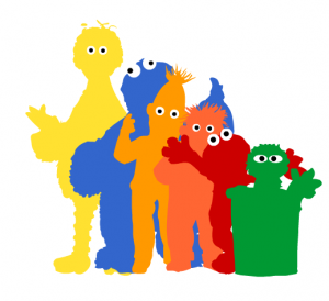
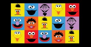
In the other contests, we ended up with a lot of designs that featured stock sketches of the characters’ faces in simple rainbow patterns. We’re bound to get a bunch of them again, and this is the first of many. The Sesame gang does lend itself to rainbow colors a little more than the Muppets (as seen here, in reverse ROYGBIV), but it still feels a little uninspired, despite the cute factor.
My rating: 2
Someone Photoshopped a picture of Snuffy, entered it into a design contest which often has professional artists as participants, and assumed it could be in the running to win. This is a thing that has happened, folks.
My rating: 1
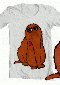
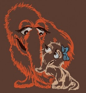
And then you get a Snuffy picture that just melts your heart! Now I feel like a jerk for mocking the last one. But maybe I can get over it by thinking of this design as an Alice shirt. Yeah, that worked. Go Alice!
My rating: 4
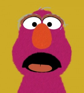
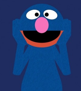
Here’s another duo from the same artist. And while I love Grover’s expression, as well as the idea of a Telly shirt, there’s one thing that would make these designs amazing, but won’t happen: Texture! You can see the grains of fur drawn into the faces, and they’d be double awesome if they could actually be made to be fuzzy. Unfortunately, I doubt that’s in Threadless’ budget, so these will go down as just “pretty good character heads”.
My rating: 3
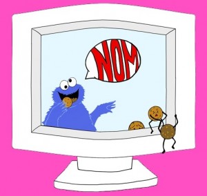
The “Cookie Monster deletes cookies” joke has been done to death. And then done some more to reanimate its corpse. And then killed once again. This one gets a bonus point for the poor cookies trying to escape certain doom, but then loses it again because I thought that was a TV at first. Nom indeed.
My rating: 2
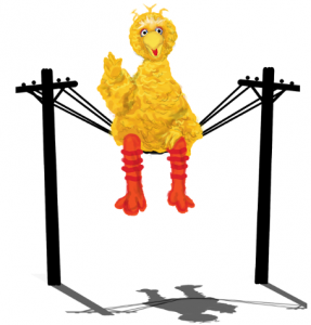
This might be our very first contender! It’s a little too simple to win, but it’s the best design yet. It’s funny, it has a great rendition of Big Bird, and the design work is unique (just look at that shadow). Though if you think about it too long, you’ll notice that those telephone poles are only about 9′ high.
My rating: 5
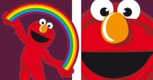 Life in Technicolor / Say Elmo
This artist made one picture, then zoomed in to make the second. Since he spent so little time on image #2, I thought I’d do the same with my review. The rainbow picture is pretty cute, and would probably work well as a kid’s shirt. But in the end, it’s pretty forgettable. The closeup, even moreso. See? You’ve forgotten it already!
My rating: 2
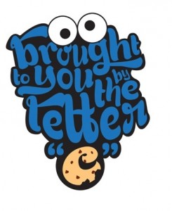
I love a design that only hints at the Sesame Street characters and concepts without actually infringing on any copyrighted material. This blob of letters and eyeballs would make a really fun and recognizable t-shirt. And I can envision a sequel with The Count and the number sponsor, or Murray and the Word of the Day, or Mumford and the daily dark magic incantation.
My rating: 5
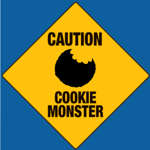
Ever wonder how the deer know to cross at the “Deer Crossing” sign?? I’m thinking the same thing here. Cookie Monster is notorious for showing up wherever cookies may be, so what sort of warning could the sign provide? Unless people are instructed to only eat their cookies near the sign. Or if there are signs everywhere.
My rating: 2
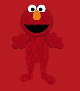
Here’s another one that would benefit from being fuzzy, rather than screen printed. The 3-D effect could make it look like Elmo is really reaching out to you, or Cookie Monster is really handing you two cookies. And really, isn’t the flawed logic of the latter the reason why that design would never work??
My rating: 3
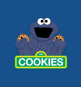
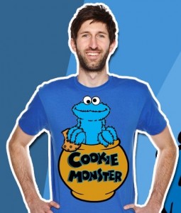
Oh boy, it’s a t-shirt based on everyone’s favorite Sesame Street character, the Monster Cookie! Nothing terrifying about that guy at all. Kids love him, parents want to be him. Oh, and Cookie Monster is in there somewhere too.
My rating: 3
We don’t really get to see the dejected, melancholic Bert very often. Maybe he’s sad because his unibrow has been dyed orange. Or, more likely, he’s upset at being included in a dull, lazy t-shirt design.
My rating: 1
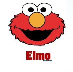
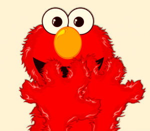
Yep, that’s Elmo from Sesame Street alright. My favorite part about this one is that the designer didn’t even bother to remove Sesame Workshop’s copyright. There’s something admirable about someone being so proud of their image theft. But then again, there really isn’t.
My rating: 1
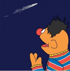
Oh, this is just lovely. It’s based on Ernie’s Daytime Emmy-nominated song “I Wonder“, but it’s also reminiscent of “I Don’t Want to Live on the Moon” (aka, That Song That Makes You Cry), enough so that both fans of the current show and the classic episodes would get something out of it. It’s also an interesting angle on Ernie that we don’t see very often, and it really shows that sense of wonder on his face. This design really speaks to me, so I’m giving it a high rating. So there.
My rating: 5
So, the Sesame Street name is the “Alice”? I guess that makes as much sense as The Count as the “Cindy”.
My rating: 2
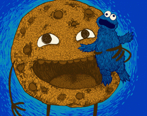
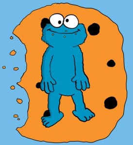
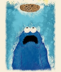
Okay, so one of two things is happening here. Either Cookie Monster has found a giant cookie, which doubles as lunch and a bed, or Cookie Monster has shrunk down to the size of a cookie, allowing him to enjoy his tininess in a way only he can. If it’s the latter, then I hope nobody passing by thinks he’s just a dollop of blue frosting and decides to have a little snack.
My rating: 3
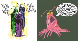 Yip Yip Yip Yip Yip… / A Little Yip
This artist managed to create two Yip Yip t-shirts in two totally different styles. The first one, based off a stock photo, makes for the better t-shirt design, but the second one is an original sketch. It does look a little strange with the tentacles splayed out like that, as if it was a squid rather than a floating space alien. Uh huh, uh huh.
My rating: 3
Wow, what a great idea for a shirt! Too bad it already exists.
My rating: 2
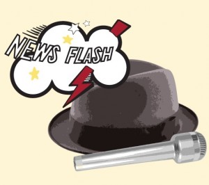
Confession: I own a bootleg “Sesame Street News Flash” t-shirt, and it is amazing and there’s no reason why it doesn’t officially exist. That said, this is a nice variation on the theme, with the hat and microphone standing in for Kermit (who can’t be included in this contest due to the fact that he’s owned by Disney). Still, the design would work a bit better without them, and I can prove it. Bootleggedly.
My rating: 4
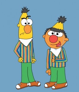 Imitation is the Sincerest Form of Flattery
Is it just me, or is there something genuinely “Troy and Abed”-esque about this one? In any case, this design is hilarious. Everyone should dress like Bert once in a while. Or at least make a Bert’s Head party hat.
My rating: 4
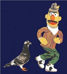
Y’know, I would buy the hell out of a shirt that has this picture of Bert on it. That hat, the saddle shoes, the awkward dancing position. It’s just gold. The pigeon adds exactly nothing, but I’d sacrifice that much to own this shirt.
My rating: 4
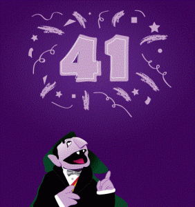
This would’ve made for a great shirt… two years ago. Or for someone celebrating that “41st birthday” milestone. Even if Sesame wasn’t entering their 43rd season this year, it’s the kind of design that would only work for a year. Then it’s outdated, obsolete, and relegated to the bottom of a t-shirt drawer.
My rating: 1
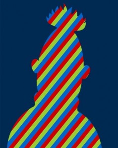
I can only assume that this artist wanted to mimic the stripes of Bert’s shirt, but I’m thrown as to why they would’ve made them diagonal, rather than vertical. I actually would’ve liked to see that, possibly next to an Ernie silhouette with horizontal stripes. Opportunity: Missed.
My rating: 2
I know this is supposed to be a picture of Elmo covering his mouth as he laughs, but all I see is Elmo trying to block his face from the paparazzi. “Elmo said no pictures, you TMZ vultures!!”
My rating: 2
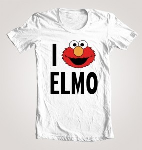
This t-shirt technically says, “I Elmo Elmo”. And if Elmo was reading it, he’d say, “Elmo Elmo Elmo”. Think about that, folks.
My rating: 1
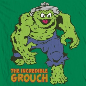
This really is incredible. And topical! (The Avengers: In theaters May 4!) I wonder how Oscar keeps that trash can lid on his head as he rampages through the city…
My rating: 5
 Terrorizing the Waters of Sesame
I totally dig the Jaws pastiche, but I really love the use of watercolors in this image. It could’ve been a pretty simple design, but the style really makes it pop. And now I’m doubly afraid to go in the water.
My rating: 5
Aw, this is cute. It’s a great use of the characters, with a style that suggests the Sesame house style. If anything, it’s a little too similar to the Sesame style, which will probably keep it from standing out against the artsier entries in this contest. But I love it anyway.
My rating: 5
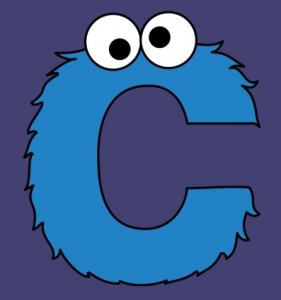
Here’s the first entry by ToughPigs’ own Mike Boon, the chap responsible for the Muppet and Sesame Street alphabet posters. In that vein, he’s taken “C is for Cookie” literally. And fuzzily.
My rating: Withheld, since we know the artist personally.
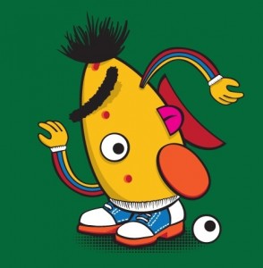
Bert got Picasso-ized! This is a really cute idea, and I guess Bert lends himself to being Potato Headed more than most characters. Still, the end result isn’t actually attractive. The red dots look like acne at first glance, and the eyeball on the ground is a little disturbing. Still, A for effort.
My rating: 4
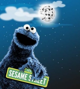
What if the moon was a cookie? Well, Cookie Monster probably wouldn’t be wasting time holding a Sesame Street sign, he’d be fashioning his own Tower of Babel to get up there and destroy the earth’s tides.
My rating: 2
This design looks like it could be a pre-existing Sesame design, stolen by the artist for this contest. But for the life of me, I can’t find any proof of that claim. So either they managed to take a rarely-used design, or they mimicked the Sesame house style so well, it fooled me. I suppose we’ll have to assume the latter, which makes it a decent design, but hardly a contender in the contest. But really, I’m just bitter about the possibility of being “fooled”.
My rating: 3
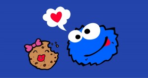
Aww, Cookie Monster’s in love! And then he took a bite out of his ladyfriend’s cranium. If that doesn’t mean true love, I don’t know what does.
My rating: 3
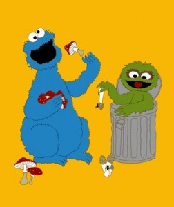
Huh. Cookie Monster and Oscar, eating mushrooms. That’s a possibility for a thing you could wear on a t-shirt someday. It’s also a great lesson for kids: Feel free to eat stuff you find on the ground! Especially strange fungi!
My rating: 1
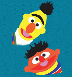
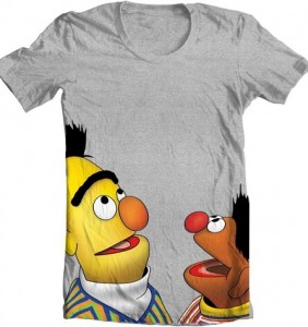
Bert looks a little better than Ernie here, but even if they both looked pristine, they still wouldn’t be good enough for this contest. Smilin’ buddies may be heartwarming, but they’re not contest winners. Sorry bros.
My rating: 2
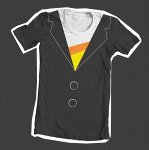
This is a nice twist on the “tuxedo shirt” idea, and a subtle nod to The Count’s outfit. Unfortunately for this artist, I cheated and looked ahead in the contest, and I found a much better variation on this idea. So although this one came first, it’s still only number 2. Ah ah ah.
My rating: 3
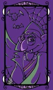
I usually dig pictures of The Count that showcase his vampirism, reminding us that a murderous beast lives on Sesame Street. This is a nice nod toward that side of The Count without going overboard with the fangs and blood and screaming villagers.
My rating: 4
Wow, Bert and Ernie are really excited to see your nipples!
My rating: 2
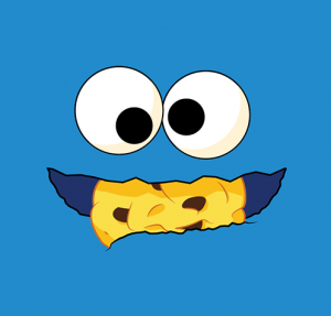
The longer I stare at this picture, the stranger it seems that Cookie Monster is just holding that cookie in between his lips. It’s rare that we’d see a picture of him eating a cookie when the cookie isn’t blurred by the motion of being thrown into his mouth and crumbled into tiny flying pieces.
My rating: 2
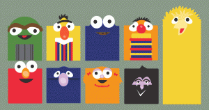
This artist made a few variations on his design, including one without the eyes, and that probably would’ve been preferable to this one, since OH GOD THEY’RE STARING AT ME MAKE THEM STOP!!!
My rating: 3
Hey, more creepy eyes! I’m not sure what this artist was going for, since he uses the rectangular bodies, but the designs of the characters are supposed to be thinner (look at Bert and Ernie’s shirts). It’s a strange use of space, and a lack of dedication to the design. If it was planned out better, it might’ve made up for the strangeness of seeing square Muppets.
My rating: 2
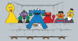
So Cookie Monster is Jesus? Yeah, okay. I can see that. I would’ve liked to have gotten more out of this idea, with all of the disciples and their Muppet counterparts, in their “Last Supper” positions. Elmo can even be Judas.
My rating: 2
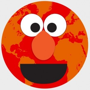
And the seas shall boil with the blood of Elmo!
My rating: 3
I have nothing new to say. Because neither did the artist.
My rating: 1
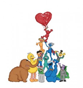
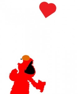
This is a nice, simple Elmo design. I imagine the heart will go over the t-shirt wearer’s heart, and Elmo will be dancing along the ribcage. Where he belongs!!! (Nope, I had no idea what I meant by that.)
My rating: 3
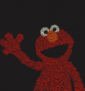
Elmo is full of tinier Elmos! We have reached critical mass, folks.
My rating: 3
Head back here soon for part two of our Threadless Sesame Street T-shirt Design Contest coverage!
Click here to make the creepy eyes stop staring on the ToughPigs forum!
by Joe Hennes – Joe@ToughPigs.com
