Part 1 – Part 2 – Part 3 – Part 4
All of the entries to the Threadless Fraggle Rock T-shirt Design contest are now in, and it looks like we have over 200 entries! That means a lot for us to review, but it also means you have a lot to rate. Head over to Threadless to cast your votes before the polls close on Monday, May 20.
If you need some help deciding what you like and don’t like, read part 1 of our Threadless contest coverage, then part 2 below, and parts 3 and 4 to come soon!
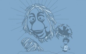
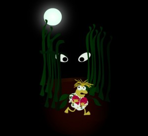
I can’t be the only one who feels a little freaked out every time Junior Gorg grabs Gobo in the intro to Fraggle Rock, which is why I like this design, which perfectly captures that moment of impending fear and the potential death of a beloved character. I’m actually not sure why I have such a positive reaction to it, but if I had to wager a guess, it has something to do with Junior’s god-like halo.
My rating: 4
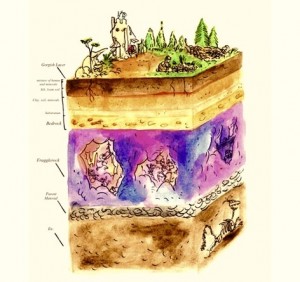
The overarching question of the series for a lot of us has been: Where is Fraggle Rock? We always assumed it was an underground cave, accessible by a hole in Doc’s workshop wall, but then it turned out to have a much more metaphysical answer. The questions and philosophies vary from viewer to viewer, but this design takes it in the opposite direction, reminding us where the Rock was originally located. So far underground, only your hipster friends have heard of it.
My rating: 4
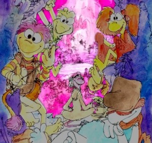
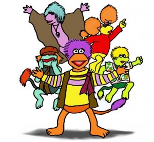
Here’s a lovely rendition of the Fraggles, which, according to the artist, was inspired by Michael Frith’s original sketches. So that gets geek points off the bat. Geek points are also awarded for the mess of Fraggles hidden in the background. My only real complaint is that the colors seems a little dark, making the background pop more than the characters in front of our faces.
My rating: 4
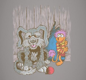
Gobo must constantly be brainstorming ideas to distract Sprocket so he can sneak into the workshop and get the latest postcard from his Uncle Traveling Matt. I guess his strategy here is to have Sprocket say hello to the audience. That’s the only reason I can think of to explain why he’s just staring blankly at us, as well as why Gobo is just standing around grinning like an idiot. Nice drawing, but way too lifeless.
My rating: 3
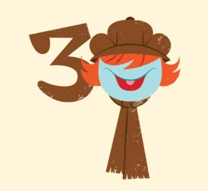
One thing that some of these artists aren’t considering is that a year from now, Fraggle Rock’s 30th anniversary will be over. At that point, Threadless will still be selling the shirts, but won’t care nearly as much about any of them with a “30” on it. I dig this variation on Boober, but I’d rather see a Wembley or a Doozer or a pile of laundry next to him rather than a number 3.
My rating: 3
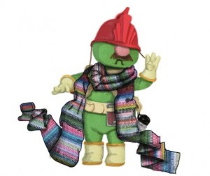
Remember what I said about loving obscure references? Here’s one from the episode, “The Great Radish Famine“, when the Doozers give up building in favor of knitting. And they hate it with a tiny, burning passion. As a bonus, this image can be color-corrected to be a Doctor Who reference. The geek market will be cornered!
My rating: 4
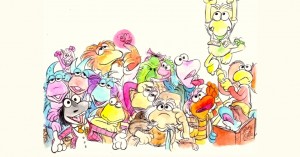
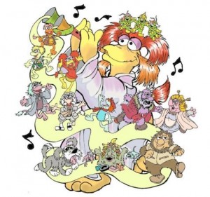
This design is a mess, in all the best ways. It’s crowded, much like Fraggle Rock probably is. The colors bleed into each other, just like their personalities. The Fraggle Five are relegated to the edge, leaving plenty of room for the more obscure characters to cram into the other half. There’s a lot to look at and enjoy in this picture, which just makes the whole thing a lot of fun.
My rating: 5
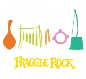
With the exception of Gobo’s guitar, I don’t think any of the Fraggles had a signature instrument, which makes for a lot of disconnect between the images we’re seeing above and the characters they’re supposed to suggest. Take away the words, and nobody would have any idea what it’s supposed to represent. Especially since Boober would be caught dead before putting a hole in his washtub.
My rating: 1
Lookit that chubby little Wembley! I want more of him. He’s taking up far too little of this design, and the mysterious Gorg/cat/albino olives are taking away the focus from the unique part of this piece.
My rating: 3
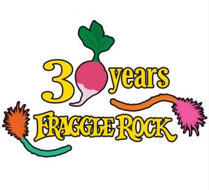
Wow, is Fraggle Rock three radishes old already? Time sure does fly.
My rating: 1
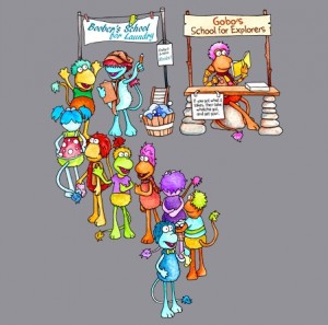
Here’s a reference to another singular Fraggle Rock episode, “Gobo’s School for Explorers“. While I love the fact that this artist went there, it doesn’t really explain why Boober has such a long line for something as boring as laundry, while Gobo is totally cool with being unpopular and lonely. (Hey, that’s Boober’s job!) It’s hard to really appreciate this one without knowing more about the episode, which means it hardly stands out as a t-shirt design.
My rating: 2
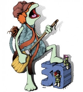
While I have little doubt that Boober can play a mean broom guitar, I’m left wondering which AC/DC song he would most want to sing. Probably not “For Those About to Rock (We Salute You)”, since he probably doesn’t care who rocks and who doesn’t. Probably not “Highway to Hell” either, since he doesn’t know what a highway is. So it’s obviously “Dirty Deeds Done Dirt Cheap”, since he’s the guy who gets stuck doing everyone’s laundry. That’s what that song’s really about, right?
My rating: 4
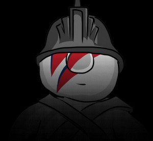
Other than their hard work ethic and lack of eyebrows, 1972 David Bowie and a Doozer don’t have much in common. If anyone should be Bowie-ized, the obvious choice is Feenie Fraggle. (I have no research to back this up.)
My rating: 2
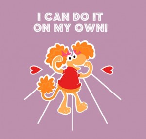
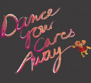
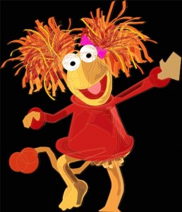
Apparently I’m really into the cartoony versions of the Fraggles in this contest, because I think that’s adorable. I can totally see it on a tween girl shirt. It probably doesn’t even need the text at the top, especially since Red isn’t doing anything on her own in the image, excepting the fact that she’s just standing there, flexing by herself.
My rating: 4
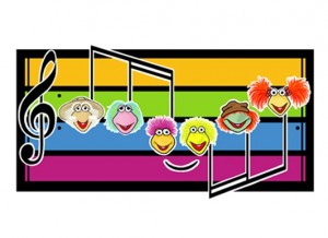
These notes don’t actually play anything Fraggle-related, do they? If not: Missed opportunity! Heck, I’d buy a shirt that just had the sheet music for the funky bass line in the theme song. Sprocket could represent the hand claps.
My rating: 2
Maybe it’s me, but all I really see here are three Doozers who are really bad at their jobs. One isn’t responding to instructions, one isn’t looking where he’s supposed to be building, and the other one is listening to a Michelle Williams album when he knows that she did her best work with Destiny’s Child. One word: Unprofessional.
My rating: 2
I love the 80s-style font! Not enough to justify the floating Red Fraggle in the corner. Or to give this design a good rating. Or to keep writing anything in this review.
My rating: 1

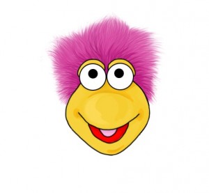
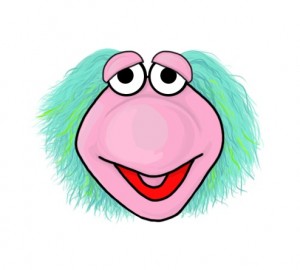
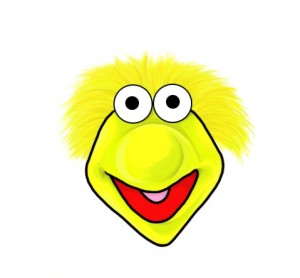
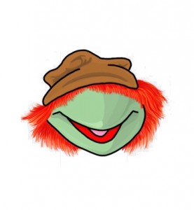
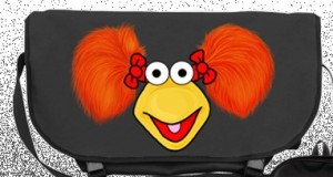
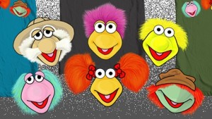
Onward to Outer Space / Gobo Fraggle
Mokey Fraggle / Wembley Fraggle
Boober Fraggle / Red Fraggle
The Fraggles
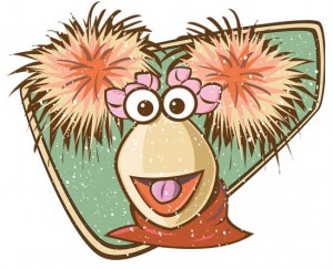
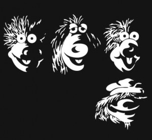
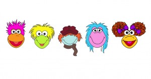
This artist made individual Fraggle face illustrations to enter into the contest individually and altogether. While I applaud the effort, the market is a little flooded. The illustrations are well-drawn, but there’s nothing to make them stand out against the other 200+ entries. Some of which include almost identical entries from the same artist.
My rating: 3
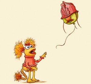
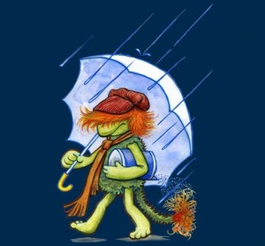
The source materials for these spoof designs don’t really have much to do with Fraggle Rock, but I love them anyway.”Red’s Balloon” doesn’t have anything to do with the similarly-titled French film, but I’ll be damned if it isn’t entertaining seeing Red with a Doozer balloon. “Boober’s Salt” has even less to do with the Morton Salt logo, but how great does he look, looking all morose and wet with a leaking barrel of salt? These are bizarre and pretty and more bizarre, and I love them.
My rating: 5
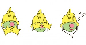
If DC Comics’ “New 52” reboot has taught me anything, it’s that adding superfluous lines to a costume does not make it any more interesting.
My rating: 1
This reminds me of all the vintage-looking stuff decorating the area around Space Mountain in Disney World, and now I want to ride a roller coaster that takes you around Fraggle Rock, through the Gorgs’ garden, and into outer space (I’ll settle for either definition). Someone make that happen now please and thankyew.
My rating: 3
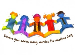
The main care that can’t be simply waltzed away is that Fraggles with human legs are terrifying and accentuates their pantlessness.
My rating: 1
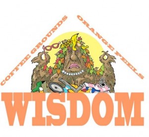
ToughPigs’ own Smig does it again. He really captures the complexity, the brilliance, and the filthiness of the Trash Heap in a design I would be proud to own in t-shirt form. Well done, Smig!
My rating: Withheld, since we know the artist personally.
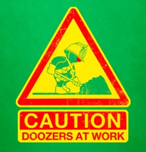
If I saw this sign while driving down the street, you’d better believe I’d slow down. Not because I’m being a cautious driver, but because I’d like to lean out the car window and try to scoop up a Doozer to take home with me. He can build shelves in my kitchen, make radish-flavored swizzle sticks for my morning coffee, and offer general adorableness to any of my houseguests. I’m sorry, what were we talking about again?
My rating: 4
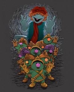
At first glance, I thought a giant Boober was chasing down a pack of terrified Doozers, but on further inspection, they’re all just rocking out, throwing the ol’ devil horns. So while I do really like this one, it’s way too dark to fully appreciate, especially if you’re like me and you judge things based on the first half-second you see it.
My rating: 4
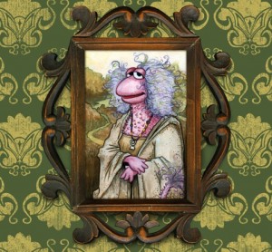
If history has taught us anything, it’s that Mokey is the least represented Fraggle in all merchandise and fan art. So it’s nice to see a cool example of how to make her look interesting and compelling and artsy. I wonder if the real Mona Lisa felt the same way.
My rating: 5
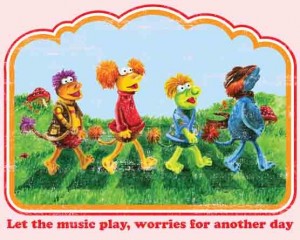
I’m a sucker for a good Beatles spoof, especially if it’s Abbey Road. I like the choice to keep the Fraggles away from the real world, although wouldn’t it make more sense for them to be underground rather than in a field? I mean, they’re not Smurfs. The “Meet the Beatles” parody is a great idea, but the shading kinda makes it look like they have warts on their noses.
My rating: Abbey Rock – 5, Silhouettes – 3
Ooh, pretty. I love the messy art style, and the fact that you can recognize each Fraggle so easily with just a couple colors each. Also because making elaborate, beautifully designed paper dolls is just showing off.
My rating: 5
I had to check three times to make sure these drawings weren’t stolen from Fraggle Rock comic book illustrator Jeff Stokely, and as far as I can tell, they’re just inspired by him. Which is not a bad thing, since both Stokely and this artist know how to draw a good looking Fraggle.
My rating: 4
Here’s another classic idea that works really well. I’m not sure it would make for the most stunning tshirt ever, but I like the style and the movement, and it really captures an iconic part of the early episodes of Fraggle Rock.
My rating: 4
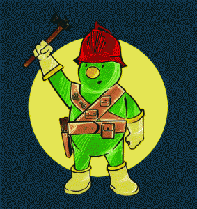
Maybe the Doozer got caught breaking out of jail, which explains the searchlight. They probably shouldn’t have let him keep the hammer in his cell with him.
My rating: 3
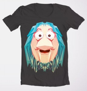
If Max Headroom was a Gorg, this would be him.
My rating: 3
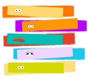
Creating a tshirt design in 3 easy steps. Step 1: Go to the hardware store and pick up some free paint swatches. Step 2: Paste some eyeballs onto said swatches. Step 3: PROFIT!
My rating: 1
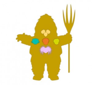
Huh. I had no idea that’s what a Gorg’s heart, lungs, liver, and pancreas look like.
My rating: 2
JUNIOR GORG IN YO FACE
My rating: 3
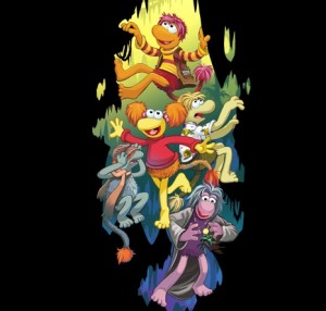
For some reason, I’m picturing the Fraggles as an early-90s action team, like the Power Rangers or the Planeteers, leaping into action at unseen villains just off screen. Fraggle powers activate! Form of an Inkspot! Form of Pa Gorg’s bathtub!
My rating: 2
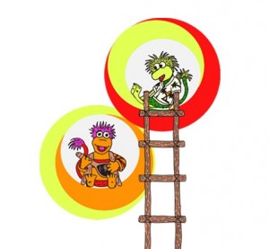
It’s nice to see that Gobo and Wembley upgraded their cave notches in favor of neon orbs. Even though they’re crazy to leave a rent controlled apartment.
My rating: 2
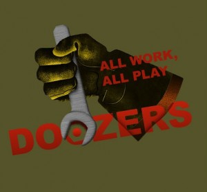
I wouldn’t necessarily suggest that a Doozer-themed design has to have a Doozer in it, but yeah. It probably does.
My rating: 2
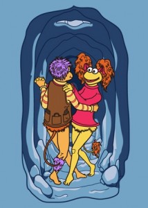
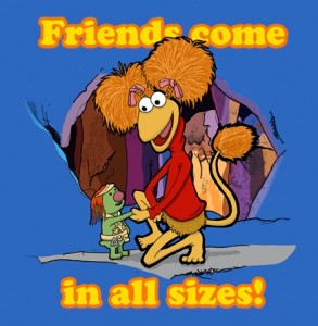
This is a cute one, promoting the bigger lesson that Fraggle Rock attempted to teach. Red looks a bit… gaunt, or svelte, or lithe. But who am I to judge? Someone once taught me that friends come in all sizes.
My rating: 3
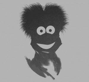
The composite Fraggle shadow will haunt my nightmares. Guess I’m sleeping with the light on tonight!
My rating: 1
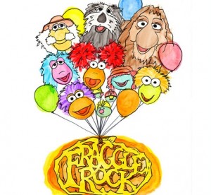
We’ve seen a few characters-as-balloons submissions on past design contests, which makes this one seem derivative, as if the artist is actively trying to rip off the idea. I’m not saying that’s what’s happening necessarily, but it’s either that or this.
My rating: 2
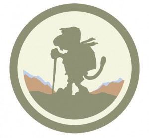
Here’s a bit of simplicity that works really well. I’d happily pay good money for this as a patch that I could sew onto my jacket sleeve or backpack. I mean, after I learn how to sew.
My rating: 5
Fraggle Rock comic book artist Jake Myler submitted this piece, and it’s fantastic. It’s no wonder he’s actually been paid to draw Fraggles. However, Jake already won a Fraggle design contest for his equally fantastic piece, “It’s a Radish World“, which is available on tshirts, mugs, ornaments, and more on the Fraggle Rock CafePress store. So while I applaud Jake’s skills, I’d rather give someone else a chance.
My rating: 4
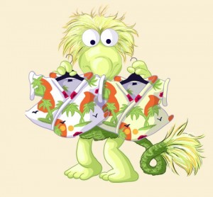
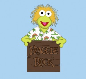
This image is so unrealistic. I don’t believe that Wembley has two banana tree shirts in two different shades of white! They’re all identical! Every self-respecting Fraggle fan knows that.
UPDATE: Facebook commenter Meagan Barbeau pointed out to us that this image is directly from the episode, “The Secret of Convincing John“, where Wembley can’t decide between two banana tree shirts, which are two different shades of white! What a fantastically obscure detail! I love it.
My rating: 4
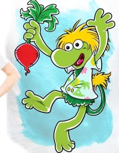
I love happy Wembley. I also love cartoony Wembley, big-nosed Wembley, barefoot Wembley, and doing-a-dance-while-holding-a-radish Wembley. So yeah, this design is alright.
My rating: 5
I’m so bored with reviewing designs that are just Fraggle faces that I can barely muster the energy to rate this one a 1. No wait, here it comes.
My rating: 1
Remember when I said that Smig hits it out of the park? Well, this is his grand slam. What a beautiful rendition of Cantus and the Fraggle Rock cast. Pictures like this remind me how lucky we are to have an artist like Smig on our team.
My rating: Withheld, since we know the artist personally.
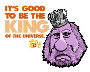 It’s Good to Be the King of the Universe
Normally, I focus much more on the art than the text in these pieces, but the in-joke here really makes the whole thing pop. Speaking of “pop”, Pa Gorg also looks great. We chose our universe’s king wisely.
My rating: 5
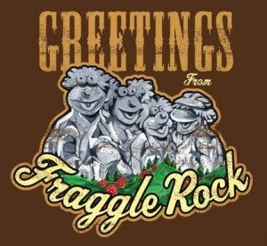
Of course Mokey got left off the Fraggle version of Mount Rushmore. She can’t even make it onto a DVD cover. Maybe it has something to do with the fact that she’s the only one without a huge bump on the tip of her nose.
My rating: 2
This image has convinced me. I will vote for Wembley in the next election.
My rating: 3
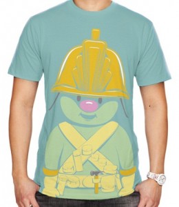
If I owned this shirt, you’d better believe the first thing I’d do is dress the lower half of my body like a Doozer and then run around town pretending to be a tiny construction worker. With a human head and arms sticking out from over my helmet. Okay, I didn’t think this one through.
My rating: 4
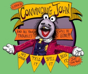
This is one of my favorites in the entire contest. And it isn’t because it’s so well put together or that it features a relatively minor character, but because Convincing John told me that I should rave about it. There’s just something so trustworthy about that guy.
My rating: 5
It’s great to see Marjory get a spotlight, with bonus Philo, Gunge, and saxophone-playing Mokey. It kinda looks like these guys jumped out of a new animated Fraggle Rock TV show. They should totally do that! It can’t be worse than the last one.
My rating: 4
We’re halfway done! Stay tuned for parts 3 and 4 of our coverage of the Threadless Fraggle Rock T-shirt Design Contest coming soon!
Click here to eat your weight in radishes on the ToughPigs forum!
by Joe Hennes – Joe@ToughPigs.com
