Yesterday, we got the next piece of the puzzle that will eventually resemble something Muppet movie-ish. No, it’s not a corner piece. Or an edge. More like an eyeball. But with the eyeball, you can construct the face to connect to the body to attach to the boat George Washington is standing on. (Wait, you’re all doing the “Crossing the Delaware” puzzle too, aren’t you?)
What I’m trying to say is that we got a glimpse at the “final” Muppet movie poster (I use quotation marks because I am in complete denial that we’ve already seen the last of the posters when it’s only July… and because being in denial is crazy fun), as well as the movie theater standee. In case you missed our newsbit about it, here they are again: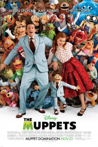
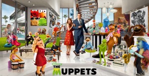
Go ahead, give ’em a click. Pretty, ain’t they?
One of the most excited parts to me is that these two new images are comprised of mostly new photos, as opposed to some snazzy Photoshopping like the last two. And because of all the newness, it leaves the door wide open for speculation, questions, observations, and obscure-character-noticing. And of course, because I love a good nitpick, I’m going to go ahead and do all that. Stuff. And whatever.
Let’s start off with the Poster, which is similar to the previous poster, but with Jason Segel, Amy Adams, and Walter trying to hold back the Muppet tidal wave, rather than, like, a big ‘M’.
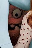 -Obscure character alert! I spy with my nerdy eye a green Frackle, a cactus, Gloat, Crazy Harry’s eyes, Behemoth, the Snowths, and penguins and rabbits and chickens (oh my!).
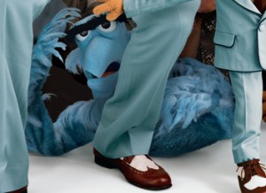 -Familiar character alert! It’s great to see Scooter so front-and-center with this and a lot of the other promotional stuff so far. Thog is looking appropriately subdued, and Sweetums looks nice and ogreish. It’s good to see Rizzo and Pepe (who happens to be wearing quite the dapper suit in both pictures) in there, despite the fact that we still don’t know if they have anything more than a passing cameo in the film. And where are Sam and Lew Zealand’s legs?? Did Puppet Heap forget to build them??
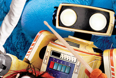 -New character alert! Aside from the obvious Walter and 80s Robot (who, by the way, I hope gets his own action figure), I can spot the Moopets hidden in the background. The faux Piggy, Kermit, Rowlf, and Janice are all in there somewhere. But are their intentions noble or nefarious? No one knows until November, noodle noggins!
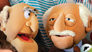 -Final thoughts: The poster is so much less “Toy Story 3” and so much more “Holy crap, there are a lot of Muppets in that poster!” I’m sure it evokes at least a little bit of the tone of the movie, and it has something going on in it besides character recognition. It forces you to take the time to find the Easter eggs and wonder why Jason and Amy and Walter are trying to keep all that Muppety goodness from us. The jerks.
Okay, enough of the poster. Let’s talk about this strange and wonderful image we only know as the “Standee“. I have so many thoughts, I’m going to have to revert to bullet points. Wish me luck.
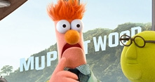 -I guess we’re supposed to deduce that this is Kermit’s house (note that I avoided the frog pun by not saying it’s his “pad”… ah, nuts). The furniture is green, there’s Muppet art on the walls, and it’s the only house with a clear view of the “Muppetwood” sign. Then again, if I could afford it, this is what my house would look like too.
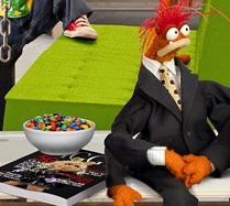 -Wow, Kermit has a pool, four hanging lights, a spiral staircase, a velvet curtain for his brick wall, and at least three candy bowls??? Dude must be rich!
 -I dig all the art Kermit has on the walls. Pop art, black and white photos, and that rad Electric Mayhem picture in the back (which, due to the light fixture above the frame, is probably worth something to the right collector). I wonder if Disney will bother to release any of it as high-end art, posters, book covers, magnets, postcards, or anywhere at all. Likewise, I like seeing Walter’s Polaroid pictures on the ground, which all seem to be new images, rather than more stock photography, which they totally could’ve gotten away with since you can hardly see them.
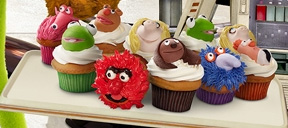 -Oooh, those cupcakes look delicious. What flavor do you think the Snowth is?
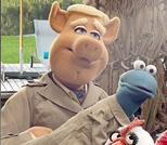 -Link is looking quite dapper in his trench coat, along with his frog and Frackle friends. I wonder if they’ve got some sort of spy mission in the film, or if they’re just expecting rain. Hmmm.
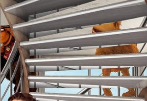 -I’m having trouble identifying the two characters on the stairwell. They look like orangutans (similar to Quongo), one nude and one nevernude. I have no idea if I’m right or wrong, or what either of those options would mean.
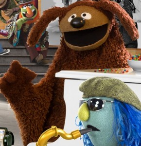 -Rowlf’s arm sock sure does go all the way down, doesn’t it? He is most certainly not dog-shaped anymore.
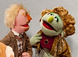 -Our pal Cameron Garrity pointed out to me that half of the art appreciating duo bares a striking resemblance to director James Bobin, right down to the sweater vest. Could it be a Muppet caricature? Or just an eerie coincidence?
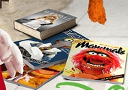 -Kermit has a book that looks a lot like Miss Piggy’s terrible “Diva Code” book (though it probably isn’t) under his coffee table. Doesn’t he know?? That book is only to be used under the coffee table leg.
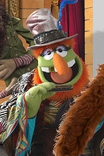 -I notice that Dr. Teeth is holding a harmonica in both of the images we’ve seen today. According to Chekov, I guess that means we’ll be hearing him play the mouth harp by Act III.
 -Okay, here’s my big gripe: Enough with the dang Photoshopping. Remember that first teaser image? That was so great because they actually got the photo puppets in the room to take the picture. But everything else has been cut-and-pasted together from dozens of separate images. And the end result is always crowded, poorly lit, with inconsistent character sizes and no actual connections between the characters. The moral of the story is: Forget the Photoshop and just hire Drew Struzan and you will have an amazing movie poster.
 -Last thought: I’m glad the movie’s logo has a “Disney” on top of it rather than “Disney’s”. It’s almost like Disney is announcing their connection without claiming full-out ownership. Yes, this is a Disney movie, but they’re not going to pretend they were behind the Muppets’ success from the beginning. Oh the power of an apostrophe-ess!
All in all, both the poster and the standee are great. Or, more importantly, they don’t suck. If they sucked, then I’d start to get worried about Disney’s involvement, the lack of excitement of the fans, and the fact that we’re complaining about two-dimensional images that come out four months before the movie. But nope, we get to be optimistic for the moment, thanks to these images. And I look forward to getting that giddy smile on my face every time I’ll see these at the movie theater. Hey, speaking of which, I wonder what they do with the standees after the movie comes out. I might’ve just found my new wallpaper!
Click here to Photoshop your friends rather than actually invite them over on the ToughPigs forum!
by Joe Hennes – Joe@ToughPigs.com
