Part 1 – Part 2 – Part 3 – Part 4
Here we are at the final segment of yet another series of t-shirt design reviews. It’s been a blast, but all good things must end. And, thankfully, all long, exhausting, slightly tedious things must as well. Thanks in advance to everyone who read through these reviews, and I hope I didn’t tick off any hostile artists out there. Good luck in the contest, and let’s get moving with part 4 of our reviews!
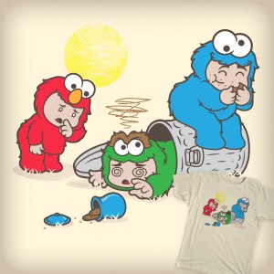
I honestly don’t get the appeal of those cutesy Chibi babies, especially when they’ve used their innocent wiles to capture and skin our Sesame Street pals. Plus, the one wearing Oscar’s fur has apparently had one too many to drink, which might explain a few of their shenanigans.
My rating: 2
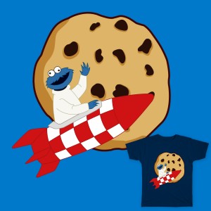
I don’t think Cookie Monster knows how rockets work. Or outer space. Or oxygen. Or G-force. Seems that he’ll even break the laws of physics to get a cookie.
My rating: 2
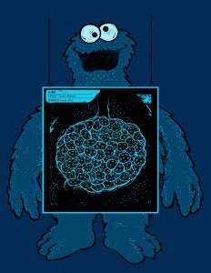
It wasn’t enough to make Cookie Monster a shuffling hulk of a creature, but we apparently needed the gut hole and the bloody gingerbread man’s head. Do people realize that this is a children’s television character??
My rating: 1
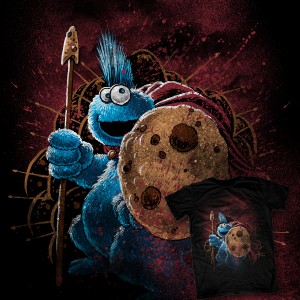
Cookie’s looking pretty intense here. I like the spear and shield accessories a lot, and I’m tickled by the idea of Cookie with a mohawk. I don’t exactly know what it’s referencing (if anything), but this artist has succeeded in toughening up the C-man.
My rating: 4
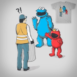
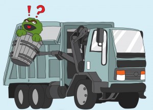
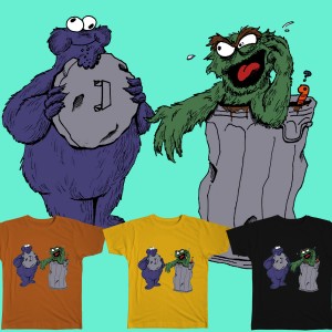
In a magical world where we don’t expect to see the trio of Elmo, Cookie Monster, and Oscar the Grouch on every Sesame Street t-shirt, it takes a bit too long to realize what this design is trying to imply. To the untrained eye, it’s just Cookie and Elmo saying hello to a confused garbageman, who seems to be carrying an empty can. The Oscar references are so subtle, you’d need a microscope and a pickaxe (or an advanced degree in Muppetology) to figure it all out without help.
My rating: 2
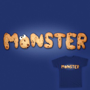
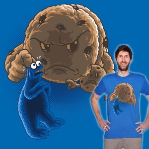
Chocolate croissant monster? Raisin bread monster? Burnt sandstone monster?
My rating: 2
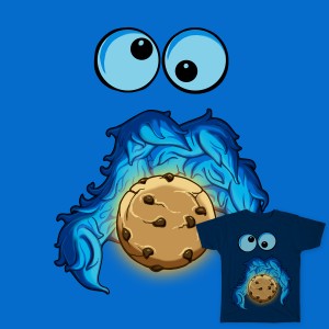
I really enjoy this design, despite the fact that my first thought was that Cookie Monster’s mouth had suddenly gone all Cthulhu.
My rating: 4
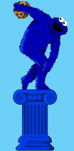
Yeah, I dig this one a lot. It’s a little loose, but this kind of off-model illustration used to be all over the Sesame Street books, merchandise, and magazines in the early days. Doesn’t this make you want to go back in time to when they could get away with this kind of stuff?
My rating: 5
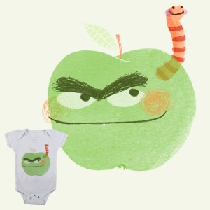
If you told me that this sour apple and his worm friend were the stars of their own children’s book, not only would I believe you, but I’d be tempted to try and find a copy of it for myself. Gorgeous work.
My rating: 5
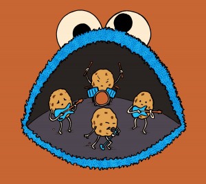
Those four cookies probably practiced for months, played at a dozen different venues, signed a 3-album deal, and got their hit song played on TRL just so they could someday play at the legendary Cookie Bandstand. This success story will not end well.
My rating: 3
I never liked it when Muppets are given human proportions. Among the many, many problems, it just accentuates the fact that most of them are very, very naked. Also, Cookie Monster has a weirdly-shaped butt.
My rating: 2
If Sesame Street characters had Bizarro counterparts, this is what their fur would look like.
My rating: 3
Great representation of all three characters (or four, if you count Slimey). They just look like they’re having so much fun, what with their balancing and teetering and cookie-grabbing.
My rating: 5
I like the idea of a Cookie Monster made out of real, actual cookies, but this effect just makes him look like he’s disintegrating, crumbling off into pieces until eventually he’ll be just a hand and the aroma of Oreos.
My rating: 2
First of all, “Grouch on a Couch” is not nearly as catchy as “Oscar the Couch”. Second of all, Oscar looks weird when he’s naked. Third, Oscar doesn’t look lazy as much as he just looks disgruntled. None of these things make me want to wear this picture on my body.
My rating: 3
More stock photography filtered or redrawn via Photoshop! The biggest sacrifice made here is that his arms are now about 6″ long. Or maybe he recycled them into the plant seen behind him. Giving a little something back to nature, eh Oscar?
My rating: 2
The drippy paint makes for a cool image of Cookie Monster, but with just a head, it doesn’t really say much. I mean, t-shirts don’t talk, so of course it isn’t saying anything. I mean it doesn’t have any purpose. Or vocal chords. But that’s less of an issue. Why am I still typing?
My rating: 3
WEIRD! Puppets puppeteering puppets??? So, who’s performing Cookie Monster? Dare we think about what Elmo is feeling right now? SO WEIRD! (But I still like it.)
My rating: 5
It’s nice to see Cookie Monster sharing a moment with the night sky when he’s not actively trying to eat the moon. I’m sure he’ll be back to his satellite-hating tricks once the moon doesn’t look so pretty tomorrow night, but for now, it’s nice to have a breather.
My rating: 5
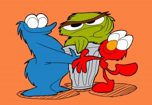
These three just look uncomfortably close. Oscar and Cookie are rubbing ears, while Elmo tastes the tops of their heads. I’m also perplexed as to why it seems like this artist copied stock art of Elmo and Cookie but decided to draw his or her own Oscar. If you’re gonna steal, you might as well steal everything.
My rating: 1
Crayons in your pocket without a pocket protector?? That’s how you get melted wax in the washing machine!
My rating: 2
I didn’t think it would be quite so jarring to see a red Oscar or a green Cookie Monster. We already have some experience with green Elmo, so that’s one less nightmare for me to have tonight.
My rating: 2
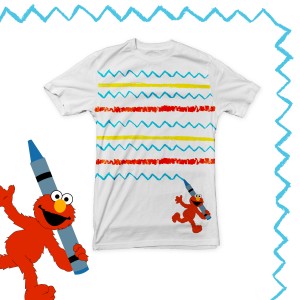 La-La La-La, La-La La-La, Elmo’s Tee
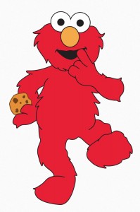
I don’t know many adults who would line up for a crayon-striped shirt. It’s freaking adorable for a kid, but this contest requires some ideas for broader audiences. Also, maybe, an originally drawn Elmo. Come on, you guys.
My rating: 2
Is Elmo recording his own album of ballads? There’s something innately hilarious about this, and it only gets funnier the longer I look at it. Why is it so funny? I don’t even know.
My rating: 4
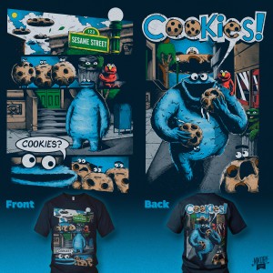
Full comic book pages are a bit too crowded for a t-shirt (in my oh-so-humble opinion), especially when it’s split up into both the front and back like this. However, this happens to be a hilarious, fun, well-drawn comic, which I’d very much like to see printed in any medium. And if it can’t be in the pages of a comic book, I’d settle for fabric.
My rating: 5
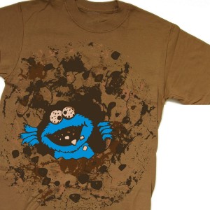
From a distance, Cookie Monster’s cookie eyes looked bloodshot and crazed. So basically, here we have an insane monster digging a hole through your torso, eating the pieces he breaks away. And then he’d probably head over to Hooper’s store to talk about the number 5, because what????
My rating: 2
Cookie Monster has cookies for eyes! What an original idea that I’ve never seen before in my lonely, lonely life!
My rating: 1
T-shirt designers seem to be torn on whether or not Cookie Monster’s cookie eating is a good thing or not. In some pictures, he’s gleefully munching away on his dessert. In others, he’s depicted as an evil monster, or as someone who deserves punishment for his diet. I think that my personal feelings lean toward the former, which I’m fighting against with this piece, which is funny and pretty, even though Cookie Monster’s about to get pummeled.
My rating: 5
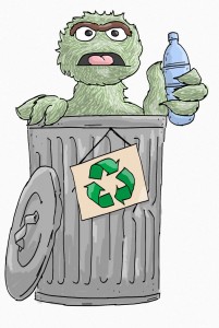
Fun Fact: When Oscar looks angry and happens to be holding a bottle, he looks like a bitter drunk! Tell your friends!
My rating: 1
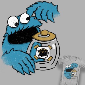
You tell me, which is more fun to see: Cookie Monster eating cookies or Cookie Monster not eating cookies? One of them is super dull, and if you don’t know which that is, just look up.
My rating: 2
Here’s a different spin on the “Cookie Monster is a recycling bin” idea. It isn’t one of my favorite designs, but it is inspiring me to carry googly eyes around so I can put them on inanimate objects and turn them into monsters. We should all be doing that all the time.
My rating: 3
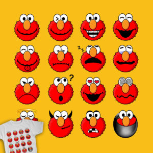
As a t-shirt, this design doesn’t do it for me. As a downloadable set of usable emoticons, I would totally back this up. Someone make that happen, please and thank you.
My rating: 3
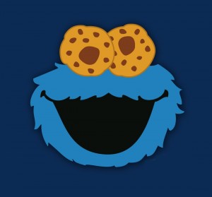
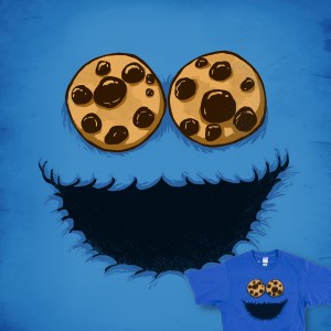
I’m really over this “cookie eyes” trend. So since I’m not even looking at those eyes, I’m left staring at the weird, bumpy lips of Cookie Monster. Or maybe those are his teeth. That would explain the mess he makes every time he tries to eat.
My rating: 2
It was bound to happen sooner or later! This is what Oscar gets for letting Bruno go.
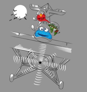
My rating: 5
The sheer randomness of these guys being in a plane should be something I get excited about, but it’s not quite ridiculous enough to get any sort of reaction out of me. Therefore, I am reactionless. I am idle and unfeeling. I am numb to pain or pleasure. All we are is dust in the wind.
My rating: 3
Hey, there’s that second Pac-Man spoof we’ve been deprived of for most of this contest! Cookie Monster looks a little odd when he’s molded to fit the Pac-Man shape, but the terrified cookies look great. I don’t recall how I felt about most of the Pac-Man parodies in the last contest, but this one probably holds up to most of them.
My rating: 4
Cute. Cute Cookie Monster. I like his giant head (or is that a tiny body?), and that he looks like he’s genuinely having a ball. And that fun is contagious. Weeee.
My rating: 4
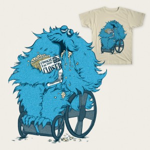
Yikes. This very, very sad looking Cookie Monster isn’t something I ever want to see. So I’m just gonna go ahead and picture him as an aging Lorax. …Nope, still sad. Blurgh.
My rating: 2
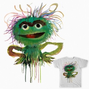
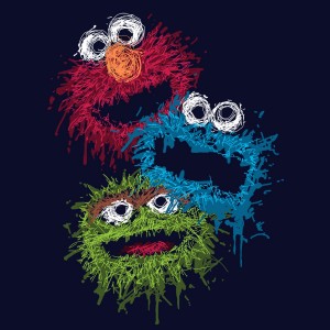
This “Oscar Wild” is very different from the “Oscar Wilde” we saw earlier this week. He looks pretty good to me, even with his spindly arms. Oscar definitely lends himself well to this sort of drippy paint job. Probably because of his love of the arts. (Ha! Fooled you. It’s because he loves garbage! You should see your face. Man. Haw!)
My rating: 4
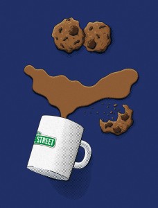
I don’t get it. It’s just a few cookies and some spilled coffee. Am I supposed to see some hidden image? Oh wait… it’s coming to me… it looks like my father being disappointed in my life choices! Clever.
My rating: 4
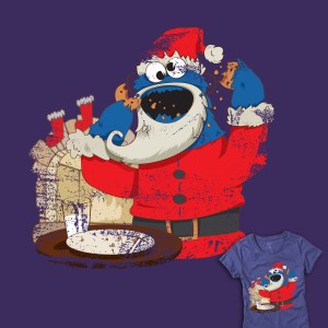
You just know that Santa Cookie has no intention of delivering toys to the kids. He’s just going door to door, breaking into people’s houses, and eating their food. It’s… actually not such a bad plan. I wonder where I can rent a Santa suit around here…
My rating: 3
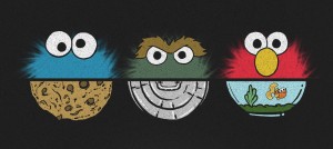
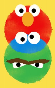
Simple! I like it! Not only is this piece playing with the one thing that makes the characters tick, but the half-circles really drive the repetition home. I don’t know if what I just wrote made any sense, but it sure sounded good in my head!
My rating: 5
If I ever saw someone with a “Free Hug” sign who looked that happy, I think I’d walk in the other direction.
My rating: 3
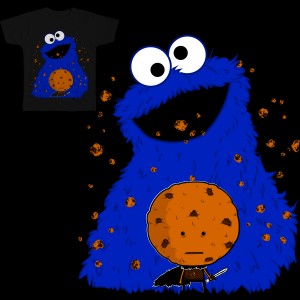
I didn’t even notice the little cookie guy’s body at first. I thought it was just another picture of Cookie Monster about to eat again, but that’s a little detail that adds a whole new layer to the image. Unfortunately, it’s so hard to spot, and Cookie Monster doesn’t seem to be playing the part of an attacking giant.
My rating: 2
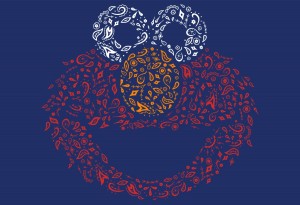
This is a cute one. I doubt the symbols have much meaning, but it’s a good twist on the same exact Elmo picture we’ve seen a billion times. It’s not enough of a change to get me very excited, but I like the motif.
My rating: 3
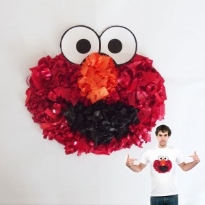
Again, from a distance, this one doesn’t work. Before you can tell what Elmo’s made out of, he just looks blurry. And actually, I’m not entirely sure I know what he’s made of anyway.
My rating: 2
Fireworks? Chalk? Or just a mess. Whatever it is, it’s bordering on “interesting” and “sloppy”, so I’m going to be a little generous and lean away from the gross option.
My rating: 4
Red and green do not make blue! If they did, Sesame Street has been lying to me for all these years. Let’s not unteach what has already been taught!
My rating: 2
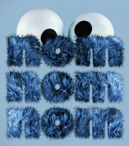
Those “Noms” look nice and soft. I could totally take a nap on those Noms. Or maybe replace a couch cushion with them. Or just use them to prop up my head while I write t-shirt design reviews!
My rating: 3
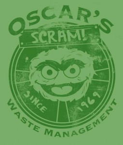
I swear, I keep reading that as “Oscar’s Scram! Waste Management”, which I know isn’t correct. I wish it looked just a little more like a real logo, as opposed to a picture of Oscar with a circle and some text. Making a cool logo is hard, since it’s simple but not too simple. This one just needs a little more thought.
My rating: 3
Their eyes are the ping pong balls! This piece doesn’t work as a t-shirt design, but it’s fantastic as a piece of Sesame Street fan art.
My rating: 4
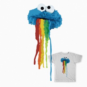
Did… did someone submit a picture to this contest featuring Cookie Monster vomiting a rainbow? Because I’m almost positive that that’s what this is. Just… spewing out a whole rainbow. Hm.
My rating: 1
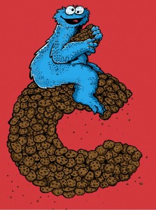
C is for Cowboy, and that’s good enough for Cookie Monster’s bizarre imagination.
My rating: 3
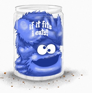
This Cookie Monster in a jar makes more sense than the previous one we saw. Instead of waiting for people to drop cookies into his mouth, he’s at the end of his cookie binge, having fallen into the jar after devouring everything in sight. These contest entries always look better after we make up a good backstory.
My rating: 4
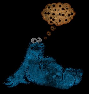
Ooh, another retro-styled Cookie Monster! The distressed colors give it that older feel too. And the cookified thought balloon is a nice touch to show what’s happening without hitting us over the head with it.
My rating: 5
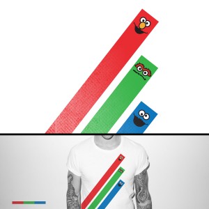
Yep, someone submitted three lines with faces on them into this contest. That’s a thing that happened. Lines.
My rating: 1
Here’s a piece by ToughPigs friend Noel Schornhorst! Noel’s work often captures that ’70s Sesame Street art style in a really cool way, and this is no exception. Cookie, Oscar, and Slimey are all so expressive, and it’s a situation that none of us would be surprised if it actually happened on the show. It’s all kinds of perfect.
My rating: Withheld, since Noel is one of us.
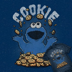
This picture is full of lies! Everyone knows that almost none of the cookies actually make it into his mouth.
My rating: 5
Seriously? You can’t expect me to write about this thing. You guys can review it and mail me your comments at ToughPigs HQ, New York, NY 10023. I’m done.
My rating: 1
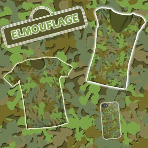
Now that’s a clever idea! It looks like camo, but it’s so much more! The best part is, you’d blend right in when you’re hiding amongst a pile of tiny green Elmos.
My rating: 4
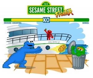
I’ve seen at least three different fan artists do Sesame Street/Street Fighter mashups, and they’re all really clever and interesting. This one, not as much. Nobody needs to see Cookie Monster and Oscar fight to the death. Seriously.
My rating: 2
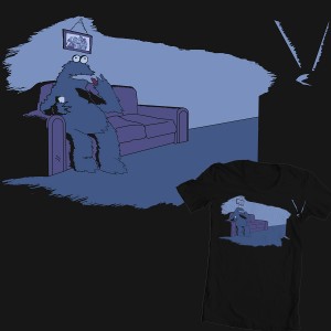 Watching Reruns of the Old Days
This is an odd one. It’s just a mundane, quiet moment in Cookie Monster’s life, which sets it so far apart from everything else in this contest, it makes me love it. Why not have a t-shirt with Cookie Monster sitting on a couch watching TV? It’s like we’re peeking behind the scenes to see how monsters really live.
My rating: 5
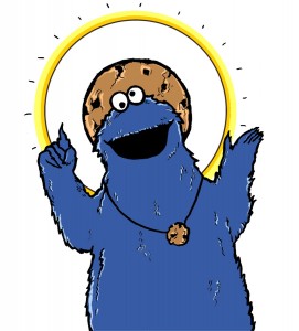
Look, just because I deify the Sesame Street characters, it doesn’t mean I have the right to push my beliefs onto others. (But I can tell you: The communion wafers are great.)
My rating: 3
 First Monster on the Cookie Planet
I wonder what he’s going to do with the flag once he finishes eating that tiny moon and finds himself floating in the nothingness of space like Sandra Bullock.
My rating: 4
As always, I like to end these contests with a little bit of trend watching. How many more times do you think Oscar appeared in this contest over Elmo? Were there more “Cookie Monster as a monster” or “Cookie Monster as a cookie” entries? Aside from those three, which Muppets made cameo appearances? Place your bets!
- Cookie Monster (solo): 111
- Oscar the Grouch (solo): 50
- Elmo (solo): 29
- Cookie Monster and Elmo: 6
- Cookie Monster and Oscar: 2
- Elmo and Oscar: 2
- Cookie Monster, Elmo, and Oscar: 57
- Slimey the Worm: 6
- Big Bird: 2.5 (one appearance by name only)
- Cookie Monster is a monster: 16
- Cookie Monster is a cookie: 9
- Living, humanoid cookies: 13
- The moon is a cookie: 5
- Cookie Monster has cookies for eyes: 5
- Oscar is wearing a hat: 3
- Z is for Zombies: 2
And thus is the end of another series of t-shirt design reviews! Thanks for reading, and we’ll do it all over again the next time one of the big t-shirt companies decides I have too much free time.
Click here to put a monster on the moon by the end of the decade on the ToughPigs forum!
by Joe Hennes – Joe@ToughPigs.com

 Cookie Moon
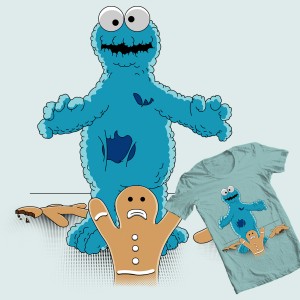 Cookie Monster – Zombi
 500 Cookie Defendors
 Someone is Living There!
 COOOOOKKIIIEEESSS
 Cookie Monster
 Best Buddies
 Besties
 Cookie Bandstand
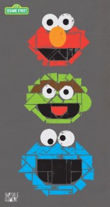 Sesame Block Party
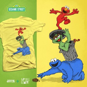 The Way the Cookie Tumbles
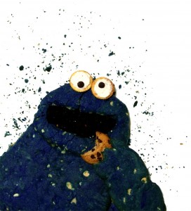 Cookie Cookie Monster
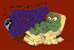 Grouch on a Couch
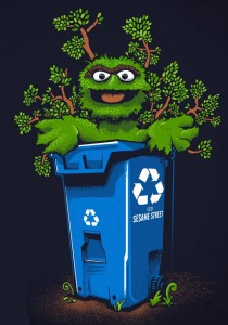 Love Recycling, Too!
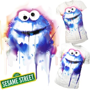 Wet_Monster
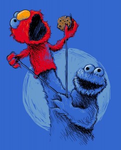 Sharing
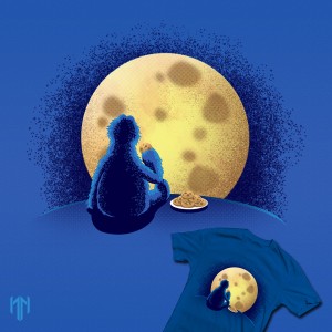 My Favorite Night
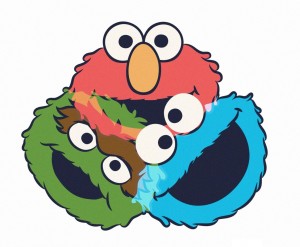 RGB
RGB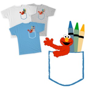 Elmo Drew a Pocket
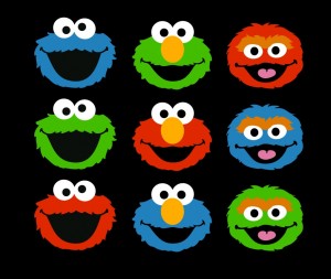 Let’s Share Colors
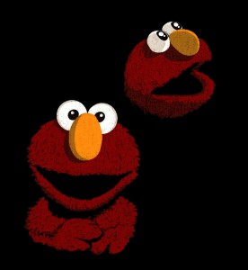 Elmo Studio Portrait
 The Day the Cookies Crumbled
 It’s Never Enough
 I Only See Cookies
 Wrong Cookie
 Why Oscar’s a Grouch
 Why No Cookie!?

 Elmoticons
 He’s Seeing Cookies Everytime
 Wrong Collection!
 Trip
Trip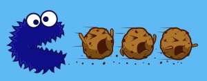 The Eating Game
 Cookie Juggling
 The After Years
 Sesame Breakfast
 The Perfect Crime
 50%
50%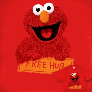 Elmo’s Free Hug
 Cookie Monster is Coming
 Ornate Elmo
 Create with Elmo
 Street Color
 Awesome Trio
 Nom Nom Nom
 Waste
Waste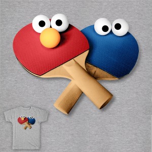 Ready to Play
 Mmmmm More Sprinkles
 My Favorite Letter is C
 If It Fits I Eats
 Cookies 24/7
 Primary
 Lunch Date
 X is for X-Ray
 Oops I Stole a Cookie
 Elmouflage
 Sesame Street Fighter
 Holy Monster