Part 1 – Part 2 – Part 3 – Part 4
When last we left off, we were about a quarter of the way through our reviews of the Threadless Sesame Street T-shirt Design Contest entries, which means we still have a ways to go! Let’s not waste any more time and get into the nitty and gritty of these Elmo, Cookie Monster, and Oscar the Grouch-themed pieces of art.
And remember, today (October 22nd) is the last day to vote! Head over to the Threadless site to cast your votes while they still count!
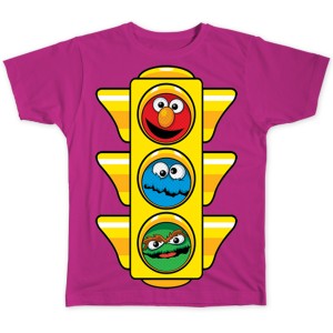
See, it’s funny because Cookie Monster best represents “Go” (seeing as he can’t stop himself from binging), Oscar best represents “Stop” (because of how he wants to keep everyone from having fun), and Elmo best represents “Slow Down”, because he’s the third one and I couldn’t think of anything else to say.
My rating: 2
Minus points for this piece looking like it’s just a photo pushed through a Photoshop filter. But plus points because it actually looks kinda cool. So, we’re back to where we started. Easy.
My rating: 3
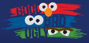
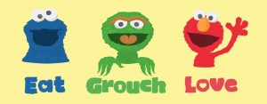
Aww, Oscar’s not that ugly. And Cookie’s hardly bad. I suppose Elmo’s pretty good. One out of three isn’t that great.
My rating: 3
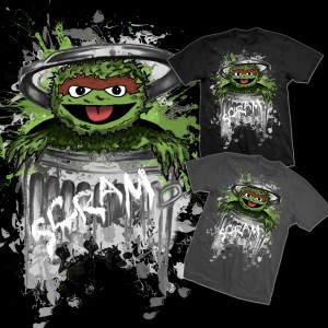
Eww, this picture of Oscar is pretty messy. It’s as if someone sneezed it onto a plate of spinach Jell-O. So, it’s perfect.
My rating: 4
Wow, that’s exactly what Oscar would look like if he had his own “Monster at the End of This Book” story. Michael Smollin would be proud.
My rating:
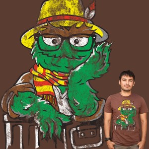
Living in Brooklyn, I see my fair share of both hipsters and homeless every day. And as this picture suggests, sometimes it’s more difficult to differentiate than you’d think.
My rating: 4
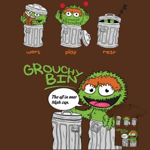
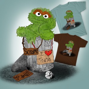
I dig that cartoony version of Oscar. I probably don’t even need the top three pictures, as the big one does all the heavy lifting anyway. Then again, it’s worth it just to give me an excuse to imagine Oscar juggling.
My rating: 4
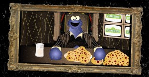
Cookie Monster as Scarface? As much as I’d love to hear him say “SAY HELLO TO ME LITTLE FRIEND!”, I think the whole “cookies as drugs” metaphor has been beaten into the ground, don’t you?
My rating: 3
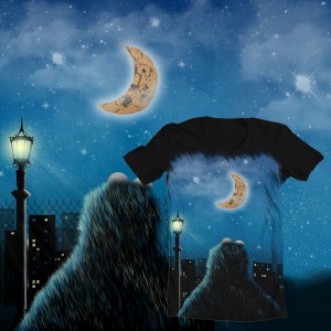
Ah, a quiet moment in the life of Cookie Monster. See how he stares into the night sky and contemplates his own mortality. Or maybe he’s making plans for his rocket ship so he can devour the moon, thus making the tides rise and destroy half of the living world, eventually plunging the earth into perpetual darkness. Either way. Very serene.
My rating: 4
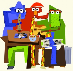
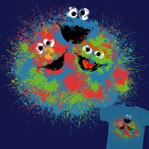
The Sesame Street gang just begs to be re-imagined by Picasso. And really, how could I complain about this design? No matter what you do, you can’t ruin it. It’s messy and disjointed, but that’s what brings it all together. Thanks for ruining my opportunity to criticize, Picasso!
My rating: 3
It’s a subtle joke, but never not funny. I want to hack my computer so Oscar replaces my Recycle Bin. Yeah, I’mma do that.
My rating: 5
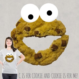
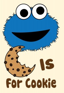
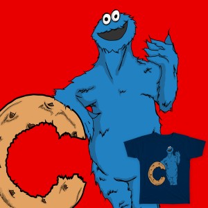
“C is for cookie and cookie is for me”??? I know that probably won’t appear on the shirt itself, but COME ON. You had ONE JOB!!!
My rating: 1
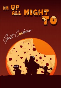
Being that I’m musically brain dead when it comes to current songs, I have no idea if there’s any real connection to the song title parody and the image itself. Did we need both? Or would we have been okay with just the silhouettes against the cookie moon? I suppose we’ll never really know, and that is the great mystery of the universe.
My rating: 4
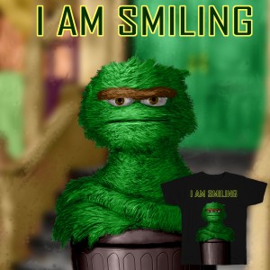
There’s a big difference between “grouchy” and downright angry. And while Oscar’s most definitely feeling the latter in this picture, it’s a welcome (and very well drawn) respite from his usual scowl and his cheeky “heh heh heh” laugh.
My rating: 5
That look on Cookie Monster’s face! It’s like he’s in a giddy shock from being given the gift of way too many cookies, like a kid with a bag full of candy on Halloween.
My rating: 4
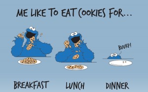
Poor Cookie Monster. After a healthy serving of cookies for breakfast and leftovers for lunch, he’s got nothing but gas for dinner. What a shame.
My rating: 4
You see, Julia Roberts? If you would’ve just changed one little word in your movie’s title, I might’ve been interested enough to see it.
My rating: 3
All it takes is a couple unnecessary (and incorrect) eyelids to completely throw me off. Yeah, I get exactly what it’s supposed to represent, but out of the context of this contest, nobody would ever look at the pink blob on top and recognize it as Elmo.
My rating: 2
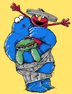
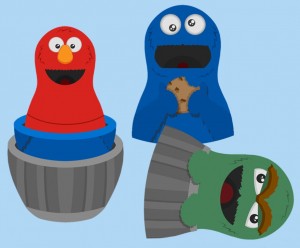
Ha! This is the first entry in the contest that’s made me laugh. I can only imagine the calamity that led to Oscar’s home being destroyed, Cookie feeling all butterfingerry, and Elmo not giving a crap. It’s perfect.
My rating: 5
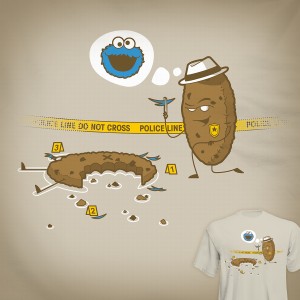
Funny, we saw almost this exact same idea in part 1. The previous one had just crumbs and blue fur on the ground, with a severely shocked cookie standing over it. This one gives the cookie a hat and badge, a more cunning look on his face, a dead body on the ground, and Cookie Monster’s looming face above. This one does the job better (and includes an actual reference to Sesame Street), but I’m still sad to have lost that priceless look on the cookie cop’s face.
My rating: 5
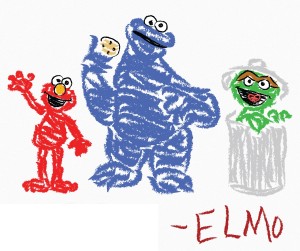
Wow, Elmo’s a good artist for being 3 1/2 years old. And for not having live hands that can actually grip a crayon.
My rating: 3
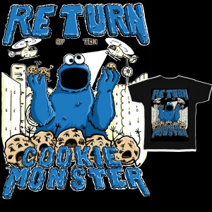
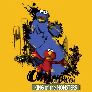
Cookie Monster is a monster again! I guess I’d be okay with that (I should be, since it’s happening so much in this contest), but I don’t buy that he’d chase Elmo around New York City. That’s a bit of terror that’s taken a little too far for these characters.
My rating: 2
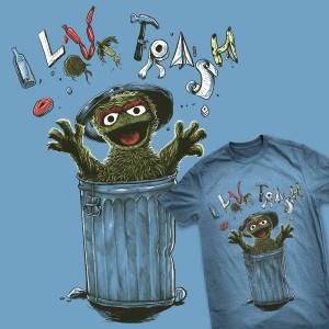
That’s the look Oscar makes when he throws bottles, sausages, toilet paper, and a freaking hammer directly at your face! Was that really necessary, ya jerk??
My rating: 3
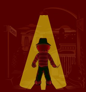 Nightmare on the Sesame Street.
Do you think Sesame Workshop would approve a t-shirt design that depicts Elmo as a terrifying mass murderer? In your dreams.
My rating: 2
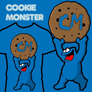
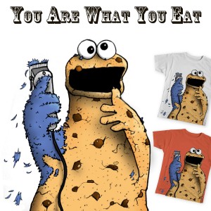
There aren’t enough designs that highlight the sheer insanity of Cookie Monster. I mean, the guy loves cookies so much, he bites his initials into each one and raises it above his head in victory before devouring it. (Don’t believe me? Watch him eat a box of cookies in slow motion.) If that’s not crazy, I don’t know what is.
My rating: 3
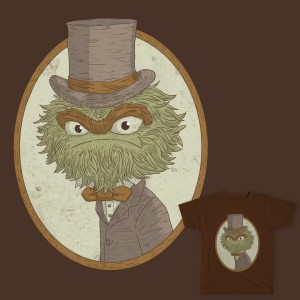
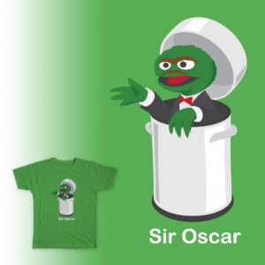
What a dapper gentleman that Oscar is! I think he should wear a bow tie and top hat every day. If the tie is tight enough, it may even increase his grouchiness. And if the hat is Scrooge-y enough, it may even decrease the surplus population!
My rating: 5
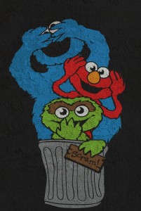
Is this what was happening right before Cookie Monster accidentally ripped Oscar’s can open? If so, I think I was expecting a lot more.
My rating: 2
My favorite part about “Sir Oscar” isn’t his dapper tuxedo, but that he’s moved into a much snazzier trash can. Like, the kind you’d find on display at Bed Bath & Beyond. My second favorite part is the mustache, because of course.
My rating: 3
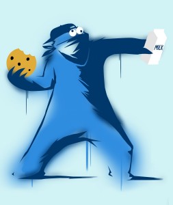
What! I’m surprised this is the first Muppet-related Banksy parody we’ve seen. And look how perfectly Cookie fits into that role. I’m impressed by this example of public defacement.
My rating: 5
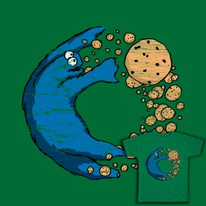
So, in this dream, Cookie Monster is flying around, chasing a cookie trail, which seems to originate at his feet. So he’s just endlessly flying in circles. These are the things nightmares are made of.
My rating: 4
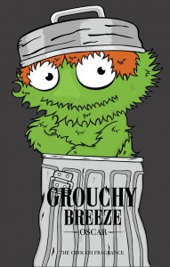
This piece would work just fine without the text. I like the idea of an Oscar-branded cologne, but the image doesn’t really look like a cologne ad. It’s just a cartoony Oscar, lookin’ all chill. He probably smells okay too.
My rating: 4
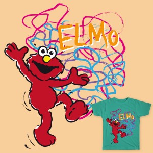
Dammit Elmo! You drew all over my brand new shirt! This is why we can’t have nice things.
My rating: 1
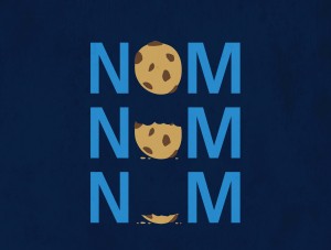
The issue with designs like this is that they’re so simple, anyone could probably print them onto a tshirt without going through Sesame Workshop or Threadless. There’s nothing copyrighted or trademarked that would require any permission. That is, unless Sesame has secured the rights to the word “Nom”, which is actually not such a bad idea.
My rating: 2
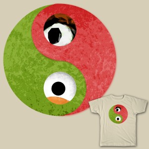
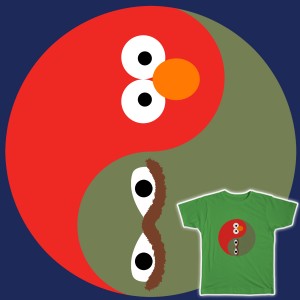
This is a better yin yang than the one above, although still a little bland. But the characters are much more recognizable, and it starts the thought process as to why Elmo and Oscar would be seen as the polar opposites of the cast.
My rating: 3
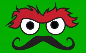
Well, this is… simple. I’d be lying if I said I didn’t like it, but how much work could it have taken to find a picture of Oscar’s eyes and slap a ‘stache underneath it? I guess sometimes it takes some perfect image placement to make a cool design rather than artistic talent.
My rating: 4
I can’t argue with that.
My rating: 1
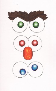
Forgiving the incorrectly colored pupils, and forgiving Elmo’s wrongly shaped nose, and forgiving the blandness of this piece… nope, too many forgivings. There’s no forgiving it anymore.
My rating: 2
I totally appreciate the fact that this artist hand drew all nine of these faces, and they’re subtly different enough to justify the work. But the piece doesn’t really say anything. They’re just faces, and there’s too much quality competition to make this one stand out in any way.
My rating: 3
Yikes! I am totally getting a Coraline’s Other Mother vibe from this one.
My rating: 2
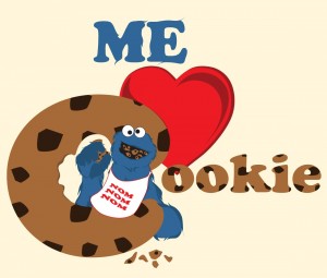
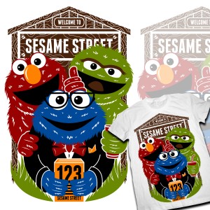
Nice design. Cookie’s bib looks a little out of place, but that’s such a minor complaint about a well put together piece of fan art. I can totally see this adorning a t-shirt or two.
My rating: 4
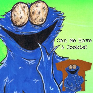
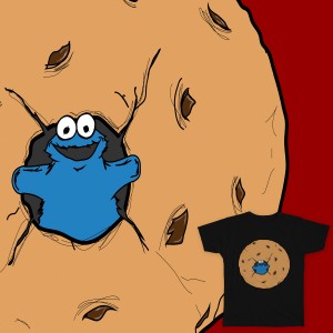
The sample of this piece is so poorly framed, it’s hard to tell what it would really look like on a t-shirt I guess that’s a Cookie Monster hand puppet saying hello through a donut hole. Am I close?
My rating: 2
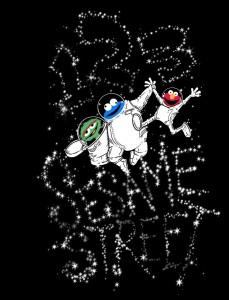
These guys look great as astronauts. Elmo’s having a ball, Cookie Monster looks like he was poured into his space suit, and Oscar is in a modified can. It’s exactly what I expected NASA to be like.
My rating: 4
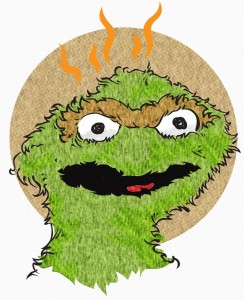
Is Oscar mad, or does he smell bad? Both, probably.
My rating: 3
I don’t know if the artist intended for Cookie Monster to look so creepy, but he will most definitely be chasing me with a machete in my sleep tonight.
My rating: 3
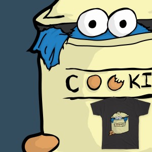 Who Stole the Cookies from the Cookie Jar?
What do you think: Giant cookie jar or tiny Cookie Monster? Answer: Yes.
My rating: 2
I like that wide-eyed Cookie Monster, but the fruit with the drawn-on faces don’t quite fit somehow. Plus, it might reinforce the “Cookie Monster is now the Vegetable Monster” myth, which we simply will not stand for anymore.
My rating: 3
Look closely at the little t-shirt in the bottom right corner. See how there’s a Cookie Monster on each side of the giant cookie? I don’t know how you’d know it from this image without squinting. That’s just poor planning, and it’s hard to vote for something you can’t properly see.
My rating: 1
He’s not a goblin, he’s a monster! Ooooohhhh, “Gobblin'”. I see what you did there. Wocka wocka.
My rating: 4
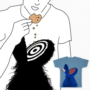
So, the idea is that the t-shirt wearer will eat cookies and drop the crumbs directly onto the targeted flatmouth of Cookie Monster. Meanwhile, when cookies are not being eaten (or when they’re being eaten responsibly), the wearer of this shirt just has to come to accept the fact that his choice of attire makes no sense.
My rating: 2
“Oh hi there. You may be wondering why me asked you here today. Have you ever considered applying for a time share?”
My rating: 2
So, just like every other picture of Oscar? Even in the same exact position, as if you traced it? That’s your entry? Okay, cool. Good luck with that, guy.
My rating: 1
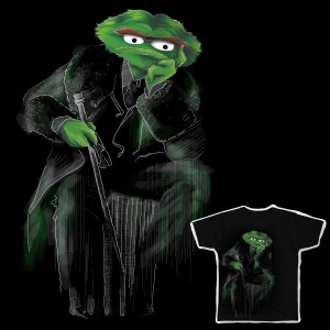
Oscar! The Wilde!!! I can’t even! I just can’t!
My rating: 5
One of my favorite entries in the last Threadless Sesame Street contest was an “Oscar the Couch” joke, but that one was much simpler. Just a green couch with Oscar’s eyes and mouth pasted on top. This one takes the idea to that next level, actually grouchifying the couch and adding fur and eyes so it looks like Oscar was actually skinned and repurposed as furniture. It’s absolutely a worthy update.
My rating: 5
Elmozart! Okay, maybe my reaction was miniscule compared to “Oscar the Wilde”, but it’s still a good idea to mash up these two fine pianists. I wish the image wasn’t so dark, as it makes Elmo hard to see. It’s even harder to hear, but there’s probably nothing we can do about that.
My rating: 4
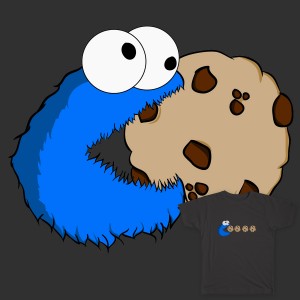
There’s that crazy Cookie Monster again! This time he’s ruining his only mode of transportation by eating his bicycle wheels! I guess it wouldn’t be the first time he ate an entire vehicle.
My rating:
This may be our only computer-drawn image in the contest, and while Cookie’s fur looks super cool, his head looks like a George Foreman grill, and his hand is just a strange furry appendage with no source, destination, or fingers.
My rating: 2
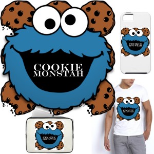
Come on, people. Where’s the creativity? Here we’ve got stock drawings of Cookie Monster and some cookies, with his mispronounced name in his mouth for some reason. Why even bother? You get no cookie, and you will go to bed without supper.
My rating: 1
That Cookie Monster has just seen what the inside of Oscar looks like, and he realizes that it cannot be unseen. That’s the look of absolute shock.
My rating: 3
Here we see Cookie Monster sharing his first awkward kiss with his cookie prom date. I make fun, but I probably did the same thing when I was in high school. With a cookie.
My rating: 2
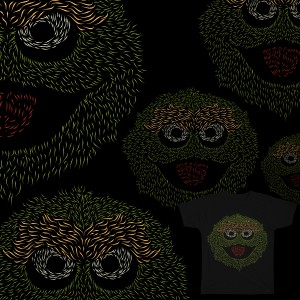
If you zoom in, you’ll see that this piece actually has a lot of detail put into it. It’s super cool looking and it gives Oscar’s face a real sense of motion. Unfortunately, it doesn’t look quite as good from far away, and that’ll hurt this piece in the long run. Bummer.
My rating: 4
When last we saw Oscar, Elmo, and Cookie Monster, they were speeding down I-80 at 95 mph in the Sloppy Jalopy. This is why monsters should always wear their seatbelts.
My rating: 1
Is Cookie Monster going door-to-door with literature about religion? Because there’s something slightly cult-like about this piece. Maybe it’s the enthusiastic support that Elmo’s giving, or the fact that Oscar is drinking the Kool-Aid.
My rating: 3
It was bound to happen sooner or later. But I guess that’s what happens when you eat nothing but sand and General Tso’s chicken.
My rating: 2
Here we’ve come to the end of another round of Threadless t-shirt entries! We’re about halfway through them all, so we still have a lot of reviewin’ to do! Head on back here later this week for more!
Click here to wonder of Oscar the Couch converts into Oscar the Pull-out Bed on the ToughPigs forum!
by Joe Hennes – Joe@ToughPigs.com

 Muppet Traffic Light
 OBP Oscar
 OTG
OTG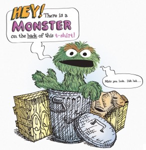 Made You Look
 Oscar the Hipster
 Grouchy Bin
 Sid Cookieface
 The Cookie Dream
 The Three Musicians
 Occupied!
 All About the Cookie
 Get Cookies
 I Am Smiling
 Return of the Cookie Monster
 Me Like to Eat Cookies
 Eat Grouch Love
 Yin and Yang of Sesame Street
 Sharing is Caring (Oops!)
 I Got You Cookie Monster
 Elmo’s Coloring Portrait
 King of the Monsters
 I Love Trash
 Me Want Cooooookie!!!
 Sir Oscar the Malcontent.
 3 Wise Monsters
 Sir Oscar
 Cookie Monksy
 Cookie Dream
 Grouchy Breeze
 Elmo Scribble
 NomNomNom
 Balance of the Street
 Trash X Mustache
 C is for Cookie
 Eyes
Eyes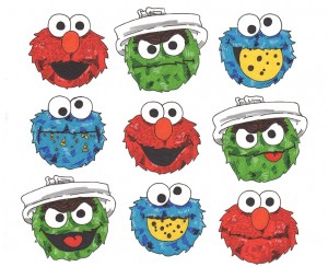 Expressions
 Can Me Have a Cookie?
 Me Love Cookie
 Cookie Buster
 The Stars
 El Grouch
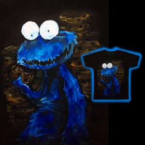 A Cookie a Day
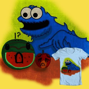 Wait! Thats Not Cookie!
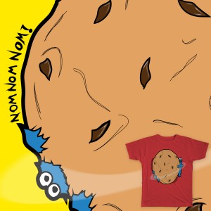 Nom Nom Nom!
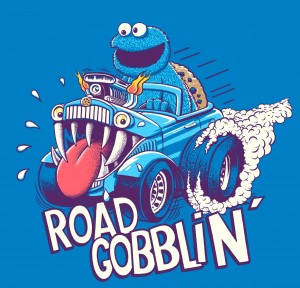 Road Gobblin’
 Drop Cookie Crumbs Here
 C is for Cookie
 Oscar’s Grungy Can
 Oscar the Wilde
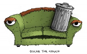 Oscar the Couch
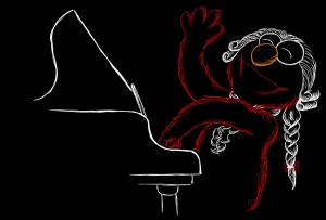 Elmozart
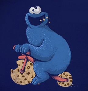 Cookie Bike
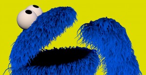 Feed Me!
 Cookie Monstah
 Nesting Dolls
 Hungry
 Oscar.
 Elmo Oscar C.Monster
 You Are What You Eat