Back in June, t-shirt company Threadless held a contest asking for artists to submit their Muppet fan art, with one (or, as it turned out, more) design to be printed and sold to the masses. And because we really love Muppet artwork around here, we painstakingly reviewed and graded over 220 entries, including some that were brilliant, some that were terrible, and some that were flat-out stolen. In the end, “Together Again” won the contest, while our pal Jamie Carroll’s “Muppetational Mosaic” took home the popular vote and was printed as well.
But just because it was a great idea, it doesn’t mean we can’t do it all again! T-shirt company Mighty Fine is holding a similar contest, and voting is already underway. Thankfully I won’t have to review as many as the last contest, as there are only 176 entries this time. (Oof.) They called for artists to submit pictures of Muppets with the theme “Adventure”, and once again, we’ll do our best to talk about every single entry.
Like the last contest, I’ll be rating the designs on a scale from 1 to 5, with 5 being the most awesomest. I’ll be ignoring the “Adventure” theme for the most part, because a good t-shirt design is a good t-shirt design, no matter what the original idea was. I tend to praise originality and shoot down ideas and images that have been used before.
Some of my reviews weren’t so universally loved last time, so apologies in advance if you’re one of the artists whose work I don’t praise. These are just the opinions of one guy, and I still salute you for putting in the work and putting yourselves out there for the world to see. If it makes you feel any better, I have next to no artistic talent myself, so feel free to insult my sketchings any time you want.
If you want to vote, you’ll have to register on Mighty Fine’s website first. It takes 30 seconds and it’s free, so why the heck not? The polls will be open from now until November 4.
Be sure to click on the links below each image to see higher-res versions of the images and to vote! And now, on with the show!
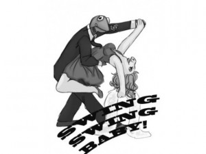
Here’s an interesting one to start us off. I like the idea of a design with Kermit and Piggy dancing, but the human-like proportions are throwing me off. If you can’t replicate the puppets’ anatomy, then I always vote for the more bizarre and interesting-looking designs. Go big (or stylized or strange or exaggerated), or go home.
My rating: 3
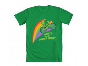
I dig this one a lot. Especially with at least two Muppet Movie references in there. One point off for that shocked look on Kermit’s face. Then again, maybe he just found an interesting way to catch flies…
My rating: 4
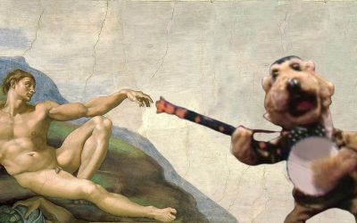
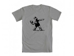
I got a little flak in the last contest for not properly identifying a Banksy reference in one of the designs. Well, I’m remedying that here. Look everyone! It’s Banksy! As a bear! Throwing a pie! Like that dude, Banksy! Except as a bear!
My rating: 4
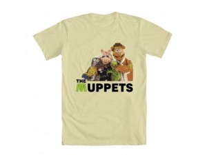
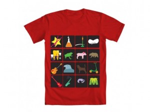
Here’s the first of what will be many Muppet photos people are trying to pass off as t-shirt designs. So, pretty much no creativity went into these. Just some cutting and pasting and hoping that people might accidentally vote for it. Also, and I’m only going to say this once: Chili pepper shirt. Ugh.
My rating: 1
Don’t tell me what I presumably know or don’t know, t-shirt!! And since when is he my Kermie? And we’re being awfully casual with the movie star’s nickname there, aren’t we?
My rating: 2
Obviously this is yet another cut-n-paste, but I can’t give it a 1 rating. I would totally buy a t-shirt with Kermit (from the US Postage Stamps) popping out of my chest Aliens-style. So, one extra point for that.
My rating: 2
Perfect. Just perfect. That’s a face anyone would obey.
My rating: 5
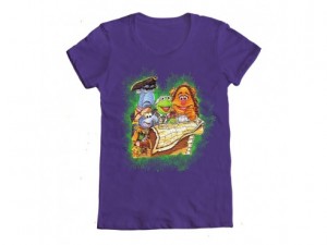
It’s a nice effort. But it’s pretty dull. Partly because we already associate Muppet pirates with Muppet Treasure Island, but also because the illustration just isn’t that great. It’s not horrible, but it’s nothing I’d watch to display proudly on my bosom.
My rating: 2
Speaking of Muppet Treasure Island, here’s one ripped from the pages of the movie’s Little Golden Book adaptation (or so I assume, based on the art). So unless illustrator Tom Brannon submitted this picture himself, I’m declaring shenanigans.
My rating: 1
I’m going to put as much effort into this review as the artist did in this design.
My rating: 2
This image made the rounds on the internet a few months ago (see the full-sized version here), so I’m glad to see it entered into this contest (by, I think, the original artist). It’s an image totally worth being immortalized ona t-shirt, the official apparel of nerds everywhere.
My rating: 5
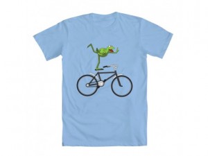
Say what you will about the iconography of Kermit’s bike ride in The Muppet Movie, but I love this shot from Great Muppet Caper so very, very much. And the artist does a bang-up job at illustrating the moment in a truly beautiful manner.
My rating: 5
This one is pretty fun to look at. I’m not sure the appeal lends itself to repeated wearings, but I like the creativity of it. If it doesn’t win, the artist should print it himself. Aside from the “M” in the bottom right corner, there probably isn’t anything trademarked by Disney. Just lots of fun, generic Muppet insinuations.
My rating: 3
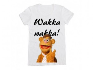
No, Fozzie. I will not give this design two points. Not only did you misspell “Wocka”, but you are on a very boring t-shirt.
My rating: 1
I was expecting something very different from a t-shirt design titled “Kermit Love“. Anyone else?
My rating: 1
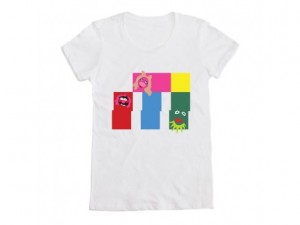
Well, this is just poor design. The characters look creepy with half their faces fading into the background (especially Piggy and her ever-present snout). The blocks have no sense of symmetry, and the one yellow block in the corner is bugging me for some reason.
My rating: 1
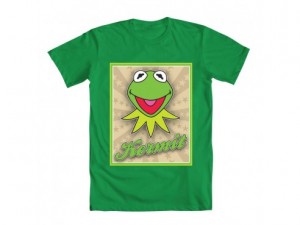
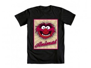
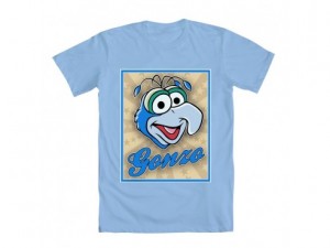
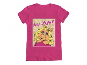
Starbursts: Kermit, Animal, Gonzo, Ms. Piggy, Fozzie Bear
I grouped these “Starbursts” designs together, because they share the same amount of mediocrity. Not a bad mediocrity necessarily. But it’s the same mundane-type of design I would expect from a real Disney shirt these days. Want a picture of Animal? We got one! Gonzo? We got one (but only one) of those too! “Ms. Piggy”? I don’t know who that is, but we got one of her as well!
My rating: 2
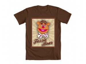
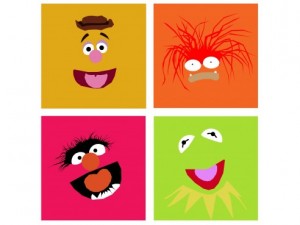
I feel like I saw a lot of these types of designs in the last contest. I get so bored looking at the slightly-Photoshopped clip art, which would probably blend into any t-shirt display as if it didn’t exist at all. Props for including Pepe, who actually lends himself to this type of design pretty okay (“…okey”).
My rating: 2
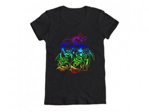
Interesting version of this well-known photo. I say “interesting” not because of the weird neon outlining, but because Jim, Kermit, and Piggy obviously come from the original picture, Fozzie was moved over, and Gonzo looks like he’s been redrawn from a coloring book or something. Still, it’s good to see that Jim made it into the contest, despite the fact that Disney doesn’t own him.
My rating: 3
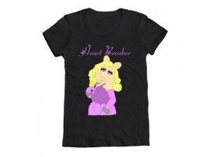
If this one were executed better (read: Stop with the Piggy clip art!), I could see it on the racks at the Disney Store. I mean, “Heart Breaker” lends itself more to a t-shirt headline than, I dunno, “Lady Pig”.
My rating: 2
Mad props to the artist for making a Crazy Harry t-shirt attempt. In a perfect world, every obscure, one-joke character will have his own shirt. From the Lew Zealands to the Muppet Newsman, from Big Mean Carl to our pal Harry here. Truly, that will be the day peace is brought to the world.
My rating: 3
This picture cracks me up. It’s a clever use of the “Adventure” theme, and can you get any further from Keanu Reeves and Alex Winters than Statler and Waldorf? The casting in the phone booth and of Kermit as Rufus is inspired. I want this plastered on the roof of my house so I can see it from space.
My rating: 5
I’m not sure if Fozzie is supposed to resemble the Ghostbusters logo, but that’s totally the vibe I’m getting here. Beyond that, I like the idea of a design with Fozzie narrowly being missed by projectile tomatoes, but I can’t say I’d spend my dollars and cents on the shirt.
My rating: 4
Here we go! Straight to the “fill bucket” in MS Paint!
My rating: 2
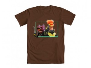
If you know me, I’m a sucker for Muppets, superheroes, and when several things I love cross over. That said, this isn’t the greatest design ever, but it still excites the nerd in me. I especially like the way Super Kermit’s collar is being blown in the wind.
My rating: 3
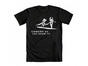
Nice work on the artist in replacing Jules and Vince’s guns with pointing fingers. Also nice work on choosing a slightly obscure Pulp Fiction quote to go with it. But something about it seems a little too obscure or too simple to be a real contender in the contest. I just hope Fozzie Bear doesn’t end up like Marvin in the back seat.
My rating: 3
For an image called “Muppets Skull Island”, it’s a little surprising to not have King Kong in there somewhere. Ignoring that, this is a cute “adventure”-type design with Piggy, as per usual, taking the “leading man” role. I’d also like to see a “Tarzan” variation on this idea. “Moi Tarzan, You Frog”?
My rating: 4
Another cut-n-paste job, this time with quotes that don’t match up to the actions in the design! Are you voting for it yet??
My rating: 1
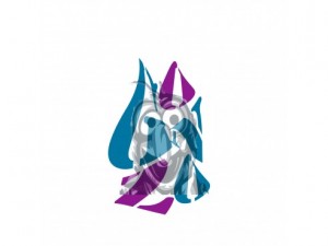
I really don’t like that Gonzo design (which we saw a long time ago). I dig the weird Gonzo font, but it also looks like Gonzo’s head is on fire. I guess that’s not a bad thing; maybe it’s a part of his act? “George fiddles while Gonzo burns”.
My rating: 2
I’d think that this design would’ve been used already in the Muppets’ “Think Green” campaign, but it doesn’t look like it. Personally, I think it’s just fair, but the design is still pretty simple and iconic, so people would probably spend some cash on it. And then, I dunno, recycle it or something.
My rating: 3
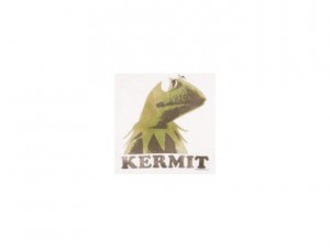
Points off for lack of hat.
My rating: 1
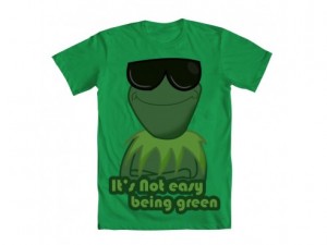
How can Kermit wear sunglasses when he has no nose or ears?? I guess he needs something if he doesn’t have any eyelids.
My rating: 3
Cute idea, but the execution is way off. What artistic style is the striped one on top? And doesn’t the hidden Kermit in the one on the bottom right defeat the original thesis of Piet Mondrian’s “Composition with Red, Yellow, and Blue”?
My rating: 2
Love the balancing Gonzo and chickens, hate the pasted heads of Kermit and Piggy in the windows. I just can’t win, can I??
My rating: 2
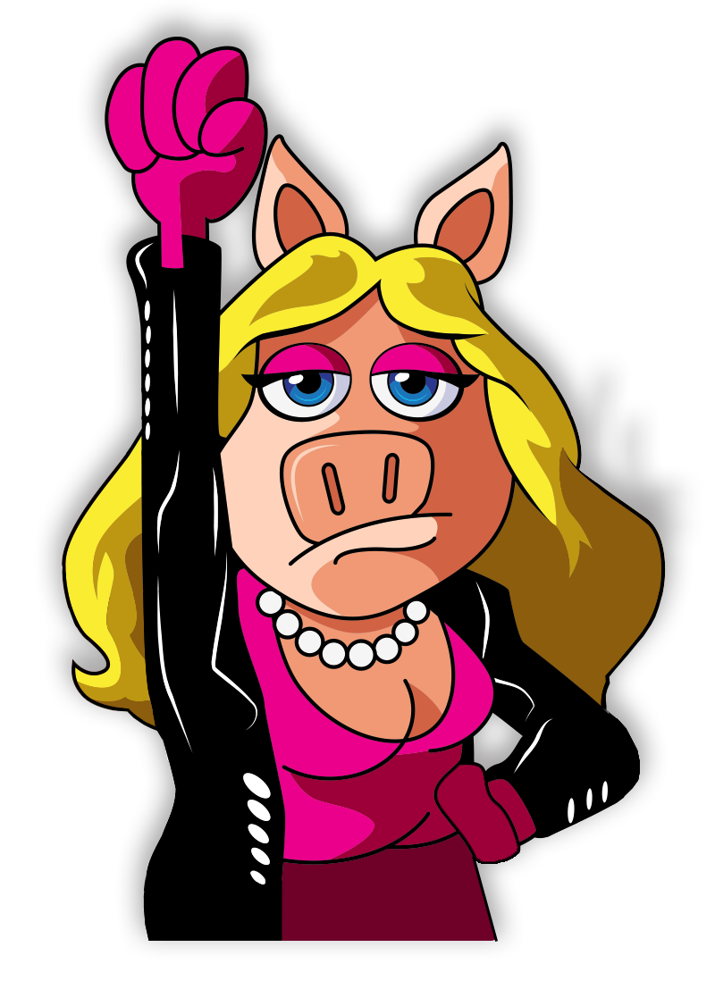
This is one of the best illustrations of Miss Piggy I’ve ever seen in a long, long time. This one has a real chance of winning, and a better chance at being bought by everyone I know. Check out the artist’s website for more pretty stuff!
My rating: 5
Nice idea for a shirt, but A) The silhouettes aren’t nearly as great as the original photo, and B) Bert and Ernie aren’t owned by Disney, so this shirt will never get made. Bummer! Especially for fans of Richard Hunt’s shadow.
My rating: 3
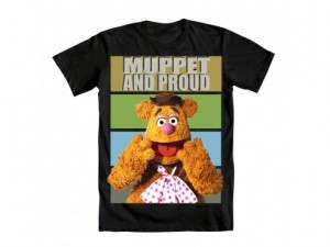
Fozzie doesn’t look all that proud to be a Muppet. More shocked or flabbergasted or amazed.
My rating: 2
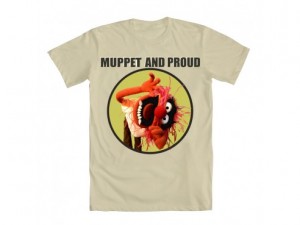
Animal doesn’t look all that proud to be a Muppet. More sideways or angry or did I mention sideways?
My rating: 2
Whenever I see this picture, I think Kermit should be laying on a bearskin rug.
My rating: 2
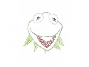
This one is like the all-text-version of the Muppetational Mosaic. At first glance, I didn’t like it, but now that I’ve spent a little time reading Kermit’s face, I kinda like it. It’s a really cute idea, and the words all have some importance to them. It’s a pretty great homage to the frog, and a better place to end today’s set of reviews!
Check back here in a few days for round 2 of the Mighty Fine t-shirt contest!
Click here to be a Muppet and sideways on the ToughPigs forum!
by Joe Hennes – Joe@ToughPigs.com
 Swing, Swing
 The Other Side
 Fozzksy
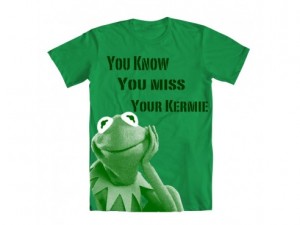 Welcome Back Kermit
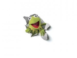 Kermit the Frog
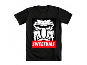 Obey Sweetums
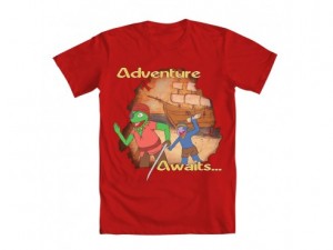 Adventure Awaits…
 New Adventure
 X-Muppets
 Ride Kermit Ride
 Literal Muppets
 Wakka
Wakka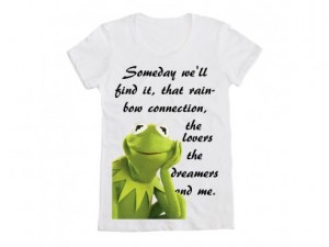 Kermit Love
 Known All Over
 Color of Laughter
 Heart Breaker
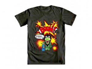 Ready, Set, Boom!
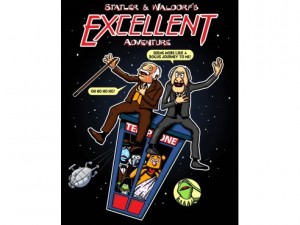 Excellent Adventure!
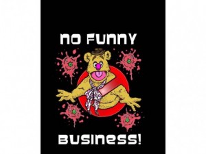 No Funny Business!
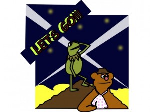
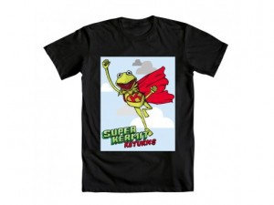 Super Kermit Returns
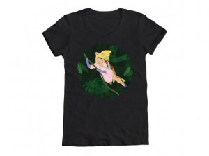 Muppets Skull Island
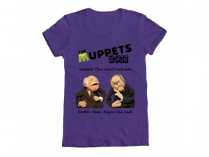 Statler & Waldorf
 Gonzo
Gonzo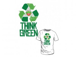 Think Green
 Kermit with Hat
 Being Green
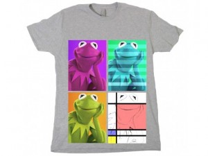 Retro Frog
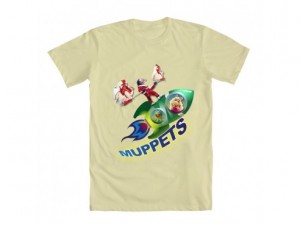 Out of Space Muppets
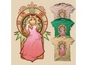 Miss Piggy Nouveau
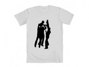
 Muppet and Proud
 Proud
Proud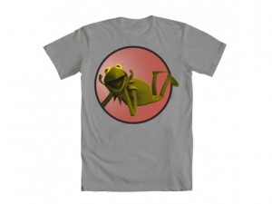 Kermit
 Kermit the Frog