Part 1 – Part 2 – Part 3 – Part 4
Today is your last day to submit your ratings for the Threadless Fraggle Rock T-shirt Design Contest (unless you’re reading this article late, which only proves why you need to be checking ToughPigs every single day). We’ve got our third and penultimate set of design reviews for your enjoyment, although we didn’t manage to get the fourth and final set out before the end of the contest. So, our apologies to those artists and readers who were looking forward to those. We’ll get them all posted in just a few days, but in the meantime, you’ll have to judge them for yourself.
Click here to submit your ratings for the Fraggle Rock designs, and enjoy the third quarter of our reviews right here!
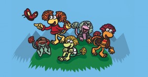
I believe there are two types of Fraggle fans: The kind that think of Fraggles as these cute, colorful creatures and the kind that think of them as members of a complex underground ecosystem. I tend to sway toward the latter, while this image is most definitely of the former. That’s a long explanation just to say that this design is very cute.
My rating: 3
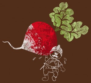
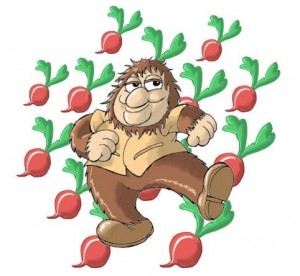
I dig the screenprinted art style in this design, and that Doozer digs radishes. Because they grow in the ground. Also because puns!
My rating: 4
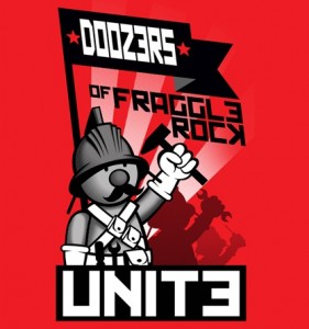
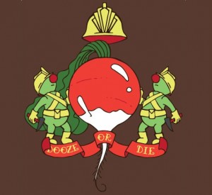
The Doozers definitely need a logo for their construction company… or, entire society, really. Okay, maybe it’s not quite so necessary.
My rating: 4
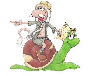
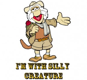
Here’s a free idea for the Jim Henson Company: A web series starring Traveling Matt as Indiana Jones. You can have that one for free. (I guess the slug is Short Round?)
My rating: 3
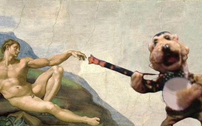
Yeah, I get that this is supposed to be like one of those “I’m With Stupid” shirts, but an outstretched hand doesn’t have the same effect as an arrow. Who knew an arrow had so much power?
My rating: 2
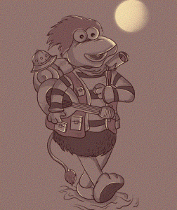
Gobo’s really let himself go, huh? Maybe it’s not that he’s looking a bit wider than normal, but that he’s got stubby little arms. Or the hat on his pack that’s obviously way too tiny for his head. Whatever it is, dude needs to lay off the Doozer sticks.
My rating: 1
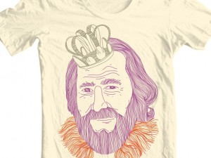
I can’t say I ever made a connection between Jim Henson and Pa Gorg, but I wholeheartedly approve of the idea of Jim as the King of the Universe. I’d vote for him.
My rating: 3
The different art styles here really show the difference between the creatures in Fraggle Rock and the monster in Outer Space. It’s a simple idea that works subtly and effectively.
My rating: 4
Our pal Ivan Guerrero does brilliant work. Like, incredibly brilliant. He made this fantastic and visually appealing parody. Look at the original and see how close it is. See what I mean? Brilliant.
My rating: Withheld, since we know the artist personally.
I wouldn’t think a picture of Wembley and Cotterpin singing a rousing duet would look so drab, but here we are, and there it is.
My rating: 1
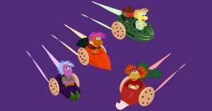
Here’s our second Doozers-as-Communists submission (with more to come). They may be a little derivative of each other, but that doesn’t mean they’re not all (potentially) fantastic.
My rating: 5
Smig is back! And he’s captured one of my favorite things about Junior Gorg: When he does a little jig. Seriously, I freaking love it when he does that. Fantastic work, Smig!
My rating: Withheld, since we know the artist personally.
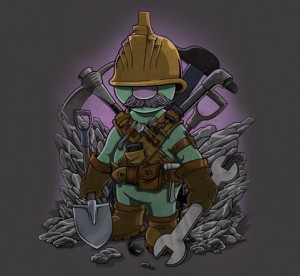
Wow, I had no idea Doozers could look so bad ass. There’s something about a gray mustache and oversized wrench that can make you scared that a 3″ construction worker could beat the tar out of you.
My rating: 5
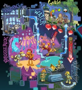
Fraggle Rock comic book artist Jake Myler has another entry, this time showing all the details of the ecosystem of Fraggle Rock (including the Ditzies!). My only complaint is that there may be too much detail for one t-shirt. And that I want a larger version of the picture above so I can really take in the whole thing. Okay, so that’s two complaints.
My rating: 5
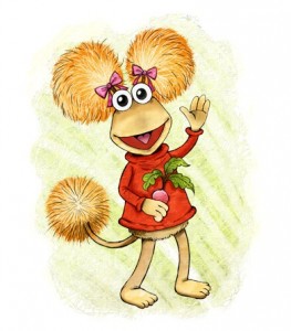
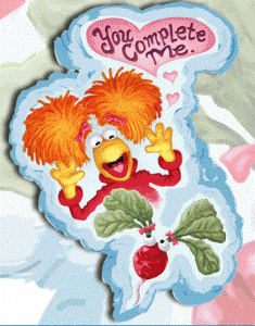
This image of Red is a little cutesy for my tastes. Maybe it’s the giant pupils or the flower-like radish or the pom-pom tail or all of the above. Yeah, probably that one.
My rating: 3
Yikes, the Fraggles are disappearing! And they’re doing it in the creepiest way! By leaving their eyeballs and hair behind.
My rating: 1
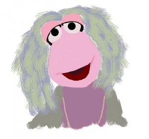
This is a nice painting of Mokey, especially when you consider that it was made by a 9-year-old. And really, the fingerpaint-esque look is perfect for Mokey, although her work would look a lot sloppier, since her paintbrush of choice is her own tail.
My rating: 3
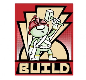
Hey, yet another Doozer propaganda poster! And I think it’s working. I have this strange urge to… build something…
My rating: 3
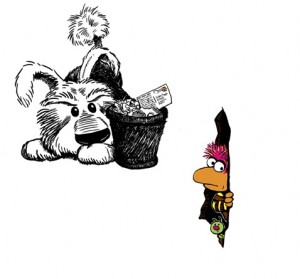
Who’s more terrified, Red or the radish or the viewer for getting stuck in the middle of this angry conflict?
My rating: 3
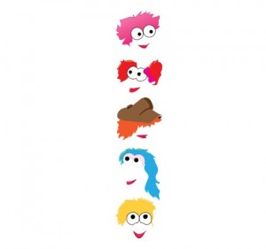
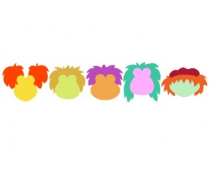
I can get behind minimalizing the Fraggle Five, but the eyeball outlines are creeping me out. Boober is really lucky in that way.
My rating: 1
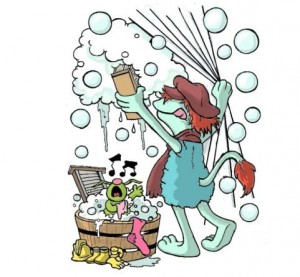
Wow, our pal Smig just keeps the hits coming! This one is particularly clever, as it looks like Boober is washing the shirt he’s on. The Doozer in the bathtub is gilding the lily, as if you’d need a reason to have a Doozer in a bathtub on your shirt.
My rating: Withheld, since we know the artist personally.
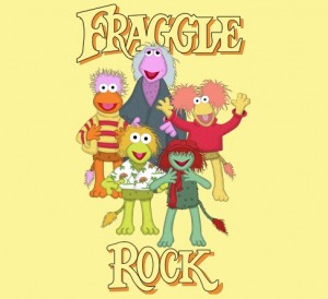
None of these images look original, and not even from the same source! Red looks like she’s been traced from a photo while Gobo looks like he’s been traced from a placemat.
My rating: 1
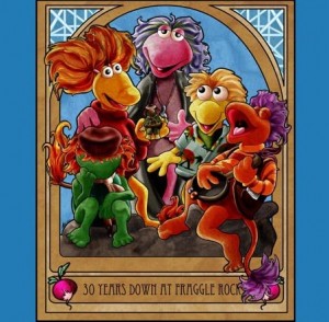
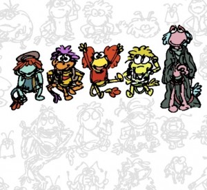
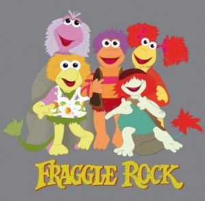
Here’s another one that was originally made for the last Fraggle Rock design contest, and I still think it’s a nice look at the Fraggle Five. The shading makes them all pop, the essence of the characters are all there, and it makes for a pretty, colorful design. It’s a Fraggle hat trick.
My rating: 5
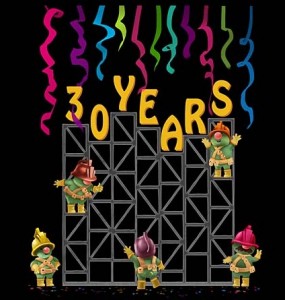
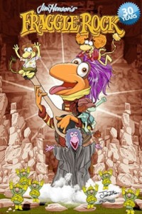
I think I’d like this one a lot more without the “30 Years” at the top. Just give me a bunch of Doozers climbing around a t-shirt and I’d be happy.
My rating: 4
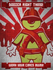
Yet another Red Doozer! Although I got my hopes up that “Doozer Right Thing” would be a parody of Spike Lee’s “Do the Right Thing“. Ah well, you can’t win them all.
My rating: 4
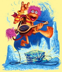
There’s been a few good variations on “rock” in this contest, and this is one of the better ones. It’s not perfect (Gobo looks a little more shocked than rocked), but he sure looks like he’s having a good time, doesn’t he?
My rating: 5
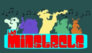
 The Mystical Minstrels / A Minstrels Logo
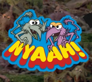
“Nyaaah!”
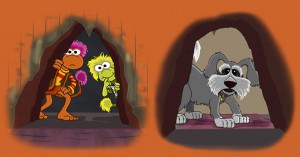
Outside, Looking In
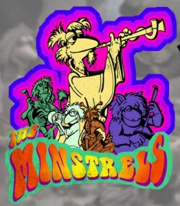
ToughPigs’ pal David Rosenberg has a few entries of his own. He’s doing the right thing by treating Cantus and the Minstrels like the rock stars they are. His picture of Philo and Gunge is another one of my favorites in this contest, as it works both for us supernerds and as a striking design. And his final design is meant to be seen with Gobo and Wembley on the front and Sprocket on the back, giving a weird, but clever, effect like there’s a giant Fraggle hole in your torso. And that’s awesome.
My rating: Withheld, since we know the artist personally.
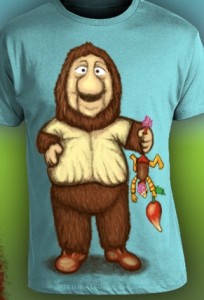 Look Ma, I Caught a Fraggle!!!
Here’s one issue with bad uploads: Some images, like this one, could be good, but we’ll never know since it’s so blurry. Or maybe Junior is just standing really far away, and we’ve got a bad zoom lens.
My rating: 2
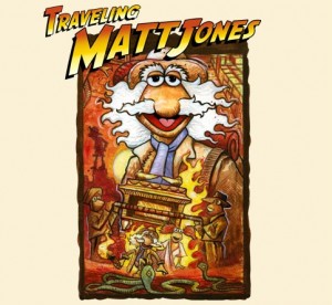
Hey, there’s Traveling Matt as Indiana Jones again! It’s a great idea for a parody, but the artist totally could’ve gone farther. How about Inkspots instead of snakes? Or a postcard instead of the Ark of the Covenant? This spoof writes itself!
My rating: 3
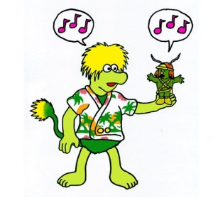
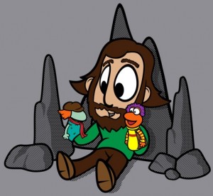
This chibi Jim Henson is kind of adorable. I like to think that the real Jim used to go into a cave to play with his Fraggle dolls every once in a while. The guy had to unwind sometime, right?
My rating: 4
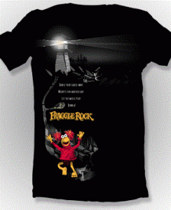
I’m guessing that the lighthouse is a reference to the British version of Doc, who lived in a lighthouse instead of a workshop. Or maybe it isn’t, and Red is just running down a hill for no real reason. It’s not always wise to assume there are reasons for things on t-shirts.
My rating: 1
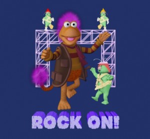
Gobo’s in 3-D! As nice as it is to see Gobo and the Doozers in the third dimension, I’d love to see them actually doing something, aside from being in mid-step. Perhaps they could “rock on”, as it were. (I don’t know what that means either.)
My rating: 3
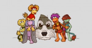
A lot of action in Fraggle Rock takes place at the Fraggle Hole, with Doc and Sprocket right on the other side of the wall. So it makes sense that so many designs in this contest take place there too. This piece doesn’t have much of that action going on, but it’s still a really pretty tableau of the Fraggles hanging around, waiting for the hairy monster to slip away. Also, tall Red is tall.
My rating: 4
I’m glad the Trash Heap, Philo, and Gunge are getting some love in this contest, but there’s something weird about seeing Marjorie with those cheekbones. She really needs to just be herself and flaunt her dirtiness.
My rating: 3
I choose Dooze. But just barely.
My rating: 2
Oh my goodness, yes. Every self-respecting Fraggle fan has at least one of these bad boys, either purchased at a yard sale or as a holdover from getting it in your Happy Meal. It warms the cockles of my heart to see them immortalized in t-shirt design form like this.
My rating: 5
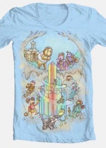
Sure, there’s a crystal palace leading down from the Gorg’s garden into Fraggle Rock. Why the heck not? Crystal palaces for everyone!
My rating: 3
I don’t even care that these guys look like they were drawn in haste. They’re adorable, and so are the other dozens of other characters flooding the background. Even that weird Fraggle bird made it in there somewhere!
My rating: 5
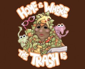
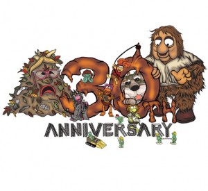
There’s a lot to be said for color schemes. The dirty Trash Heap, the brown Junior Gorg, and the poop-like “30” take up the bulk of the image, with the Fraggles and Doozers hardly visible. So it just looks old and dirty and messy in the end, as if the next step is to bury the whole thing and hope it sprouts.
My rating: 2
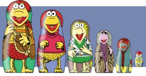
Considering the fact that we don’t know how baby Fraggles are born, I’d suggest against the idea of putting them inside each other.
My rating: 2
Guys, seriously. Stop tracing stock photos. We know you didn’t come up with the designs yourself. Unless you’re John Barrett, you don’t get a free pass.
My rating: 1
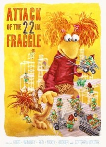
I’m not entirely sure what’s happening here. Gobo’s huge and trying to catch a snowflake on his tongue, Mokey is conducting a seance, and the Doozers are doing the Electric Slide. I’d like to see this artist tackle something else, maybe something that isn’t as much like a bad dream.
My rating: 3
And so we’ve come to the end of another Fraggle Rock art contest spotlight! Head on back here in just a few days for our fourth and final set of reviews for the Threadless Fraggle Rock T-shirt Design Contest, and if you haven’t yet, cast your votes for your favorites!
Click here to rock out to Fraggle Rock on the ToughPigs forum!
by Joe Hennes – Joe@ToughPigs.com
