Here we are at the end of a long line of Muppet t-shirt designs from Mighty Fine’s contest. It’s been a fun ride, but it had to end sometime. We’ve seen a lot of great designs, and we’ve seen even more terrible ones. And if you’ve been voting, maybe your favorite design will be available on a real honest-to-Frog t-shirt pretty soon!
Today (Friday, November 4) is the last day to vote! So be sure to register on Mighty Fine’s website and vote for all your faves. You’ll also need to register to view the correct links below, so you might as well just go for it. Double whammy!
And now, let’s finish this contest off. To the tees!
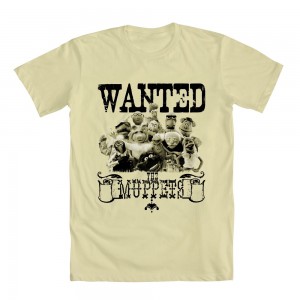
I wonder what laws the Muppets broke that would result in their being wanted on an old timey poster. Did one of Gonzo’s chickens file a sexual harassment suit against him? Did the Muppet Show Theater’s building violations finally catch up to them? Just how many parking tickets does the Swedish Chef have???
My rating: 2
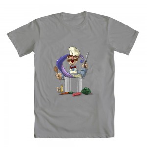
I like this design because something is actually happening. It’s not just an image of the Swedish Chef standing around or pretending to smoke a joint. He’s dangerously close to… well, danger. And more importantly, he’s close to something funny. No matter how vague all that sounds.
My rating: 4
And the award for laziest t-shirt design ever goes to… meh. Whatevs. Bleh.
My rating: 1
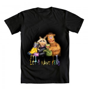
So, the Muppets are simultaneously fading away and melting, with their multicolored drippings spelling out “Let’s Have Fun”, as if they’re a spooky message from beyond the grave demanding that you leave the haunted house your dearly departed great uncle left you in his will. Man, my version is so much better!
My rating: 2
Second prize for the laziest… you know what, forget it.
My rating: 1
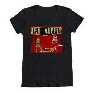
What makes this one funny to me is all in the details. Kermit’s jaunty coat, Piggy’s seductive fan, the strange use of a swingset, Piggy’s awkward (and most likely uncomfortable) sitting position. It may be funny, but it sure isn’t very pretty.
My rating: 3
I like the joke that this design seems to be telling. But it seems like something is missing, and it took me a while to figure out that it’s “everything else”. The joke is present, but there’s a lot of white space without any reason for it. Maybe the pictures need to be larger, or maybe there needs to be more detail in the images on the right, or possibly something in the background. In any case, the vast emptiness of this design is going to hold it back more than the stock photos and animal outlines.
My rating: 3
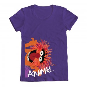
Man, people really like that sideways-Animal photo. I wonder if any of them wish there was some sort of mysterious right-side-up Animal photo they could repurpose for a lame t-shirt design.
My rating: 2
What a great and simple concept: Show the Muppets in some of their more recognizable modes of transportation! I’ve got a few suggestions for furthering the theme: The chickens in the motorboat from “Muppets Take Manhattan”, Rowlf’s pedal-powered piano from “Dog City”, Robin riding on Sweetums’ head… Okay, maybe this design is good enough as it is.
My rating: 4
I’m trying hard to overlook all the reused stock photography in this contest, and this one helps with that challenge. It’s a pretty clever design, and a worthy use of the pre-existing images. In fact, I doubt this concept could’ve worked without the photos, seeing as it’s supposed to be a film reel. I’m happy for exceptions to the rule!
My rating: 4
Listen. I don’t want to have to claim that this idea was stolen, but THIS IDEA WAS TOTALLY STOLEN! From none other than ToughPigs’ own Smig! (See the original right here.) Okay, so it’s conceivably possible that more than one artist saw the similarities between “Beaker” and “Beiber”, but I’m just gonna have to side with our guy. Sorry, random Mighty Fine contest entrant!
My rating: 3
This design is SO CLOSE to being amazing! The fur, the hat and the necktie are all perfect. But why did the artist have to misspell “Wocka”??? There’s nothing funny about that.
My rating: 3
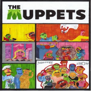
This looks like it should be the most action-packed comic strip ever, but I’m having a little trouble following the story. Which one is Little Orphan Annie?
My rating: 2
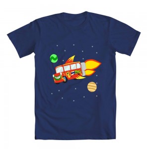
If you made a list of “famous buses”, The Magic School Bus and the Electric Mayhem bus probably come right between the bus from “Speed” and the one from the final scene of “The Graduate”. I’m a little surprised that no one ever thought to mash them up before. And Dr. Teeth and Ms. Frizzle have the same fashion sense too!
My rating: 5
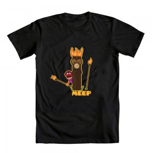
Animal and Beaker don’t really share a lot of screen time (Leprechaun Brothers aside), so it seems a little odd to me to see them paired up. Though maybe they should be together a little more often, since Animal is a tornado of destruction and Beaker is a magnet for the same. That said, the potential relationship I mentioned doesn’t really come across in this design. Though I do worry for everyone involved if Animal gets his hands on a tiki torch.
My rating: 3
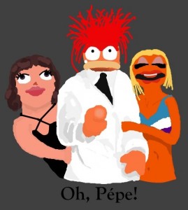
I love everything about this illustration. Pepe is a giant! And he has a James Bond-esque harem of ladies, including the all-midriff version of Janice and the rarely-seen Wanda. And the “Oh, Pepe!” text just clinches everything you could possibly want to say (or to be said to you while wearing this shirt). Okay, so it’s not really all that good. But man, I want it to be.
My rating: 3
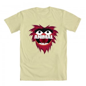
In case you didn’t know who Animal is, he’s the guy with his name plastered across his upper lip.
My rating: 2
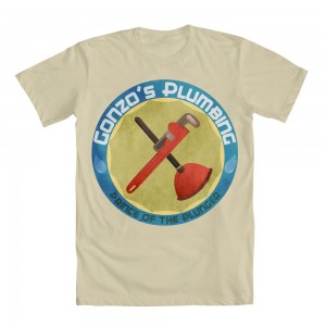
Who said a Muppet shirt has to have Muppets on it?? I would proudly buy and wear a design with the logo of a Muppet’s side job on it. And if it’s a logo for Gonzo’s plumbing business, then that’s all the more reason to get this made.
My rating: 5
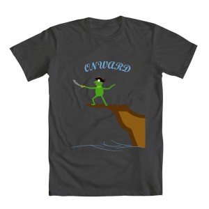
What, you haven’t always wished for a t-shirt with Kermit sword fighting the expanse beyond a cliff dropoff?
My rating: 2
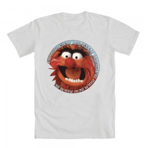
Did Animal take a bite out of his own face?? I suppose it was only a matter of time before his animalistic hunger became metatextual.
My rating: 2
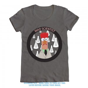
Here’s another example of a mediocre design that I can see Disney actually selling. A lot of people relate to Bunsen and Beaker for their love (and abuse) of science, so why not give those nerds a few things to wear on their upper bodies to advertise that fact?
My rating: 3
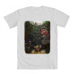
This is the sort of design I expected to see a lot more of with the “Adventure” theme. And aside from Piggy’s weirdly-shaped head, it’s not bad. Kermit in particular is looking particularly three-dimensional. The downside is that you can replace the Muppets with literally any characters and it would stay the same. There’s no humor or characterization beyond “Hey look, it’s Gonzo!” So, neat design, but not very Muppety.
My rating: 4
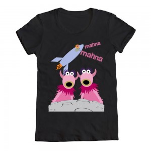
I want to hate this design for the sheer randomness of putting these abstract characters in outer space, but I’m tickled at the idea of the expanse of such a simple song/skit. Mahna Mahna keeps going further from the Snowths so he can sing his song (from the back of the room to off-site via telephone, to the restaurant down the street, to another city, to another country, to another planet). The possibilities are limitless, well beyond the confines of Sandra Bullock’s therapy office.
My rating: 4
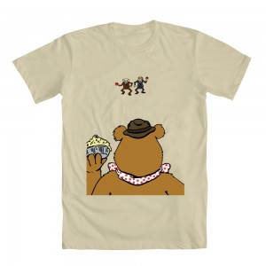
My first reaction to this design was, “Uh oh, something’s about to happen.” And that’s a great thought to have when looking at any picture of the Muppets. Enough of the posers and smiles and dead stares straight ahead, give me some action (or better yet, the promise of action, much like this one). My only complaint is that the main focus of this piece is the back of Fozzie’s head, which isn’t the most interesting thing to look at. But really, I want this shirt to be made if only so I can see how the story ends.
My rating: 4
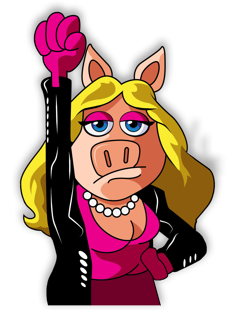
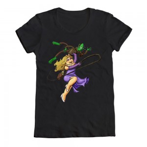
Cute twist on an old classic! Miss Piggy is so far from “damsel in distress”, and I’m sure she’d feel much more comfortable in heels and a whip. (Not in that way, you sicko.)
My rating: 4
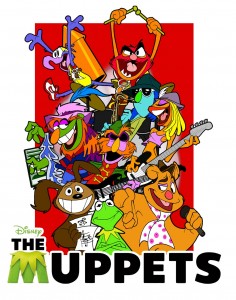
Here’s one by Muppet comic book cover artist Dave Alvarez. I can’t see any reason why he shouldn’t be allowed to submit an entry, just because he’s worked as a professional Muppet artist in the past. In fact, I’d encourage him to submit more designs, especially if it means we get entries like this. Alvarez really gets the characters, and he gives them such expressive faces. I want him to design my entire wardrobe.
My rating: 5
If you don’t hear the whistling theme song of “The Andy Griffith Show” in your head right now, you probably have no soul. Y’might wanna look into that.
My rating: 4
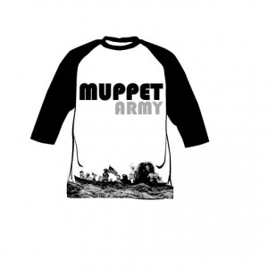
The higher-res version of this design is not very hi-res at all. So it’s a little too tough to tell what it is and how good it looks. In any case, I don’t think I’ve ever seen a t-shirt design that’s focused on the bottom hem of the shirt. And maybe there’s a reason.
My rating: 2
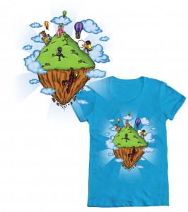
At first glimpse, this shirt doesn’t look Muppety at all. Sure, it’s pretty, but you’ve got to get pretty close to the person wearing it to see the gang rock climbing on one of the floating islands from “Avatar”. Still, it’s a neat-looking design, so I can’t fault it for much.
My rating: 4
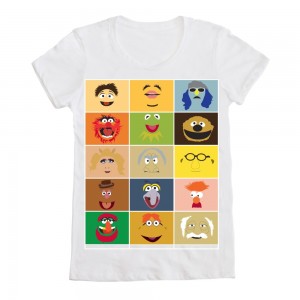
I feel like we saw a half-dozen or so designs just like this one back in the Threadless contest, but it’s still neat to see. Especially with the inclusion of Walter. But I’m also curious as to how the artist chose the placement of the characters. How did Piggy get relegated to the left side, rather than one of the more central squares? Statler and Waldorf are far from symmetrical. And Janice gets one of the most visible spots. I admit, these aren’t really valid complaints, just mild curiosities.
My rating: 3
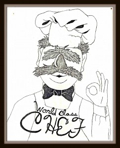
My, what fancy handwriting the Swedish Chef has! And slightly off-kilter, just like the Nordic cook himself.
My rating: 3
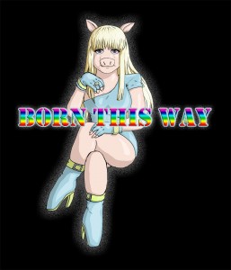
Ugh, enough with the Gaga. But more importantly, enough with people slapping a pig’s head onto a human body and calling it “Miss Piggy”. Because Piggy it ain’t.
My rating: 2
For the love of Jim, how many times have we seen t-shirt designs with Animal’s head accompanied by a little bit of text? It’s not only lazy, but it’s uninspired and trite. And stupid and horrible in bed and possibly anti-Semitic.
My rating: 1
I don’t know why Statler and Waldorf are on fire, and I don’t care. This shirt makes me laugh and it makes me think and it makes me suspect that a certain bear might be guilty of arson.
My rating: 4
Another fun image of the Muppets, y’know, doing stuff! The action is great here, with Piggy at her finest and the rest of the gang in hysterics. It’s a chase scene worthy of a quality t-shirt.
My rating: 4
I can overlook the strange shape to Kermit’s head. But what I can’t get over is the fact that it looks like it says “Uppets”. I mean, that’s a capital “U”, right? I’m not crazy!
My rating: 3
It’s true what they say. The airlines really don’t treat you well in eighth class.
My rating: 3
What??? Kermit, Fozzie, and Gonzo riding a dinosaur???? Why am I not wearing this shirt RIGHT NOW?? And last week. And tomorrow. And until Doomsday.
My rating: 5
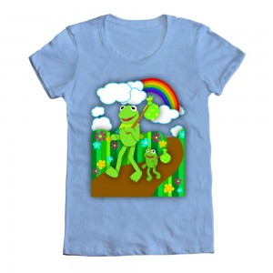
I have seen this picture roughly 500,000 times, but I don’t think I’ve ever seen one with Kermit’s feet submerged in the swamp water like that. But sorry, it’s not enough to get me to give it a higher vote.
My rating: 2
If I had a magic genie, I might consider wishing for a t-shirt with a picture of Kermit and Fozzie from Movin’ Right Along on it. But it it was a vengeful genie, he’d probably give me something like this one. And then I’d probably wish for more wishes.
My rating: 1
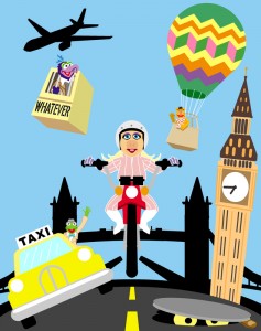
This is beautiful. What a great homage to The Great Muppet Caper. There’s also a great balance to the image, with Fozzie and Gonzo offsetting each other, and Kermit riding opposite Big Ben. Sweetums (who, of course, I thought was Oscar at first glance) is a fantastic touch. I wish we could end the contest right here. But there’s just one more entry…
My rating: 5
You know what? No. I give up.
My rating: 1
Many thanks to Nicole Campos at Mighty Fine for all her help! And double thanks to everyone who submitted a design and had to read all the horrible things I might’ve said about your work. Also, y’know, sorry about all that.
Click here to ride a freaking dinosaur on the ToughPigs forum!
by Joe Hennes – Joe@ToughPigs.com
 Muppets Wanted
 Chef Muppet
 Muppets Steppum
 Fun With Muppets!
 Muppets Smile
 TMS
TMS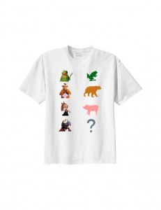 Who’s What
 Animal
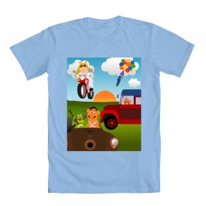 Getting There
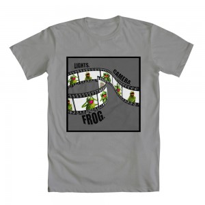 Lights Camera Frog
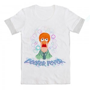 Beaker Fever
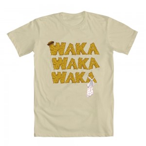 Waka Waka Waka
 Muppets Comic Strip
 Magic Mayhem Bus
 Totem Trouble
 Oh, Pepe!
 I’m an Animal
 Plumbing Artiste
 Onward!
 Eat.. um Beat Drum
 Beaker the Mad Scientist
 The Lost Treasure
 Mahna’s in Space
 Showdown
 My Hero
 Muppet Toons!
 Road of Happiness
 Muppet Army!
 Adventure in the Sky
 Simply… Muppets
 World Class Chef
 Born This Way
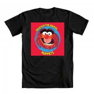 Unleash the Animal
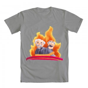 Tied Up
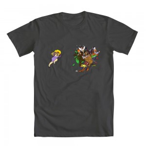 A Pig’s Fury
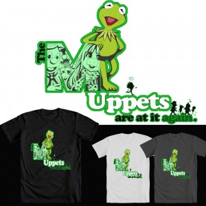 Their At It Again
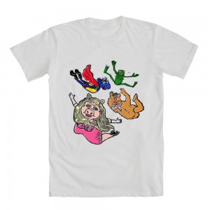 Geronimo!
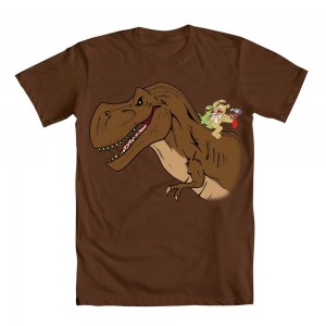 Mesozoic Muppets
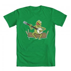 Songs About Rainbows
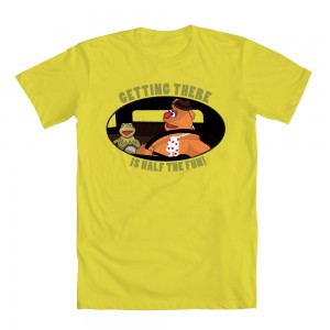 Getting There
 Muppets Adventure
 Gonzo Nose