Before you get your hopes up, you should know that the Threadless contest has ended. Voting is closed and the winners are being debated on in the underground lair of the villainous Threadless Legion, who get final say on which t-shirts will be produced.
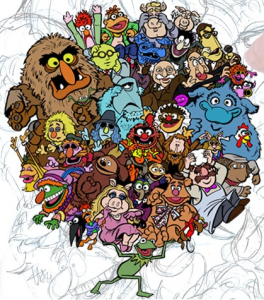
Congrats to Jamie Carroll for winning the popular vote with his fantastic “Muppetational Mosaic” piece! See all of the top winners on the contest home page.
And now, let’s move on with the penultimate segment of our Threadless contest saga!
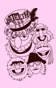 Dr. Teeth and the Electric Mayhem
This must be from the same person who did the “Hey, Hey We’re the Muppets” submission from part 5. The characters are still looking way too flat for me. And for a piece of artwork based on three-dimensional puppets (not to mention three-dimensional characters), that can be a pretty big fault.
My rating: 2
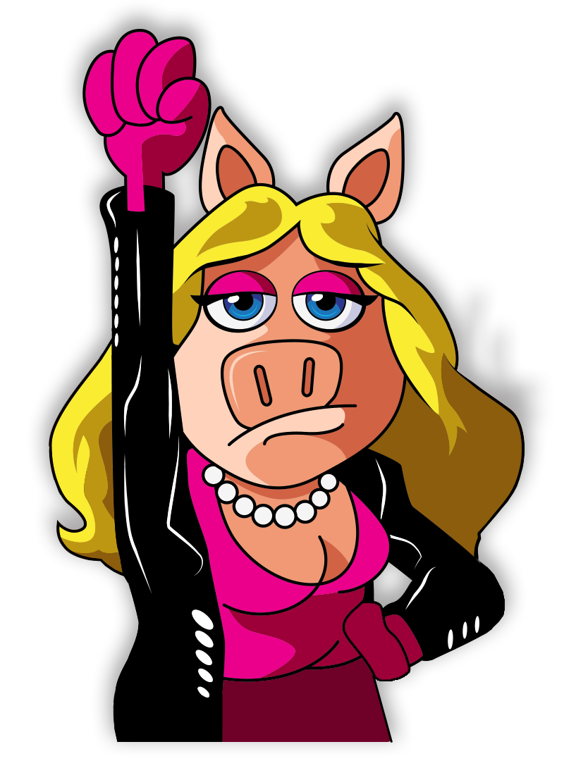
Blurg. All I can see are stock photos (see: Swedish Chef, Rowlf, The Electric Mayhem), poorly drawn characters (see: Sweetums), a strange amalgamation of current and Muppet Babies designs (see: Gonzo), and whatever Miss Piggy is supposed to be.
My rating: 1
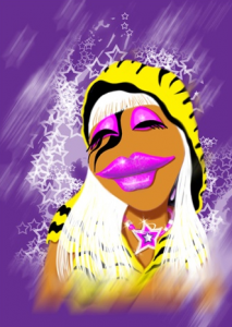
If you’re gonna do a Lady Gaga pastiche, you might as well go all out! I love the style of this one. You can almost taste the airbrushing. And Janice does a pretty mean Gaga impression. She’s got a pretty good Poker Face (mainly because it’s comprised of just lips and eyelids).
My rating: 4
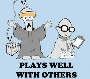
It’s interesting how Baby Bunsen is the most represented Muppet Baby in this contest. This image is cute, but it would work just as well with the characters as adults. Though I’m not sure if it would make it any more clever. In any case, I don’t know if I need to see a baby about to get electrocuted.
My rating: 3
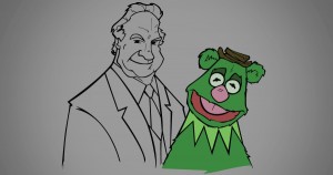
This is another one of my favorites in the entire contest. I love it when someone takes a one-off joke from a Muppet production and expands it into something larger. The “Kermit and Fozzie’s Dad” joke never fails to make me laugh, and it’s fantastic to see it immortalized in fan art form. I wonder whatever happened to that Kermit/Fozzie hybrid puppet…
My rating: 5
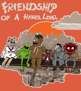
If only Miss Piggy and Fozzie didn’t look terrible, this could be an interesting image. It would also help if something funny was happening, but as it is, it’s just some Muppets sitting on a rail above the city. Perhaps if someone was plummeting. Any volunteers?
My rating: 2
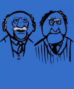
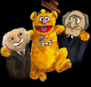
This drawing is terrible! It’s simple and it looks like it was (intentionally) drawn in haste. I guess like the use of white in their hair and how the line work makes them look older. And maybe all that simplicity is pretty good. Okay, maybe it’s not so bad. Yeah, I kinda like it. More!
My rating: 4
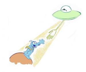
So, Gonzo lives on a Little Prince planet? I guess that’s no stranger than some of the other theories out there. And I’m not sure if I should be weirded out by the Kermit-eyed UFO or if I should take it as a representation of the relationship between the two characters. Well, I know how I should interpret the picture, but that’s not necessarily the way my brain is gonna work.
My rating: 3
More simple Muppet designs! But oh my goodness, how creepy are they without eyeballs! SO CREEPY! That’s how creepy. I mean, what will they use to make their magic triangles???
My rating: 2
Me thinks this is the same artist as the one above, as the outlines of the characters are too similar. In any case, this is decidedly less creeptastic, though a little too simple (thematically, this time) to make any waves. Maybe if he added a couple dozen Muppet heads, then his “Circle of Muppets” idea would come across more clearly.
My rating: 3
One thing I like about this idea is that some of the characters are sharing lines (for example, the side of Beaker’s head is the same line as Sam’s neck). If that idea was taken to a deeper degree, then that might’ve been a great metaphor for the interconnectivity of the Muppet family. But as it is, it’s just kinda dull and forgettable.
My rating: 2
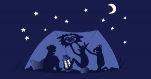
TOPO STICKY! On a t-shirt!!! That would pretty much make my year. Topo Sticky is the best. I’m not even looking at the right half of this design. Is there someone else there? I don’t know, because all I see is Topo Sticky. TOPOOOOOO!
My rating: 3
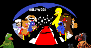 With Big Dreams, Comes “Green”
Grover + Cookie Monster + Barkley + Disney contest = This design has no chance. I mean, not that it had any chance to begin with.
My rating: 1
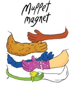
I’m gonna go ahead and ignore that little pointy collar bracelet Kermit is wearing, if only so I can make a feeble attempt at actually rating this design on its merits. I like the idea of the t-shirt wearer being hugged by the Muppets, but the “magnet” part is a bit unnecessary. I’m also curious as to how the characters would be positioned on the other side of the shirt. Must be pretty crowded over there.
My rating: 3
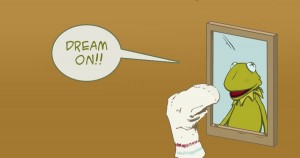
Normally I’d roll my eyes at yet another “Don’t forget that your pal Kermit is actually a puppet!” reference. But the “Dream on” word balloon makes all the difference. It turned a mediocre idea into a message of hope and finding the potential in the ordinary. And who knows, maybe that sock will grow up to be everyone’s newest favorite Muppet someday!
My rating: 4
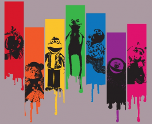
I like the color choices and the dripping paint, but bleh to more stock photos! And double bleh to the use of the Palisades Scooter figure. At least this one made an attempt at something new by using the Kermit poser from the poster for the new Muppet movie. In the end, this would’ve been a contender if it had only used some original sketches.
My rating: 2
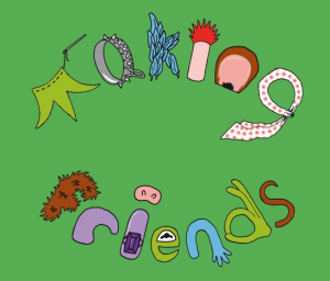
Cute idea, and a nice play on words. Though I can’t say I’m not a little bit disturbed at the idea of making Frankenstein friends out of felt, pig snouts, and neckerchiefs.
My rating: 3
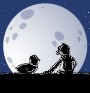
Aw, Gonzo loves Camilla! But why are they sitting so far apart from each other? Did Camilla catch Gonzo canoodling with another chicken? Again??? I know, I can’t tell those chickens apart either.
My rating: 3
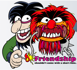
Here’s another interesting pairing I’m not sure we’ve seen before. But it almost seems like a no-brainer. Crazy Harry likes to blow stuff up, and Animal probably wouldn’t mind being in the middle of an explosion every now and again. The positioning of the characters is a little off. Maybe if Harry was a little further away from Animal, or if either of them had torsos. Torsos are where it’s at!
My rating: 3
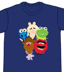
Ah, this is more like it! Every character has a little something going on with the expressions on their faces. There’s a great mix of familiar and obscure characters, including Jim and Walter. And the “Atlas” reference is a nice touch, not to mention appropriate for Muppet Show emcee Kermit the Frog to be holding his friends and employees up, no matter what the strain on his poor froggy spine.
My rating: 5
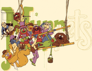
One thing I can never get enough of is seeing the Muppets try to create something meaningful and then fail miserably. This piece has potential to capture that feeling, but doesn’t quite make it. Half of the characters are having trouble painting the mural, but the other half is just mugging for the camera. And I have no idea where Rowlf’s lower half is.
My rating: 2
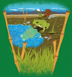
This one harkens back to the “Dream On” design, but substituting frogs for puppets. I like that concept a lot, and it makes for a pretty shirt in this case.
My rating: 4
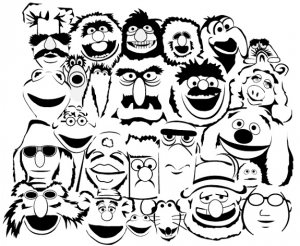
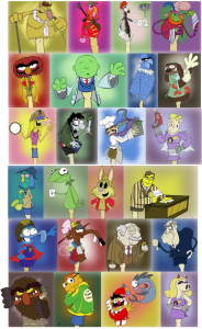
I like these designs a whole lot, and any one of them would make a fantastic shirt. But put them all together and it ends up feeling crowded and unfocused. I think they could be used best as trading cards. Y’know, if anyone out there actually buys trading cards anymore.
My rating: 3
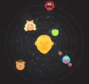
I am tickled at the idea of Planet Gonzo’s chicken moons. Without that, this image would just be a bunch of Muppet heads circling Jim’s god-like face.
My rating: 3
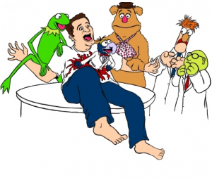 In Space, Nobody Can Hear You Laugh
Okay, let’s run down the list of disturbing things in this picture! 1. Gonzo is still an alien, despite low Muppets From Space ticket sales. 2. Kermit seems way too happy to be seeing Gonzo as a bloody mess. 3. That guy looks a whole lot like a shoeless Jason Segel. 4. Hey, where are that guy’s shoes anyway??? 5. Oh yeah, and I guess Gonzo bursting out of the guy’s ribcage or something.
My rating: 1
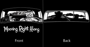
I would buy a two-sided “Moving Right Along” shirt in a heartbeat. It’s a great concept, and an even greater song. But two things need to be changed in this design. First, Kermit and Fozzie need to be rendered a little better so it either looks photo-realistic or like an original design. And second, the artist needs to learn how to spell “Moving”.
My rating: 2
Kermit has been such a showoff ever since his hands got run over by that steamroller.
My rating: 2
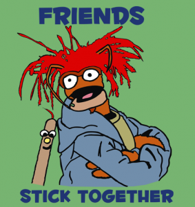
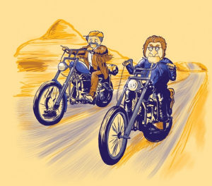
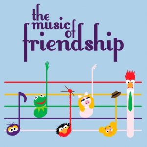
As a design on its own, this one is just okay. But taking the “friendship” theme into consideration, this illustration takes the cake. Only in the magical world of Threadless can Fozzie Bear get all buddy-buddy with his hecklers. Frog bless us, every one!
My rating: 3
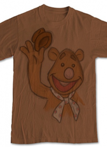
I want it. Someone make this shirt and sell it to me. It’s so off-model, yet recognizable! And did I mention that I want it??
My rating: 4
The idea of Kermit taking a group photo is a solid one. But the tracings of Muppet stock photos are just too sloppy to consider. Clean it up and you’ve got a great design on your hands.
My rating: 2
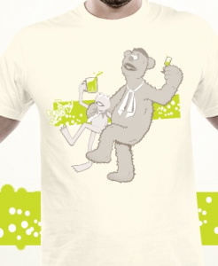
How does Kermit drink with such a teeny tiny mouth? Oh I see, he has a straw. Questions answered!!
My rating: 2
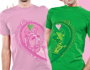 Love Between the Pink & the Green
Awww, what an adorable concept! But I guess you’d always have to stand on the right side (or left, if you’re the other one) of your significant other. And I guess you’d have to coordinate your wardrobe for the day. And then you’d be that couple!
My rating: 4
I’ll bet you didn’t know that this was how Statler and Waldorf got to the Muppet Show theater every day, did you??
My rating: 3
I believe Kermit had a question. Yes, Kermit? Fozzie, no hats in school. And Beaker, sit down unless you have enough green ties for everyone in the class.
My rating: 3
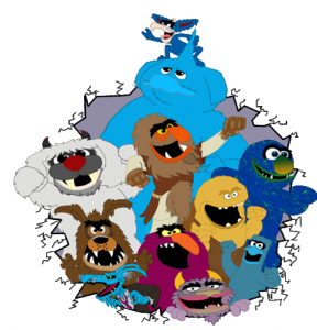 David Rosenberg Bonus – Party Like a Mon-Star!
Our pal David Rosenberg submitted this entry to the contest, and wow, he really draws a good Muppet monster! He makes me wish we had a Muppet monster Saturday morning cartoon. Because seriously, who wouldn’t love to watch that???
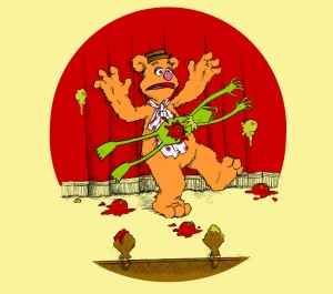 Dan Romens Bonus – The Frog Really Stuck His Neck Out That Day
This brilliant piece comes from ToughPigs forum member Dan Romens. And as you can see, Dan knows exactly how Kermit feels about Fozzie, despite the fact that tomato stains are really hard to get out of felt. I adore this piece, and I’m really glad Dan could share it with us.
Stay tuned for the final segment in our Threadless contest coverage, coming soon!
Click here to stick your neck out on the ToughPigs forum!
by Joe Hennes – Joe@ToughPigs.com
