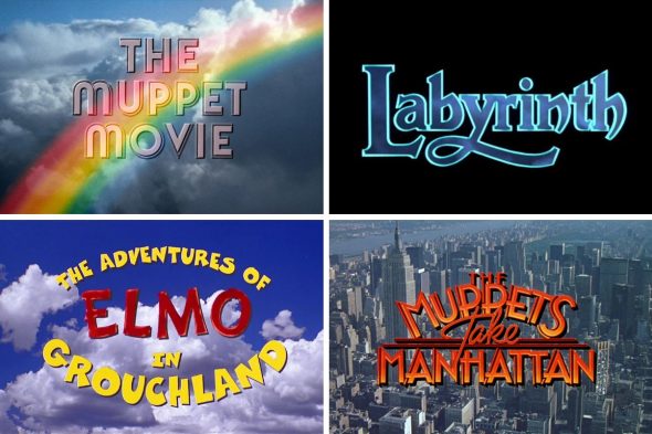
Ah, the movie title card. It lets you know what film you’re watching, and often helps to set the mood. It’s an artform that doesn’t get celebrated as much as it ought to. Why am I musing about title cards? Recently, a Twitter post from user Film Updates caught my eye:
It got me, as most things do, thinking about Muppets. Their movies all have title cards, and most of them are pretty neat! But which is the best of the best? Which set the mood while also looking good? And where do the “Sesame Street” movies fit in, not to mention “The Dark Crystal” and “Labyrinth?” Worry no more about these questions, because I’m here to worry about them for you! (There are much more important things for you to worry about. I’ll worry about movie title cards, you worry about saving the planet, deal?) I’ve put together the 100% definitive ranking of Muppet, Sesame Street, and Jim Henson-era movie title cards, from worst to best. No need to ask anyone else’s opinion, this is the only list you’ll ever need. Now let’s get to it!
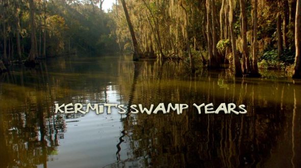
16. Kermit’s Swamp Years
Well, you had to know we’d put this last. The font looks like something you’d get if you searched online for “swamp font.” The background isn’t awful, but the murky green doesn’t look quite as inviting as it did back in 1979. Worst of all, it just doesn’t capture the energy of Kermit the Frog. That being said, it does capture the mood of the film, which is “bad.”
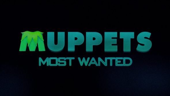
15. Muppets Most Wanted
According to Muppet Wiki, after filming had wrapped, the title was changed from “The Muppets… Again” to the title it has now, and wow, does it look like it. The subversiveness of the “Muppets” font is completely undercut by the video screen aesthetic. It honestly feels like I could slap this together on my home computer if I had a free evening… and visual effects training.
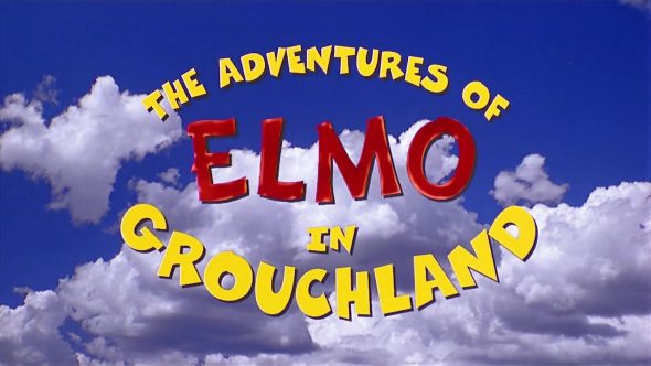
14. The Adventures of Elmo in Grouchland
I know the title isn’t actually written in Comic Sans, but this is the Comic Sans of movie title cards. I know this is a “Sesame Street” movie, and it’s aimed at kids, but this feels more saccharine than it should. Woof.
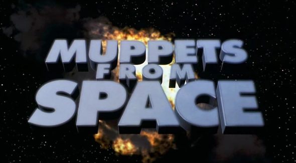
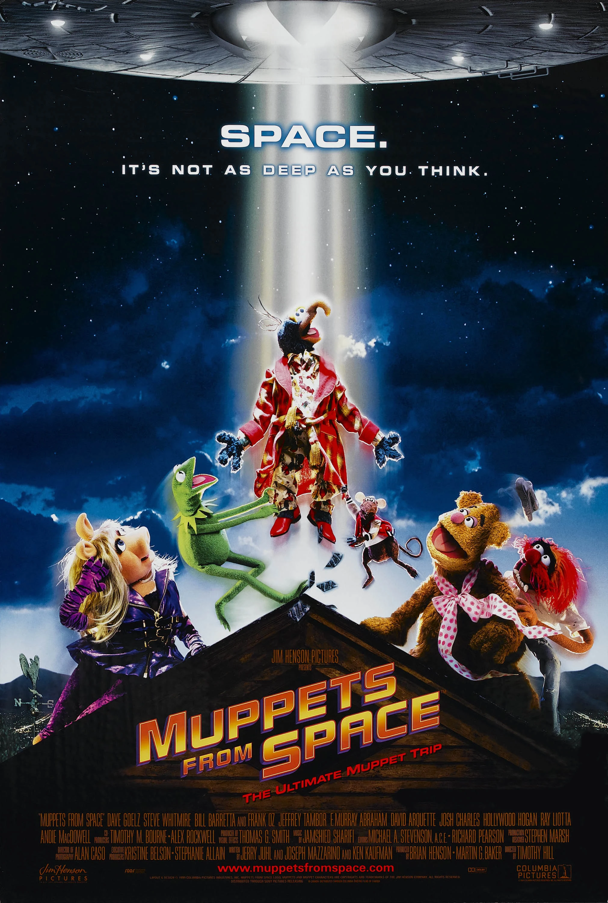
13. Muppets from Space
And we follow the previous title up with its fellow 1999 release. Did they get a two-for-one deal at the underwhelming title store? Still, despite it looking more like a warning sign than a title, it at least has a cool space background, which helps elevate it above those lower on the list. It’d be much higher up if they had used the title design from the poster. Now that says fun, excitement, and the best performance Bobo’s had yet.
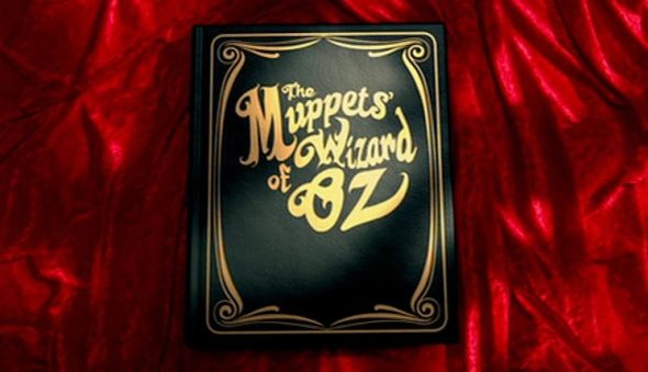
12. The Muppets’ Wizard of Oz
The first movie the Muppets did after being purchased by Disney, I can appreciate them borrowing the storybook title as a way to pay homage to the legacy of their new home. I also love how the border of the book resembles the proscenium of a stage, as if to subtly remind us that the Muppets are actors playing the characters that L. Frank Baum created. If only the rest of the movie was as good.
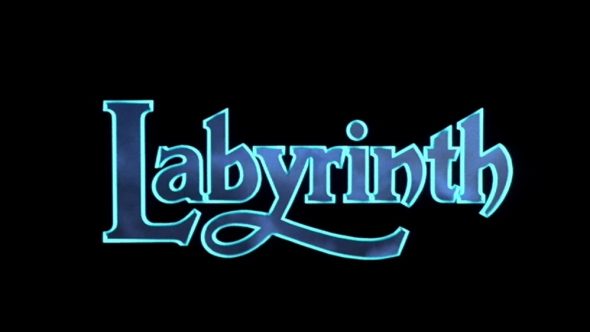
11. Labyrinth
This is the point where I remind folks that just because the title isn’t highly ranked doesn’t necessarily mean that the movie is bad. “Labyrinth” is a fantastic journey with memorable creatures and a killer soundtrack. And the opening titles are really good with its CGI owl flying around in the darkness. But for whatever reason, the title card itself doesn’t feel as epic as the movie deserves. The owl flies by, which triggers a ripple effect that reveals the title shimmering. But it’s just… there. It sort of feels neutered in a way. Maybe if it were bigger, it would be more impressive. Still, the film makes up for it.
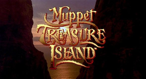
10. Muppet Treasure Island
The design of the title is beautiful, but the shortcoming here is the choice of color. The tan and brown gradient gets washed out in the golden sunset. I think if they had stuck with the white and red of the rest of the credits, it would’ve better offset the shot. Thankfully, the sun is quickly blocked by the rock formations as the camera pulls back. Making it the color of an old treasure map is a clever idea, but the execution isn’t spectacular. Far from the worst, but also far from the best.
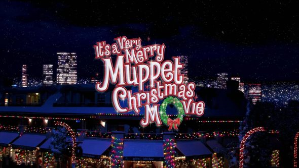
9. It’s a Very Merry Muppet Christmas Movie
I have to say, I was not expecting to rank this title card this high, but it does earn respectable marks. We get the buzz of a cityscape decked out for the holidays, matched with an appropriate font for the magical theme. It definitely caught my attention. This is one title I’m glad was created, no need to show me what the world would be like without it!
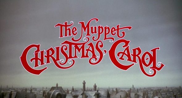
8. The Muppet Christmas Carol
Speaking of Christmas, the far superior yuletide movie comes just ahead. The red bookish font on the blue sky is nice as it slowly reveals the London setting, but what really sells this one is the music that accompanies it. The instrumental rendition of “It Feels Like Christmas” lets the audience know that this isn’t going to be a totally dreary rendition of “A Christmas Carol.” There are Muppets in it, after all! It has just the right feel to get folks in the spirit of the season.
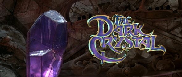
7. The Dark Crystal
The only one that works as both a title card and a caption, since the title of “The Dark Crystal” is displayed right next to the Dark Crystal! It’s mysterious and otherworldly, reminding us that there’s a big adventure ahead, and that crystal is a huge part of it. Just don’t let any Podlings stare at it without sunglasses.
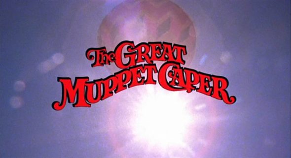
6. The Great Muppet Caper
Speaking of adventure, the second Muppet movie told us pretty quickly that they were going even bigger than before, putting Kermit, Fozzie Bear, and Gonzo in a hot air balloon to start the opening credits. And that lens flare gives the whole thing a touch of distinction. That Jim Henson fellow sure knew his way around a camera.
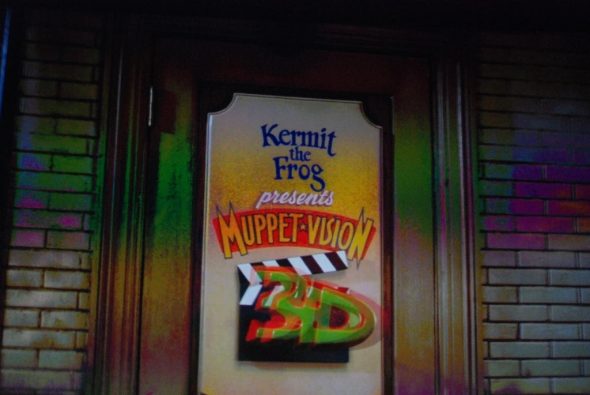
5. Muppet*Vision 3D
You want 3D? They’ve got plenty of it, and they’re not afraid to show it, as the “3D” on the door jumps right into our faces, with a little help from Gonzo. It also says “Muppets” to a T, with a door in a dingy hallway that has a hodgepodge of designs on it. But up top, that’s the right font to show Kermit’s homey-yet-whimsical every-frog vibe! Take notes, “Kermit’s Swamp Years!”
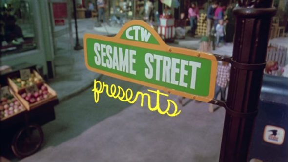
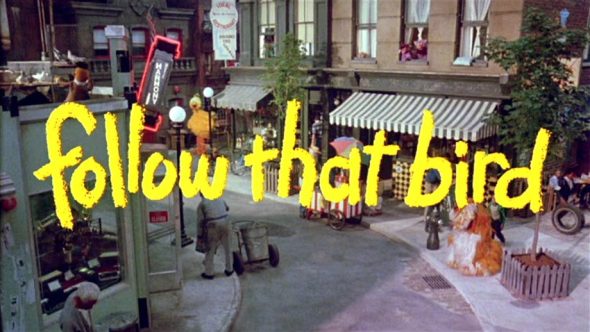
4. Sesame Street Presents: Follow that Bird
Granted, this one is actually two title cards (depending on whether or not you accept “Sesame Street Presents” as part of the formal title), but it does exactly what it needs to do. Rather than just have “Sesame Street” written out on the screen, the title gets us excited by showing us the first shot of the world’s most famous street, and what better spot to pick than the famed street sign! And the second half reveals the setting for the first time on the big screen, with a title that has a wonderfully childlike presentation, as if it were written in sidewalk chalk, matched perfectly by the Big Bird yellow color. They knew what a big deal the first ever “Sesame Street” feature film was, and they embraced it.
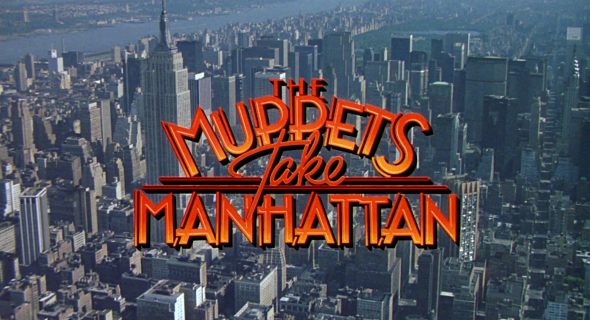
3. The Muppets Take Manhattan
There’s an amazing simplicity that works so well here. New York City has an energy all its own, much like the Muppets, and those two worlds are ready to collide as the gang sets their sights on Broadway, as evidenced by the Art Deco-style font reminiscent of the classic theaters of the Great White Way. In a way, it manages to tease the basics of the film’s story before we know it. The Broadway beat is ready to meet the Muppets, and we haven’t even finished the opening credits!
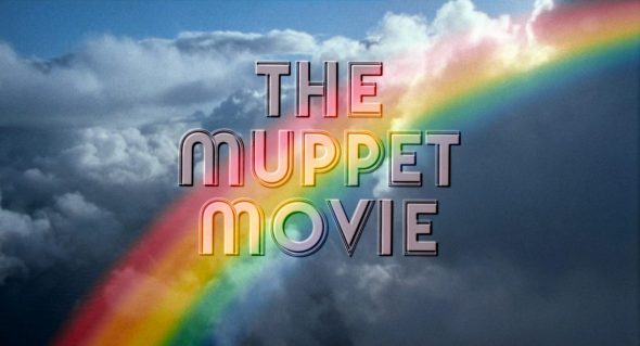
2. The Muppet Movie
With the first ever Muppet movie, it had to be made evident pretty quickly that this was an adventure that was too big for television. (Well, they also had to set up the screening room framing device so that when the film breaks down halfway, there’s something to look at, but that’s not important.) So the title takes to the sky to show us the streamlined Hollywood font of the title card, in gleaming white offset by the rainbow. It almost feels dreamy, much like the Muppets chasing their dreams of stardom. Looking at this, you know something special’s about to happen. Hey, did you know that rainbows are featured frequently in this film? You did? I should’ve figured on that.
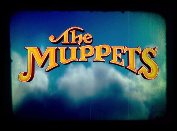
1. The Muppets
Say what you will about the movie, but that title card knows how to grab attention, incorporating the classic Muppet logo on a vintage home movie. And there are those dreamy clouds again, connecting the past with the present. It’s nostalgic, invoking memories of the Muppets’ heyday, and lets us know this one was made for the fans, both old and new. We got to see characters we’d never see again, like Uncle Deadly, and Wayne and Wanda. And then there’s Walter, the center of the story, and a massive Muppet fan. How could it not be for folks like us? Seeing this for the first time in 2011, it let me know that Muppet magic was back, welcoming me home. It gives me a warm fuzzy feeling every time I see it.
Click here to play your title cards right on the ToughPigs forum!
by Matthew Soberman ([email protected])


