We’re finally here! After six articles and the coming-and-going of the entire Threadless Muppet T-shirt Design Challenge, we’re very proud to deliver the final batch of designs.
Thanks again to everyone who submitted a design! Despite my personal ratings, you all did some fantastic work, and I’m very happy to have had the chance to spotlight your work here on ToughPigs.
And now, on with the show!
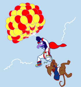
It took me a second to realize what I like about this piece, but I think I’ve figured it out. Rather than try and copy the scene from The Muppet Movie, it’s only inspired by the scene. Note Gonzo’s daredevil costume, the colors of the balloons, and of course, Rizzo dangling from a shoelace. It’s as if Gonzo remembered the dangers involved with his previous flight and is making a death-defying attempt at recapturing that feeling. The look on his face tells the whole story, and the story is what’s selling this design for me.
My rating: 4
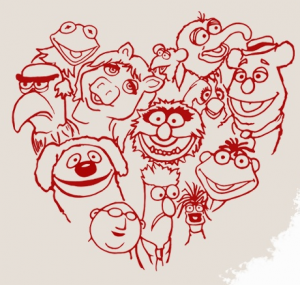
This is, what, the third or fourth design with a bunch of Muppets positioned in the shape of a heart? It’s a little sloppy and the character sizes are a little inconsistent, and these are the details that keep designs like this from being real contenders.
My rating: 2
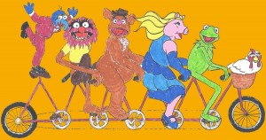
I’ve had this nightmare before. I’m innocently riding my bike when I discover that I’m being chased by a poorly-drawn Piggy/Fozzie/Animal. And no matter how fast I pedal, they’re always right behind me! I’ll never look at a tandem bicycle the same way again.
My rating: 1
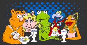 Every Day is a Sundae When You are with Friends
Muppets eating ice cream? Sure, why the heck not. The Fozzie and Miss Piggy designs don’t quite mesh for me, but the others look pretty good. Especially Kermit, with his almost invisible “Henson Stitch“. I’d like to see this artist try something with just Kermit, if only for my own personal enjoyment.
My rating: 3
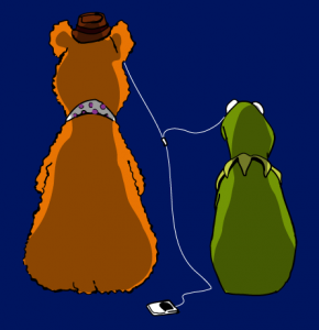
This piece is so close to being a nice, sweet image of two pals sharing the gift of music, but there are two things that I can’t stop thinking about: Fozzie’s double butt crack and quadruple amputee Kermit. So yeah, I just ruined it for everyone. Sorry about that.
My rating: 3
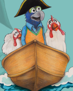
This is actually a pretty decent drawing of Gonzo and his chicken ladies. The colors really pop out at you. I wish there was a little more action in the image, but I’ll take what I can get. But mostly, I like the fact that Gonzo’s wearing a sweater vest while boating. That’s what I call sailing in style!
My rating: 4
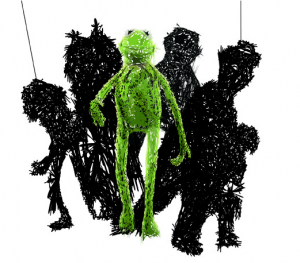
I have no idea what those two thin lines are supposed to be, so for the sake of my own sanity, I’ll just ignore them. I actually think this is an interesting take on the poster for the new Muppet movie. This design looks pretty neat on Kermit, but the other characters are a lot harder to pinpoint. You can kinda make out Fozzie and Animal, but if I had to guess at the other two (without having seen the poster), I’d guess Doglion and Beauregard. And no, I won’t tell you which is which.
My rating: 3
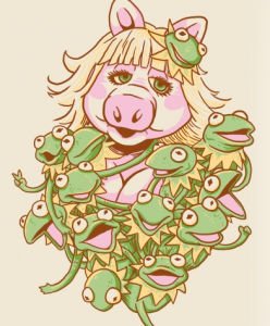
I’m actually surprised that more people haven’t attempted this idea. Miss Piggy looks pretty good here, but the real success is all the different looks on the faces of the Kermits. I think it’s fantastic, and not just because of the cleavage!
My rating: 4
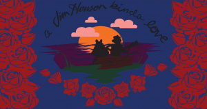
The lighting creates some neat effects on this shirt, but the watercolors look a little slapped-together for my tastes. Not bad, but hard to appreciate.
My rating: 3
Everything looks weird! Piggy is too short. Kermit looks more photo-realistic while Piggy is overly simple. Kermit has a third dimension while Piggy only has two. And everything looks weird.
My rating: 2
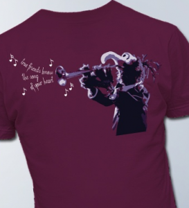
Once again, the “friendship” theme forces the artist to add in words that weaken the piece as a whole. Sure, it’s just a photo of Gonzo, but I think this would make a pretty rockin’ shirt. Just, y’know, without the hardly-related words coming out of the trumpet.
My rating: 3
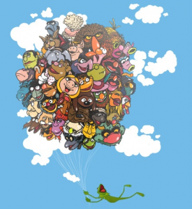
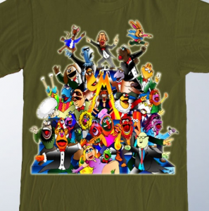
Wow, this one is wonderful. All of the character designs look great, I love the inclusion of obscure characters (Mr. Poodlepants!), Kermit looks like he’s having the time of his life, and I like that the artist tastefully added some off-property characters without falling into copyright infringement territory. Can you find Big Bird, Red Fraggle, and Slimey the Worm??
My rating: 5
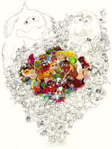 The Lovers, the Dreamers, and You
I wish we had access to a higher-resolution version of this picture, because I could spend an hour scouring this image for every obscure character hidden in the peripherals. The design work is really fun, and I think the coloring job is an interesting touch. I’d buy this print just so I could spend more time looking at it!
My rating: 5
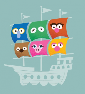
This design puts together several different repeated ideas from the contest: Boats. Muppet eyes. Doesn’t make any sense outside of the context of the contest. It’s the Threadless contest trifecta!
My rating: 2
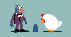
I guess I have to make an exception in this case for the artist’s use of the Gonzo Palisades action figure, because it works pretty well with the giant chicken. Also because I think the idea is kind of hilarious.
My rating: 3
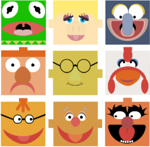
Are those supposed to be LEGO-esque pegs so the Muppet heads can fit together?? Because it just makes them look like they have big ears or mohawks. Also, how did Bunsen manage to get himself into the center square? Who does he think he is, Paul Lynde? What do you mean he’s not Paul Lynde???
My rating: 2
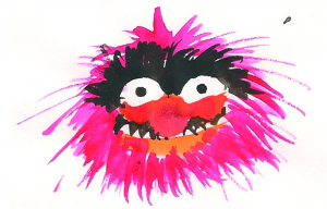
Whoops, someone spilled their fruit punch and accidentally submitted it into the contest! But apparently accidents make cute t-shirt designs. I’ll have to keep that in mind the next time I spill coffee grounds all over the kitchen floor.
My rating: 4
Kermit the Frog + Steve Martin = The Best Thing to Ever Happen to Anyone Anytime.
My rating: 5
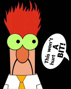
What makes this design neato is the fact that Beaker’s eyes are glow-in-the-dark. And frankly, I don’t know why no one thought of doing this exact same thing before. The execution could be a little crisper, and fixing that sideways word balloon would be a good start.
My rating: 3
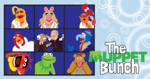
Slapping a bunch of altered photos into a grid, a good sitcom parody does not make. Though I always thought Animal would’ve made a great Cindy.
My rating: 1
Yeah, I remember playing with Colorforms too. I didn’t make a t-shirt design out of mine though.
My rating: 1
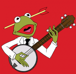
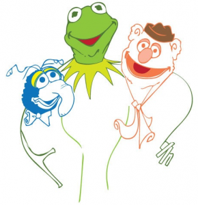
There’s something slightly Al Hirschfeld-esque about this one. Most likely the pencil-thin arms on Kermit. But unfortunately, the coloring is a little inconsistent, and Fozzie looks totally wonky.
My rating: 2
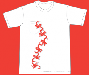
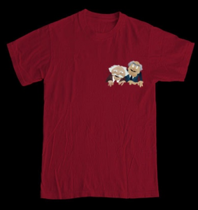
I like designs that take the actual t-shirt into consideration, like the way this one uses the “pocket”. In any case, I think this piece is way fun, despite the fact that you can’t tell that it’s Muppet-related until you get super close to it. In any case, it’s totally worth it just to see The Swedish Chef as a monkey.
My rating: 4
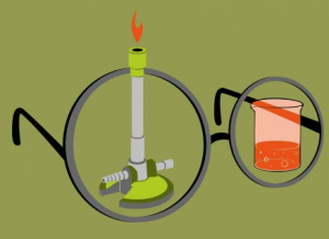
Wow. Brilliant. It’s a shame that Bunsen burners are tall and thin while the beaker in question is short and fat. This is the kind of shirt only a real Muppet fanatic can appreciate. Thankfully, I am that fan.
My rating: 5
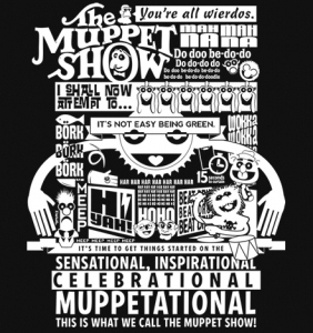
There is so much crammed into this image, I hardly know where to look. But while that may have been a criticism of other designs, I think it works really well here. The black-and-white keeps it from sensory overload, and the variety of phrases and fonts and images offers a lot of fun for anyone reading it.
My rating: 4
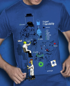
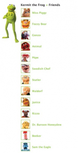
Here is yet another image that needs to be seen in a higher resolution to be truly appreciated. If you can’t tell, the shirt is a blueprint designing the main Muppet characters. Give a bear a hat, a frog a collar, and a pig some lipstick, and you’ve got comedy/variety gold!
My rating: 5
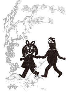
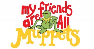
The design work is decent, but the Muppet references are way too easy to overlook. Both Kermit and Piggy are hard to see (plus, they’re off-center, which I hate) and the words above the graphic are even harder to make out. Though it is a pretty sweet sentiment. Siiiiigh.
My rating: 2
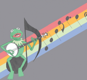
We’re getting close to the end of these t-shirt design reviews, right? Because I’m totally running out of things to say about pictures of Kermit and rainbows. We get it, the dude likes rainbows. And he wonders why there are so many songs about them. Can we move on??
My rating: 2
This must’ve been a super-easy design to make, but a reasonably clever idea. I wish the artist bothered to use a real picture of Gonzo, rather than the photo puppet, and I can’t quite tell if Sam is a photo or an illustration. (I suppose it doesn’t really matter, does it?) But as simple as this one is, it might actually make for a cool shirt.
My rating: 3
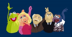
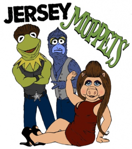
Kermit is calling you a loser. Miss Piggy is playing the finger hole game (you can Google it, folks). Waldorf is compensating for Statler’s hair loss. And Gonzo is celebrating the legalization of gay marriage in New York.
My rating: 3
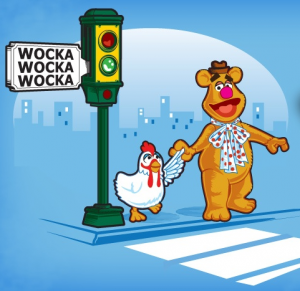 Why Did the Chicken Wocka Across the Road?
Okay. Yes. Hilarious. Clever. Yes.
My rating: 4
Every once in a while, I am reminded that there are people in the world who are constantly coming up with much better ideas than anything I could come up with. So, I pretty much hate the artist. With a burning passion.
My rating: 5
Ohgodwhhyyyyy! Might as well gouge my eyes out now. They’re pretty much ruined.
My rating: 1
I am officially out of things to say. Hey look, a froggy!
My rating: 3
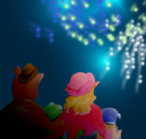
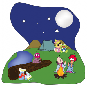
Ah, what a nice image to act as the final submission to the Threadless contest. Everyone looks so happy and well-dressed! Again, I’d like to see this in a higher resolution so I could pore over the artwork, if only so I could see that flying Bean Bunny a little better.
My rating: 4
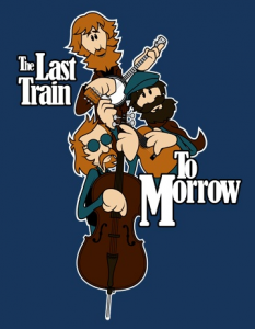
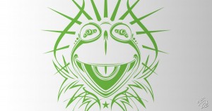
Dave Hulteen Bonus – Last Train To Morrow, Tribal Kermit
For our final bonus designs, we’re taking another look at some artwork by our pal Dave Hulteen, who submitted these older images to the contest. And although they weren’t created newly for the contest, I’d still spend some serious coin to have the opportunity to wear them on my torso.
Thanks again to everyone involved in the Threadless contest! And keep an eye on ToughPigs to find out when the winning design will be available to purchase!
Click here to try really hard to forget Snooki-Piggy on the ToughPigs forum!
by Joe Hennes – Joe@ToughPigs.com
 Sharing Buds