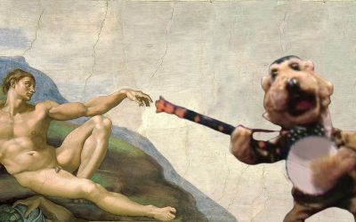
We’re well past the halfway mark, and it’s time to make a hard dash for the finish line! There’s only a few more days to vote in the Threadless Muppet T-shirt Design Challenge, so be sure to make your voice (or your clicking finger) heard!
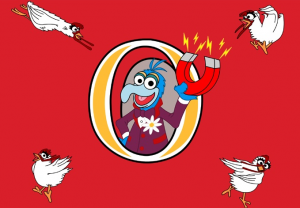
Oooohhh, “Chick Magnet”! I get it! The illustration of Gonzo is okay, but I really love the chickens being pulled in different directions. It seems like the kind of wacky thing Gonzo might’ve done in his Muppet Show days. And then he’d probably unintentionally drown under a pile of perplexed chickens. Comedy!
My rating: 3
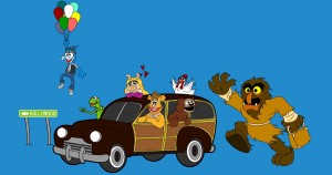 Getting There is Half the Fun, Come Share It With Me
What a great Muppet Movie homage! Gonzo floating away with the balloons has been done a few times in this contest, but it’s understandable since it’s probably his second-most familiar image (after blowing the trumpet in the Muppet Show ‘O’). It’s also nice to see the wood-paneled car, as opposed to Fozzie’s Studebaker. And Sweetums is definitely the cherry on top. I just love it.
My rating: 5
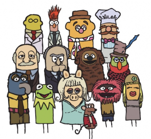
I’m not sure if these designs are inspired by anything, but I think they’re crazy adorable. I wouldn’t be surprised if Disney ended up putting out a series of finger puppets that look just like these. They don’t even need those cumbersome arms to weigh them down!
My rating: 5
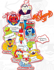
This piece has 10 characters with 10 descriptive adjectives, almost all of which make me say, “Really???” Statler (without Waldorf, oddly enough) is grumpy, but not at all cuddly. Animal is only “cooool” in merchandise and your childhood memories; most of the time he’s just manic. Kermit does talk, but I’d hardly call him “talkative”. Bunsen is right in questioning whether or not he’s a joker, because he most certainly is not. But the biggest gaffe of all: The Swedish Chef is a cook, but far from being an awesome one.
My rating: 1
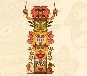
Cute concept. I think what makes this one work is the minor details on the edges. Kermit’s swampy things, Fozzie’s stars, and Gonzo’s sidekicks. This might make a cool stackable figurine. You should get on that, Disney Merchandising!
My rating: 4
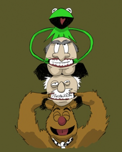
I wonder what happened to Kermit’s neck. It was a nice neck, but now it is no longer neck-like. Also, it looks like Animal ironed his hair in preparation for a hot date. With someone who doesn’t mind that he has no arms.
My rating: 1
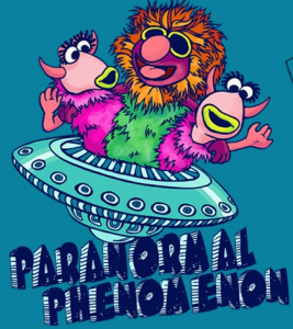
I don’t hate the Muppets Tonight sketch with Sandra Bullock saying “phenomenon” and getting backed up by the two Snowths with their “Do doo do do doos”, but people revisit that well all too often. Like, waaaay too often. I’d say people either need to come up with their own variation on the joke (there are so many words that work: Shyamalan, Islamabad, Hermione…), or stick with the classic: Mahna Mahna. We can talk about spelling later.
My rating: 3
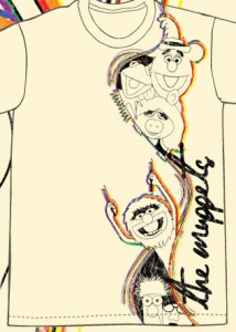
I dig the design choice to have the streaky artwork running down the side of the shirt, but the characters all look a little too off-model, yet not so off-model to be a stylistic choice. Animal has a weird lip thing going on, Fozzie looks a bit flat, and Miss Piggy is on the brink of passing out. Oh, and Bunsen needs a milk crate to stand on so he can get back in the picture.
My rating: 2
This is a good example of what I meant by “off-model as a stylistic choice.” Kermit in particular is odd-looking, but still recognizable. And the looks on Statler and Waldorf’s faces are fantastic. I’m also digging the giddy look on Fozzie’s face as he forces his rivals to enjoy themselves for a change.
My rating: 4
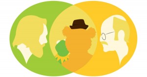
Ooooh, pretty! There should be more Jim and Frank images in this contest. And more Venn diagrams.
My rating: 5
I liked this design fine until I realized that the Gonzo in the picture is attached to Fozzie’s arm. Are we supposed to assume that Fozzie is “real” while Gonzo is just a puppet? If so, that’s creepy/perplexing on a number of levels. I don’t even want to think about the possibility that Fozzie may be using Gonzo’s hollowed-out body for his own sadistic uses. Maybe I’d feel better about it if Gonzo wasn’t wearing the chili peppers shirt. So much disturbing in one picture!!
My rating: 2
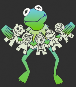
I think I’d like this one better without the weird “Before You Leap” Kermit. The paper doll designs definitely look inspired by the Pook-a-Looz dolls, which would make for a great t-shirt design in itself.
My rating: 2
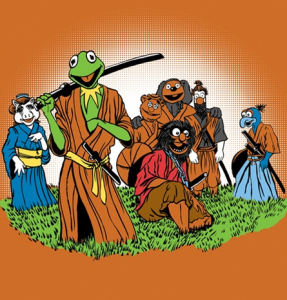
Samurai Muppets! Neat idea, but there isn’t much explanation for why the Muppets are dressed as samurai. Is it part of a show, or a pun, or are they analogous with their Seven Samurai counterparts? If the idea is taken just that much further, this piece would be respected on a completely new and interesting level.
My rating: 3
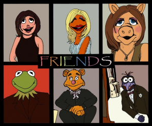
Okay seriously, stop with the Friends references. (PS: Who is that in the top left corner? Wanda?)
My rating: 1
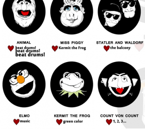
I couldn’t get a good-sized screenshot of this design, so feel free to click on the link above to see all of the “yearbook” entries. There’s just too much I don’t understand about these designs. The Count has an earring? Miss Piggy has a snot bubble? Animal looks like Beard? I do like the designs for Elmo, Beaker, and Gonzo, all of whom look like nerds. And I’d give a higher vote to a Blues Brothers-inspired Statler and Waldorf shirt. But in the end, nothing makes any sense.
My rating: 1
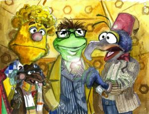
Fun Fact: I recently started watching Doctor Who for the first time, so this submission seems particularly poignant to me right now. I don’t know if the characters match up with the personalities of the different Doctors, but design-wise, it looks fantastic. I do wonder how an elaborate piece like this would look on a t-shirt though. Would it have to be one big rectangle? If that’s the case, then it would definitely make a better poster than shirt.
My rating: 4
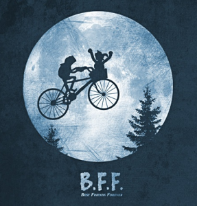
I get it! It’s the bicycle-riding Muppet with the alien in the basket! Gonzo does look a little awkward though, possibly because of the flailing arms. I wonder if this would be a cooler design with something like a Koozebanian in the basket, but maybe no one would get that but you and me.
My rating: 3
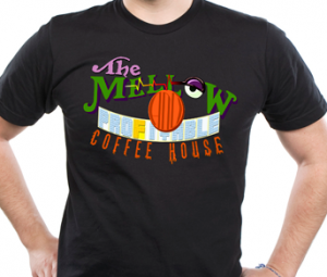 The Mellow and Profitable Coffee House
Fan. Tastic. Everything about this is great: The Muppet Movie reference, Dr. Teeth’s face, the font choices, the obscurity. If I ever open a coffee house, at least I know the logo is ready.
My rating: 5
This is a joke that’s been used a few times already in this contest, but it’s illustrated pretty well here. I wonder if the reason Beaker allows Bunsen to use him as a guinea pig boils down to friendship, or if it’s something else entirely. Maybe Bunsen offers a really good health package. Or free donuts.
My rating: 4
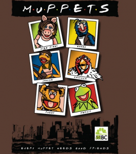 Every Muppet Needs Good Friends
Seriously, did you not just hear what I said about Friends shirts? Knock it off! Especially if the only thing you’re going to change about your Photoshopped Muppet pictures is to give Miss Piggy Jennifer Aniston hair.
My rating: 1
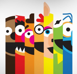
Oh good, more overly-simple Muppet designs! I like how the characters are in “rainbow” order. It makes the whole thing so much more pleasing to the eye. It also gives the image a sense of motion, as I can’t help but scan my eyes over it from left to right every time I look at it.
My rating: 5
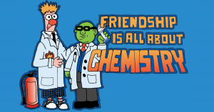
It’s a cute idea, but the characters are far too wooden. Beaker is hardly reacting to the fact that he’s ON FIRE, and Bunsen isn’t doing much of anything at all. This is a lesson on why you should be wary about using your Palisades figures as models. Those things don’t move.
My rating: 2
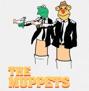
Wow, there’s a lot going on here. There’s the Pulp Fiction reference, the chickens instead of guns (?), and the fact that they’re tiny puppets. But none of those things connect to each other, leaving this illustration as a slapped-together mishmosh of half-baked ideas.
My rating: 1
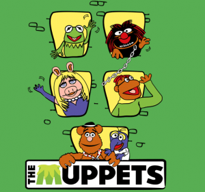
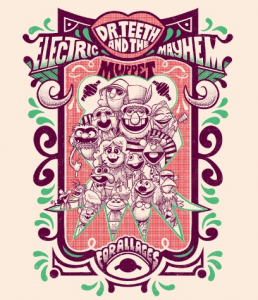
Ooooh, I likey. These character designs are really fun, and I’d love to see this artist illustrate a Muppet comic book to see some other emotions aside from “We’re SO HAPPY to be posing for this picture!” The giant Kermit head in the background is lovely as well. It does seem odd that the top of the image reads “Dr. Teeth and the Electric Mayhem” when the image comprises of all of the main Muppets, but I’m perfectly happy to overlook that since the rest is so fantastic.
My rating: 5
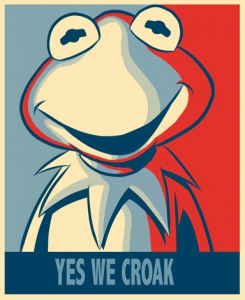
Aren’t we a little tired of the “Hope” design yet? And is Kermit trying to pass along an existential message that some day we will all die? Yes, Kermit, we croak. We all croak sooner or later.
My rating: 2
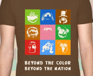 Beyond the Color, Beyond the Nation
More altered photos, but not altered very well. I do like that none of the characters are in their appropriately-colored box, but some of those faces are just too hard to see. Gonzo and Sam look a little faded, and Kermit (who has the Bruce Vilanche-esque honor of being in the center square) is almost invisible.
My rating: 1
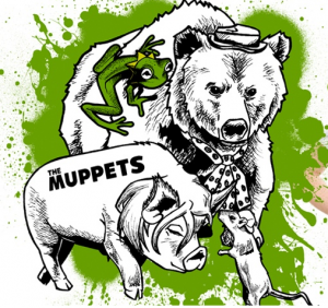
I like this design a lot, except for a few details. The “Muppets” logo on Miss Piggy seems unnecessary and distracting. It took a second too long to recognize Rizzo (though I do like that he’s been included here). And the colors are a little arbitrary. But all three of those things can be overlooked, because I think the rest is pretty well executed.
My rating: 4
There is exactly one thing I like about this shirt, and it’s that Sam is standing in the same position as the person wearing it.
My rating: 1
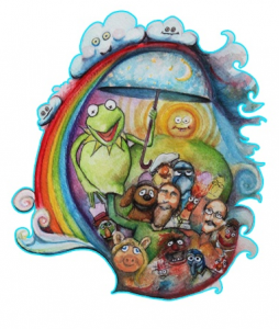 Just Close Your Eyes and Make Believe
This piece has a nice use of colors, and I like how the images fade as you get closer to the edges (Pepe is just eyeballs and hair!), but there’s something that rubs me the wrong way here. I think it’s seeing Kermit on Jim’s arm while the other Muppets look on. It’s far too jarring to have a group of Muppets who are supposedly alive when one is specifically singled out to be a puppet. Choose one or the other.
My rating: 3
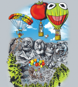
The characters in this piece all look a little static to me (Animal, Swedish Chef, and Miss Piggy are all copied directly from stock photos), but I like the conceit of this dreamlike state of flying Muppets and their pals who’ve been carved into a mountain. It’s delightfully wacky, but perhaps a bit too busy for a cool-looking t-shirt.
My rating: 3
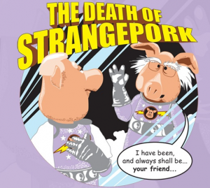
This is possibly the greatest thing to come out of Star Trek II, and that includes Ricardo Montalban’s fake pecs.
My rating: 5
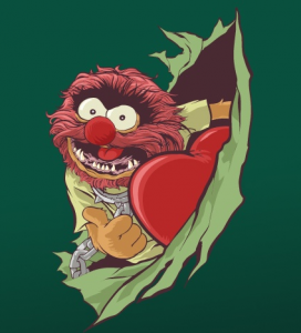
So wait. The conceit of this design is that Animal has ripped open the wearer’s chest cavity, ripped out his heart, and seems to be pretty happy about it? Eh, at least he’s well-drawn.
My rating: 3
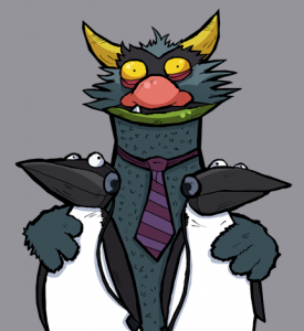
I find Big Mean Carl to be hilarious, mainly because he’s so deranged. I could totally see him “befriending” two headphone-wearing penguins who are just waiting for the moment when Carl decides to have a snack. It’s a Muppet moment worthy of t-shirt immortalization.
My rating: 4
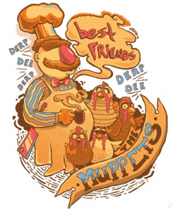
I like the idea that the Swedish Chef is best friends with a chicken wearing sunglasses. Someone should write that fanfic. (Note: Please no one ever write that fanfic.)
My rating: 3
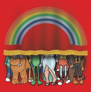 Peter Savieri Bonus – It’s Time to Raise the Curtain
ToughPigs’ own Peter Savieri once again blows the competition out of the water. With this image, he proves that you don’t need to see a Muppet’s face to know who he or she is. Is it possible that the Muppets have the most recognizable ankles in popular culture?? If anyone can prove that theory, it’s Peter.
Part six of our Threadless contest coverage is coming ’round these parts very soon!
Click here to get all buddy-buddy with a penguin on the ToughPigs forum!
by Joe Hennes – Joe@ToughPigs.com
