When you mix hipstery t-shirts, a giant voting campaign, and a partnership with the giant among giants that is Disney, you’ve got the Threadless Muppets T-shirt Design Challenge. Dozens of graphic designers and illustrators, both professional and amateur, have been submitting their Muppet-inspired shirts in the hopes that theirs will be chosen to grace the underside of a printing press (plus the added benefit of getting some cash or Muppet swag).
I don’t know about you, but I’m a sucker for some good Muppet fan art (as evidenced by my love for spotlighting it here on ToughPigs). And this Threadless contest has fan art in spades. Rather than just post it all here (which would be stealing), I thought I’d offer my two cents and review each one (which would be commentary!), along with my rating (from 1 to 5).
Of course, I can be a harsh critic. There are certain things I don’t like, and certain things I go nuts for no matter how bad everything else in the image may be. I don’t like when preexisting images are copied directly. I don’t like it when I can tell what poser puppet (or worse, what Palisades action figure) the picture came from. I don’t like jokes that are too obvious. But on the flip side, I love cleverness. I love over-simplicity. And most of all, in this case, I love the ones that might actually make a cool-looking t-shirt.
The theme (as if “Muppets” wasn’t enough) is “friendship”. So you’ll see a lot of entries that keep to that, but also a few that ignore it completely. Personally, I couldn’t care less.
With few exceptions, I don’t know who the artists are. So I’ll just go ahead an apologize in advance for insulting or downplaying your artwork right now. The opinions of this writer don’t represent ToughPigs at large and all that. We may be snarky, but we’d never intentionally insult our readers.
Enough of that nonsense. Let’s take a look at the first 25 entries to the Threadless Muppets T-shirt Design Challenge! And be sure to click the links below each picture so you can vote too!
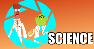
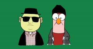
I admit, I didn’t get this one at first. Apparently it’s a “Breaking Bad” reference, which is a show I haven’t gotten around to watching yet. Not knowing that, it’s just Bunsen and Beaker in street clothes. Being partners or something. While looking dead-eyed out of the t-shirt wearer’s nipples. I just can’t get excited about that.
My rating: 2
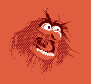
I really like this one. It’s just an Animal head, but the lines in his fur (hair?) gives a sense of motion, as well as a neat artsy look. Plus, he looks super happy. I’d wear it!
My rating: 5
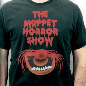
This one, on the other hand, disturbs me. I get that it’s supposed to be like the lips from the Rocky Horror poster, but it also has the teeth, tongue, fur (hair?), and nose to make Animal recognizable. Instead, it looks like he got taken out by The Bride, O’ren Ishii-style.
My rating: 1
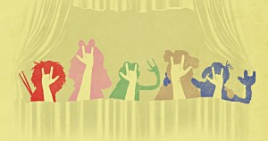
I originally thought the Muppets were all throwing the devil horns, completely forgetting that they’re showing the ASL sign for love. Will other people make the same mistake?? If they’re dumb like me, then probably. Still, props for getting the puppeteer hands in approximately the right places in each character’s head.
My rating: 3
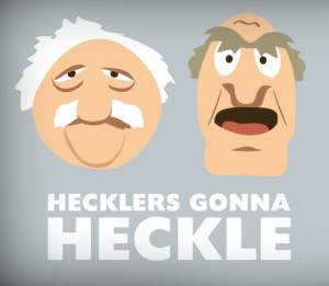
This one shouldn’t be in the contest at all, seeing as it completely rips off the infinitely better “Haters Gonna Hate” t-shirt. I detest theft.
My rating: 1
It’s an interesting concept. The drawing is… okay. Not great, but there’s some love in there. Fozzie kinda looks like my grandpa.
My rating: 3
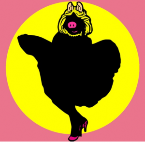
The Piggy-as-Marilyn-Monroe thing has been done before, but not very well. There’s no reason for there not to be an official photo of Miss Piggy standing over a grate on a calendar somewhere. And I dig the silhouette, which keeps it simple, yet instantly recognizable.
My rating: 4
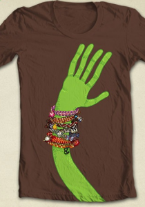
Kermit’s got bling! I tried to pick out which friendship bracelets came from whom before cheating and reading the artist’s notes. A point off for the amount of time it took me to figure out who that lowercase “g” belonged to (they’re actually Scooter’s glasses).
My rating: 2
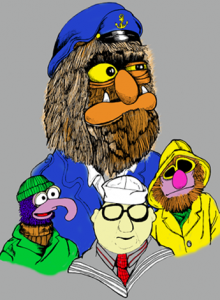
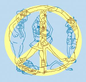
This one’s taking that “friendship” theme a little too far, and not quite literal enough. While I’ll usually take any opportunity to see Sweetums dressed as a sea captain, I’m left with too many questions. How was this random assortment of characters chosen? Why is Mahna Mahna there? And if it’s ever printed on a t-shirt, would anyone know/care why they’re dressed like sailors?
My rating: 1
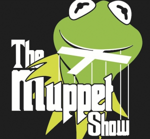
For the life of me, I can’t figure out what the Muppet/Godfather connection is here. Especially when it’s already been done, and so much better. Also, it looks silly to have Kermit holding the marionette handle in his mouth. What does he think he is, a puppeteer?
My rating: 1
Kermit looks so happy to be hypnotoading you! Nice Futurama reference, and one obscure enough to rein in the geek-level fans.
My rating: 4
I want to love this one. I really do. It’s simple and it excites several different parts of my Muppet-loving brain. But it is WAY too much like this one. I’m completely on the fence, so a middle-of-the-road rating it gets.
My rating: 3
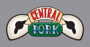
First I rolled my eyes at the “Friends” reference, which I guess I can get over (people do seem to enjoy that television programme). But then I noticed that the image has Kermit’s eyes, but a Miss Piggy reference. That’s some weak design, and conflicting jokes. Not even “Friends” would stoop to that (though they probably would).
My rating: 1
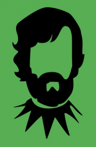
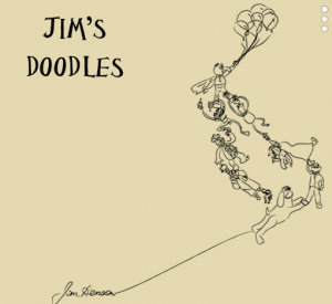
How amazing would this shirt be if they were actual doodles from Jim Henson? Still, the artist did a bang-up job in imitating his style. I want to wallpaper my bedroom with this.
My rating: 5
Apparently this is a reference to the “Portal” video game. Not having played it, I’ve got to go with my first instinct, which is to rate it based on the picture itself. It’s just the Muppet fanatic in me, but all I can see is Photoshopped pictures of the Palisades toys. I wish I got the joke.
My rating: 2
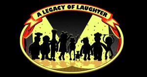
This artist used a mix of photo puppets and Palisades toys for his reference, which is completely throwing me off. Not only is that all I see, but it messes with their proportions. Look how tiny the Swedish Chef looks in comparison to Kermit. But I do like the idea of a shot from behind with the characters in the shadow of the spotlights. So that deserves an extra point.
My rating: 3
It’s original and it’s meta. I love both of those things so very, very much. It’s a little sloppy, but I think it’s supposed to be. Still, I’m not sure I’d wear it. Though I’d definitely wear a shirt with a picture of myself wearing the same shirt.
My rating: 4
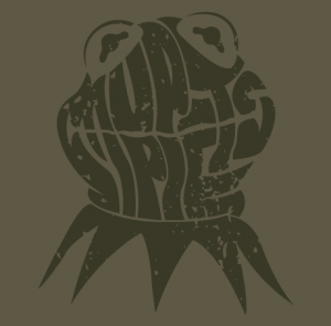
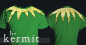
I like it. I wonder if it would look good in person, from a distance. I have a feeling it’d end up looking like an illustration of a human brain (with a frog collar).
My rating: 4
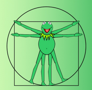
This idea was used for one of the “Muppet Celebrity T-shirts“, which weren’t made available to the general public. But despite that (and the fact that this Kermit has a belly button), I can’t justify its existence.
My rating: 1
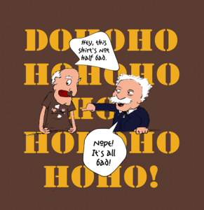
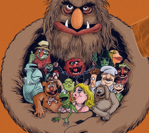
Seriously?? You’re going to steal from ToughPigs??? Oh no you di’int!!
My rating: -5,000
Yet another t-shirt idea that’s already been used. Which is also sad, because I wrote down the same t-shirt idea like 5 years ago. I swear, I really did!
My rating: 1
I will only buy this shirt if the “Meeeee…” travels up the shoulder and down the sleeve. Because that’s pretty much how Beaker would do it in real life.
My rating: 4
I’m really glad this artist decided to draw all the characters him/herself, rather than relying on previous art or photos. A few of them are off-model, which might enrage a few diehard fans, but that’s to be expected. The only parts that really bother me are Piggy’s lips and the deranged (in a creepy way, not in a Muppet monstery way) look on Sweetum’s face. I like the design, but it’s too unsettling to wear.
My rating: 4
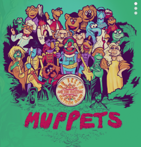
Really? The Muppets haven’t ever done a Sgt. Pepper parody shirt?? This really surprises me. I’d love to see one with actual photo puppets, but for now, this will have to do.
My rating: 5
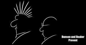
Does anyone even remember “Alfred Hitchcock Presents” anymore? Bunsen looks great in this style, but he’s not recognizable at all without Beaker, which kinda ruins the illusion. Still, it’s a decent effort, and oh so simple!
My rating: 3
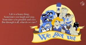 Dave Hulteen bonus – We Got Us
We’ve done a ton of work with Dave, so it wouldn’t seem fair to rate his selection along with the rest. But check out his entry, which is bound to be another Dave Hulteen classic! Obscure Muppet song and all!
Stay tuned for part 2, coming soon!
Click here to steal from the best on the ToughPigs forum!
by Joe Hennes – Joe@ToughPigs.com
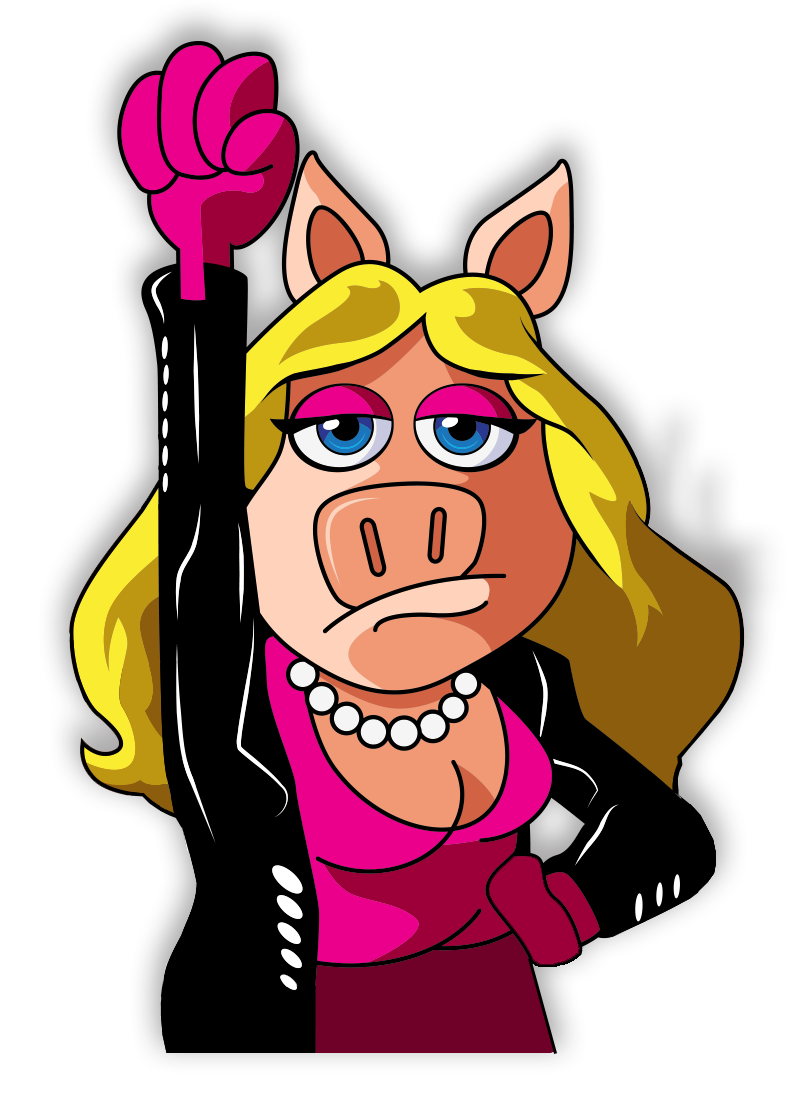
 Say Hi to Friendship