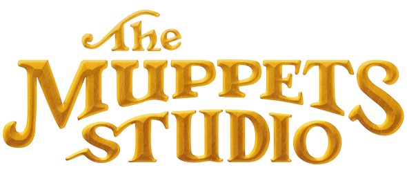
Big news for font lovers! The Muppets Studio has a brand new logo. It’s gold and shiny and reminiscent of the classic Muppet Show opening.
The Muppets Studio has had a few logos over the years, all with varying degrees of beauty, intrigue, and Muppetiness. Dare I say, this may be the best one yet.
The Muppets Studio has given ToughPigs an exclusive sneak peek at the logo and its accompanying animation, which you can see below. And not only that, Muppets Studio VP Leigh Slaughter joins us for a brief Q&A about why we’re getting this new logo and where we can see it next. Enjoy!
ToughPigs: Why does Muppets Studio need a new logo? And why now?
Muppets Studio VP Leigh Slaughter: The Muppets Studio has gone through several logos over the years, but we didn’t feel that the current logo really represented who we are as a studio today and the direction we’re headed. Now that we have projects that originated fully from our team, we felt it was the right time to make the change to represent who we are now. This has been in the works for quite some time and we’re so excited to get it out into the world.
ToughPigs: What do you hope the new logo conveys?
Muppets Studio VP Leigh Slaughter: The Muppets have always represented a spirit of optimism and determination, and a new logo and studio identity is a chance for us to celebrate our optimism for a bright future. We tried to capture so much of what defines The Muppets in the design – from bringing back that iconic Muppets “M” to capturing the gold from the theater itself.
ToughPigs: The new logo invokes the feel of the old Muppet Show sign. What was it about that specific image that evokes the height of the Muppets’ popularity?
Muppets Studio VP Leigh Slaughter: You’re absolutely right – this represents the early heyday of the Muppets and harkens back to a time when the nostalgia for the Muppets is very strong. Those letters are instantly recognizable. But we took it a bit further by changing a few of the letters and elements so that it’s got a bit of a modern touch, as well. It’s part a nod to our past and part a nod to our future.
ToughPigs: So far we’ve only seen the black-and-white version. Will there be variants of the logo? More colors? Animation? Explosions?
Muppets Studio VP Leigh Slaughter: Absolutely! The base version of the logo has a gold overlay similar to the gilded designs of the Muppets’ theater interior. Similar to how the Disney logo changes in front of different films, there is plenty of opportunity to do this with our new logo..
ToughPigs: Where will we be seeing this logo next?
Muppets Studio VP Leigh Slaughter: As you know, our next project – which I’m very excited about and cannot wait for you to see – is Muppets Haunted Mansion. You’ll see the new logo attached to that special is a customized way that evokes the spirit of that particular project.
ToughPigs: Is this a sign of bigger things to come from Muppets Studio?
Muppets Studio VP Leigh Slaughter: I think it’s a sign that we have a lot planned for the future and in various stages of development.
ToughPigs: Is there anything more can you tease? What’s coming up next for the Muppets??
Muppets Studio VP Leigh Slaughter: We have projects in different levels of development – both large and small – and even some things for our fans. I can’t reveal more than that at the moment, but look forward to sharing with you soon!
Many thanks to the Disney team for this exclusive! Click here to choose your fonts carefully on the ToughPigs forum!
by Joe Hennes – Joe@ToughPigs.com
