Part 1 – Part 2 – Part 3 – Part 4
Boy, Threadless really likes these t-shirt design contests! By my count, this is their fifth Henson-related one, after two Sesame Street themes, one Fraggle Rock, and one Muppet. And now they’re going after the Muppets for a second time, because why the heck not and let’s see some fan art.
Once again, we’ll be reviewing every entry to the contest. As of this writing, there are over 200 submissions, some of which are brilliant, some are hideous, and most are somewhere in between. You’ll just have to read on to find out which are which.
Unfortunately, due to the Thanksgiving break and Threadless’ new voting methods, the voting process is already halfway over. So we suggest heading over to the contest page right now and casting your votes for whatever’s left. The artists will appreciate it.
And now I cover my own ass: All the reviews below are just one Muppet fan’s opinion. If you’re the artist, don’t take them personally. I tend to vote more for innovative thinking and against pre-existing art, although I’m also wily and unpredictable. But really, we’re all here for the same reason: To applaud and roll our collective eyes at all sorts of Muppet fan art.
So let’s get on with the show!
I don’ think I’d want to eat that thing, let alone wear it on my body. I’m sorry Kermit, but spinach and cucumber do not belong on a pizza.
My rating: 2
I believe one of the other recent t-shirt contests had a picture of Kermit riding a bike, and I loved it. It’s so iconic, it deserves to be immortalized on a shirt. I could do without the “XING”, but that wouldn’t deter me from buying it.
My rating: 5
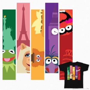
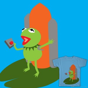
Here’s our first entry with a direct tie-in to Muppets Most Wanted. It’s a cute concept, and if the character designs were a little tighter, I could see Disney selling it. Especially because it would sell at all of the international Disney theme parks and stores.
My rating: 4
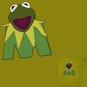
I can’t believe I never envisioned Kermit’s head on top of the new “M” logo. It is horrifying. It’s as if Kermit became a victim of some sort of Dr. Frankenstein or Dr. Human Centipede. Just imagine him crawling at you on his “M” stubs. Nightmares, man.
My rating: 2
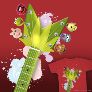
It took me a second. Upside-down and slightly altered, the “M” logo looks like a plant. And the paint splotches in the background don’t help. It just doesn’t look enough like a guitar to evoke the right image, and you can’t really zoom out to see the whole thing without needing to squint to see the faces. It’s like the Muppet guitar was doomed from the start.
My rating: 3
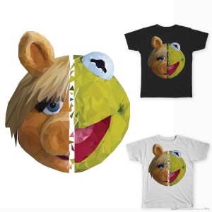
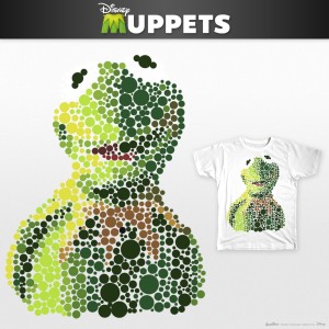
There’s going to be a bunch of entries in this contest that are basically pre-existing images pushed through a Photoshop filter. This one does that too, and call me crazy, but I kinda like it when it’s using the two face halves like this. The split faces wouldn’t work without the filter, and the filter wouldn’t work if it was on just one face. It still doesn’t stand out enough for this contest, but the aesthetic is there.
My rating: 4
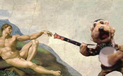
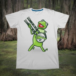
Love it. Kermit isn’t a boring character, so why does he need to be seen from the neck up and staring straight ahead in every picture? Give the Frog a double-necked banjo and let him rock out once in a while.
My rating: 5
If you touch a frog, you’ll get warts. If a frog touches a toad, this is what happens.
My rating: 1
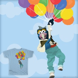 Gonzo’s Attempt Around the World
This picture of Gonzo is so iconic, why isn’t it already available on a t-shirt? I would buy one and Paul Williams would buy one. And then: Profit!
My rating: 4
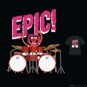
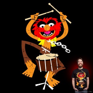
This epic shirt is hardly epic. Animal, the character best known for going crazy and wreaking havoc is tucked away behind a drumset, just hanging out with his arms above his head. It’s not a bad one, just not EPIC!
My rating: 3
Step 1: Get weird. Step 2: Stay weird. Step 3: Put some weird away for retirement.
My rating: 4
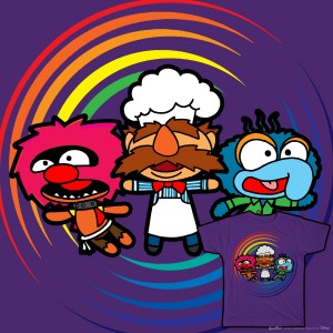 A Whole Lot of Crazy Right Here
I just had a vision of Animal, The Swedish Chef, and Gonzo traveling between parallel universes on Sliders, and it was awesome. (Gonzo is Jerry O’Connell, by the way.)
My rating: 3
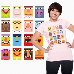
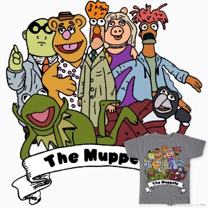
This could be a great design once it’s tweaked so some of the characters don’t look like they’re wearing white bandanas over their eyes like Ninja Turtles.
My rating: 4
Yikes, it’s like a picture of Muppet helium balloons. They’re all puffy with odd proportions. They’d be great for a birthday party, but terrible for a birthday shirt.
My rating: 1
That’s a cute picture of Animal. I have a feeling I’ll be tired of that “distressed” look by the end of the contest, but for now, I think it looks neato.
My rating: 4
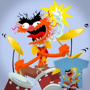
Ah, now that’s an epic Animal. Just look at the pure rage and insanity in his face. This is how I picture him in my head. It makes me glad his therapy in The Muppets didn’t stick.
My rating: 5
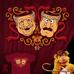
This piece comes courtesy of ToughPigs pal Jamie Carroll, who won a previous Threadless contest with his Muppetational Mosaic. And while it’s almost impossible for anyone to come close to the epicness of the Mosaic, this one is fantastic on a completely different level. If Statler and Waldorf haven’t been made into comedy and tragedy masks before, it’s an idea that was begging to be made. Jamie has a knack for finding that perfect element and making it damn pretty.
My rating: Withheld, since the artist is one of us.
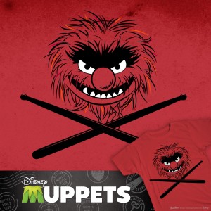
Wow, that is an Animal you wouldn’t want to meet in a dark alley. But exactly the sort of face I can see adorning a lot of t-shirts.
My rating: 5
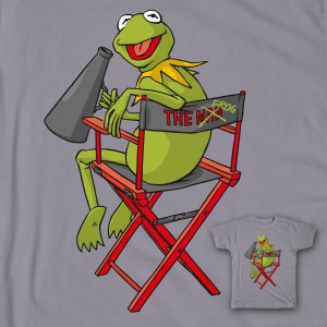
I love seeing Kermit in the director’s chair. That frog is totally the man.
My rating: 5
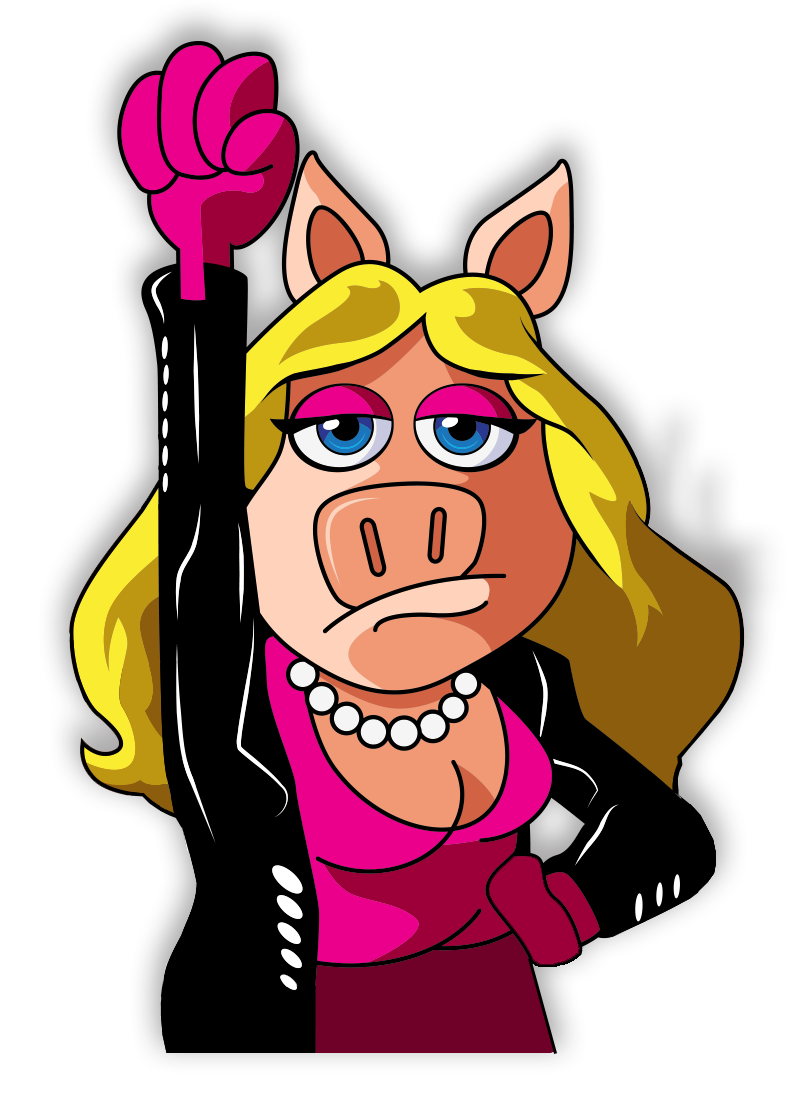
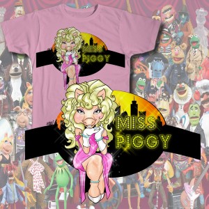
That’s an interesting version of Miss Piggy. It’s well drawn, but it also looks like something you’d find at a Las Vegas gift shop. Piggy can be kitchy on the inside, but almost never on the outside.
My rating: 3
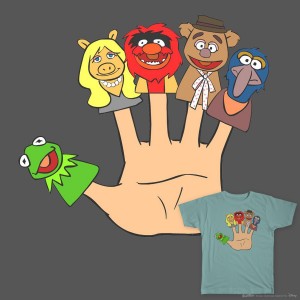
I don’t know if the disregard for how Muppets actually work is intentional or not, but either way, it weirds me out.
My rating: 2
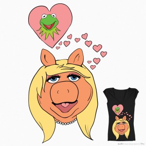
This seems like the kind of design that would look good on certain shirts (like one for a 16-year-old girl) and not as good on others (like one for a 31-year-old male Muppet blogger).
My rating: 3
Kermit is ready to add a single pepperoni to his giant hot dog! This t-shirt really tells a full story.
My rating: 2
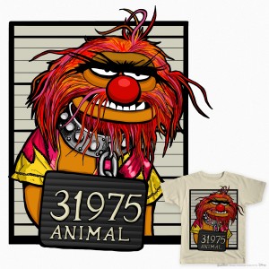
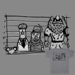
Animal could’ve done any one of a dozen things to land himself in jail. He could’ve attacked or eaten any number of things or people, and I would completely believe it. However, I wouldn’t quite believe that he’d manage to get himself caught.
My rating: 5
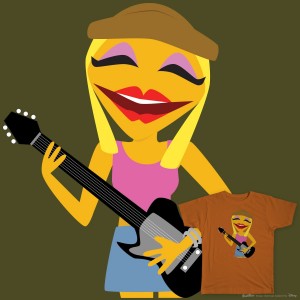
Very nice big-headed Janice there. She probably needs a little something extra to get the votes it needs to be printed, but it’s a nice enough start.
My rating: 3
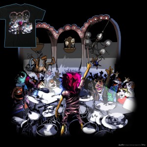
Ha, I love this one. There’s a lot going on, and I love designs that make you want to zoom in and look at all the details. I also love designs that make you want to jump headfirst into a mosh pit.
My rating: 5
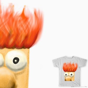
I like Beaker’s firey hair and panicked eyes, but his flesh-colored nose is throwing me off. Does it make me a bad person to discount this design for such a minor detail? Probably, but I’m used to it.
My rating: 3
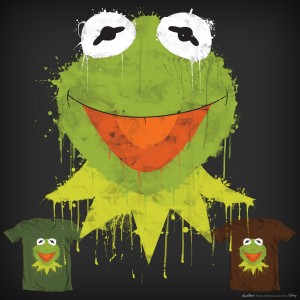
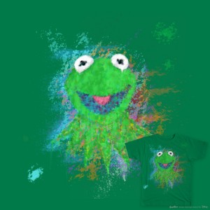
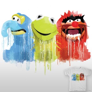
This is what Kermit would look like if he stayed in the swamp rather than go to Hollywood. He’d be all goopy and drippy and covered in some sort of unidentified quasi-liquid.
My rating: 3
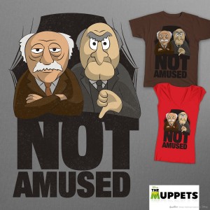
Waldorf is not having any of your shit. Statler gives exactly zero fucks. And I love this shirt.
My rating: 5
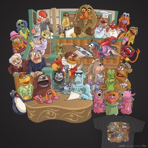
Wow!!! This artist made all these adorable Muppet designs and made them even more adorable by putting them in the arches. I would love to have little vinyl action figures of these guys.
My rating: 5
The outline design is a nice idea, but it makes the globe really hard to recognize. Instead, it looks like you should be able to solve it like a maze.
My rating: 3
In The Muppet Movie, Kermit only traveled by foot for a very small amount of time (between losing his Schwinn to the steamroller and hitching a ride with Fozzie’s Studebaker), but I like to imagine it went something like this. A stoic frog and his banjo against the world.
My rating: 5
This piece was entered into a previous contest, and if I recall, I liked it a lot then too. My only complaint is the strange size and length of Sweetums’ arms, but it’s easy to ignore them once you start looking around at all the stylized faces tucked into his armpits.
My rating: 5
As amused as I am at the idea that Statler and Waldorf go home to play with their own Muppet puppets, the little faces on their hands just looks off-putting.
My rating: 2
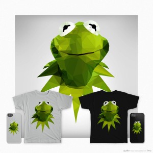
I’d say that using Photoshop filters is the laziest form of artistry, but I can’t even classify it as art. It’s a button.
My rating: 1
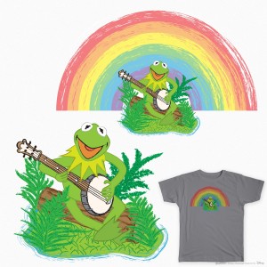
I know I’ve seen this exact image before, possibly without the rainbow. Even if that one element is new, it’s still completely stolen and that’s probably frowned upon.
My rating: 1
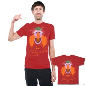
With Floyd being such a cool and popular character, I’m surprised that we haven’t seen him on a shirt yet. This would be a good one to start with.
My rating: 5
I like this one just as much as the last time we saw it. I won’t deduct points for the unoriginality, mainly because I want one of them to actually get printed. Come on!
My rating: 5
The Muppets would make for good swatches. I’d like a Fozzie-colored bathroom and a Gonzo-colored library.
My rating: 1
Cramming the Muppets onto a motorcycle is a nice enough idea, but I wasn’t sold until seeing Kermit’s swan dive on the front. It’s a great way to repurpose that familiar pose from Great Muppet Caper.
My rating: 4
That’s not Animal. That’s Grover on fire.
My rating: 3
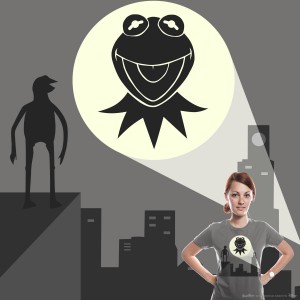
Nice idea: “The Kermit Signal”. Poor execution: Kermit’s off-looking silhouette. Idea that would fix it: Give Kermit a Batman costume. Batman costumes fix everything.
My rating: 2
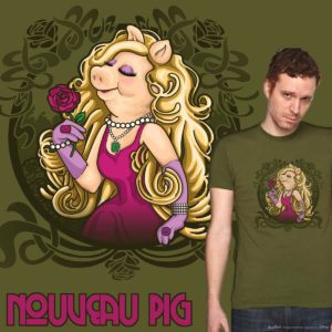
Nice looking Pig, with some great details, especially in her hair. And the crest around the image helps it to work a lot better as a t-shirt design, rather than just another random bit of fan art.
My rating: 4
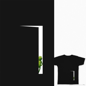
Aw man, this would be such a strange, creepy design if the artist didn’t use an image from Kermit’s Swamp Years. See, this is why copying existing photos is a bad idea! I mean, aside from all the other reasons.
My rating: 3
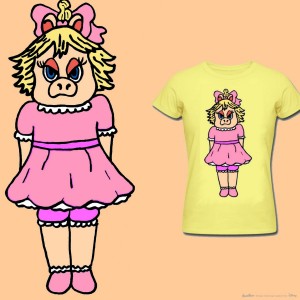
Does the world really need a t-shirt with an angry Baby Piggy on it? The answer is no. Nobody needs that.
My rating: 2
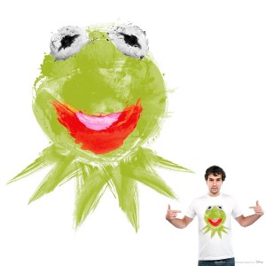
The fingerpaints make for a nice change from the Photoshop work, but it’s a little too kiddie for a contest for adult shirts. And that’s saying something when you’re talking about a contest about puppets and froggies and piggies.
My rating: 3
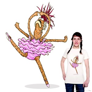
I can’t even imagine what someone who’s never seen Muppets From space would think when they saw this. Is that a deep fried octopus wrapped in red cabbage? Has Beaker been shrunk and mutated while his torso is in mid-explosion? A prawn ballerina… nah, too unbelievable.
My rating: 4
The thing that interest me most about this image is the odd choice of characters. I would love to see Rizzo, Beaker, Dr. Teeth, and Sweetums get into some shenanigans together.
My rating: 3
It’s not easy being out of focus.
My rating: 3
I can imagine The Swedish Chef wearing this shirt in a desperate attempt to get a little lovin’. Mainly because he doesn’t speak English, so he needs some help emphasizing what he really wants.
My rating: 3
Wow wow wow! This is beautiful! I don’t want it on a shirt, I want it framed on my wall.
My rating: 5
You know how you can look up at the clouds and start to see them form into images? Once they turn into Muppets and then start to rain, this is pretty much what you’d see. Oh, also it’s acid rain. So, run.
My rating: 3
That’s over 50 reviews down, over 150 to go! Stay tuned for part 2 of our Threadless reviews shortly!
Click here to put an unnecessary filter on the ToughPigs forum!
by Joe Hennes – Joe@ToughPigs.com
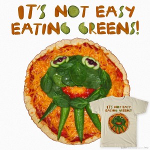 It’s Not Easy Eating Green
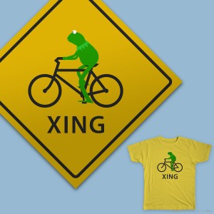 Kermit Crossing
 Muppets Go Global
 Kermit Frog
 In Tune
 KermitPiggy
 Swamp Shredding
 Moisaikermit
 Epic!
Epic! Stay Weird
 Muppets Squared
 The Muppets Gang
 I’m an Animal
 Release You Animal
 Comedy and Heckling
 Animal
 He’s the Frog
 The Apple for His Eye
 Finger Muppets
 Oh Kermie!
 Kermit’s Launchpad
 Animal Most Wanted
 Janice
 Ovation
 Beaker
 La Frog
 Not Amused
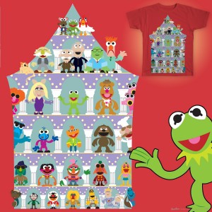 Casting Call
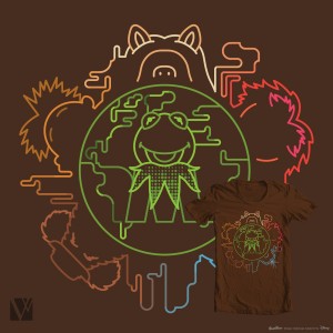 Around the World
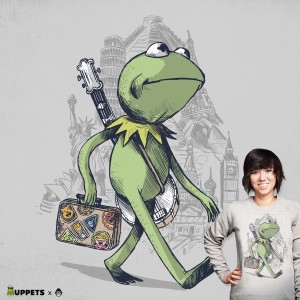 The Green Traveler
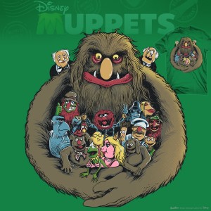 Hug
Hug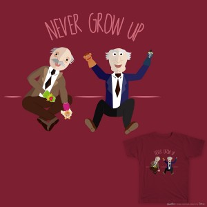 Never Grow Up
 Polygon Frog
 The Rainbow Connection
 Floyd Pepper Rockin Hair
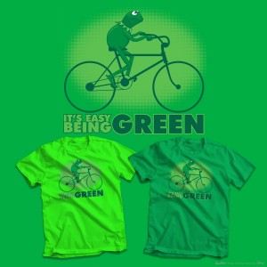 Green Since Day One
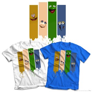 Muppet Stripe
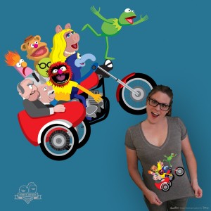
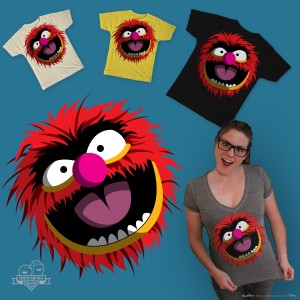 You’re an Animal
 Hey It’s the Kermit Signal
 Nouveau Pig
 Kermit is In the House
 Moody Piggy Baby
 Paint It Green
 Pepe the Ballerina King Prawn
 The Line Up
 Kermit
 Kiss the Chef
 Backstage Right
 Color Splash