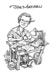
 As Sesame Street fans, just about every one of us has a stack of Sesame books that rival any library or used book store. And if you were to pore through your collection, the name you’d see most (y’know, after Big Bird and Ernie and Grover) is Joe Mathieu.
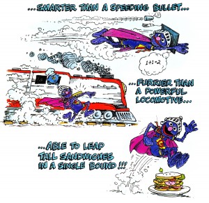
Joe Mathieu has been illustrating Sesame Street books for the last 38 years and shows no sign of stopping. He’s drawn practically every Sesame character, both puppet and human, and is responsible for such classic books as Cookie Monster and the Cookie Tree, The Ernie and Bert Book, The Exciting Adventures of Super Grover, and many more (which you’ll read about below).
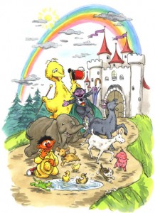
I’m sure you’ve all fallen in love with your fair share of Sesame Street books, which is why we’re so proud to present our interview with illustrator Joe Mathieu, along with some samples of his artwork, which you can click on to see in a larger format. Happy reading!
ToughPigs: How did you get your start as an illustrator for Sesame Street?
Joe Mathieu: Actually, I had been freelancing as a children’s illustrator for about a year ( I graduated from RISD in ’71) and I was constantly showing my portfolio to anyone who would see me. I would leave a printed sample of my work wherever I had been. One of these samples caught the attention of an agent named Ted Riley who brought me to meet Michael Frith, the art director at Random House, who was just starting work on some of the first Sesame Street books, and who was looking for illustrators for these projects. I had to beat out an awful lot of competition, but I soon found myself being escorted to the Muppet headquarters where I met Jim Henson and all the Muppet performers and builders. I was also taken to the Children’s Television Workshop where I met all the book people, Sharon Lerner and Chris Cerf in particular. These three companies teamed up to create the Sesame Street books that I worked on.
TP: What sort of preparation or research did you have to do in your early days as a Sesame illustrator? Did this preparation lead to any personal relationships with the Muppeteers or puppet builders?
JM: Since there were no style books in the beginning, I was given access by Jim Henson to the Muppet “morgue” where the characters were stored. I would go in there and put the puppets on and study them. I would sketch and photograph them; it was a lot of fun! I was also allowed to go to the television studio where Sesame Street was taped. I would stand quietly all day watching the show being created. I went so often, I think the security guard at the entrance just thought I worked there. Some tapings were right on the street with Big Bird, Oscar and the human actors. Other days were the Muppet “insert” days where I would watch Ernie and Bert, Cookie Monster, Kermit the frog, Grover etc. I got to know the performers and I even took my wife and kids in a few times. The performers were never too busy to entertain the kids between takes; they were great.
 TP: Can you briefly walk us through the normal process of how a Sesame Street book is made from your point of view?
JM: I would typically be sent a manuscript for which I would then draw rough sketches. The sketches were reviewed by everyone at Random House, CTW and finally they were “blue lined” at Muppets so that the Muppet characters were correctly rendered. I would then do revisions and finally finished art which I delivered to the publisher. In the earliest days, Jim Henson himself did the blue lines! Michael Frith eventually moved from Random House to become the art director at Muppets, and he took over the blue lining. Eventually, there were others as well. Western publishing also created a line of Sesame Street books.
TP: What are your favorite characters to draw? Which characters are most challenging?
JM: I really loved drawing all the characters and the way they interacted. I enjoyed drawing the human characters too. I would have to say, though, that I particularly liked Ernie and Bert; there was a simplicity in Ernie’s face that was very difficult to capture, but was very charming. Big Bird, too; very subtle. I always thought the Count was somewhat difficult. I loved the character; he just had a lot going on.
TP: Which of your Sesame Street books are you most proud?
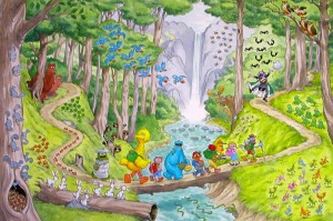 JM: I would say the “Sesame Street Dictionary” for one, because it was a sort of definitive statement at the time, although it looks a bit dated to me now. And “Big Bird’s Big Book“, because it was created with no manuscript; I was given rough concepts for each spread, like counting, or colors, and asked to come up with whatever I wanted. Since I had just taken my young family on a tour around the United States, it became just that! A few words were added after the art was finished. I also like that one because it is so BIG, and I was asked to keep the scale of the pictures small, so you have birds eye views of hundreds of little Muppet characters running around everywhere.
TP: Speaking of The Sesame Street Dictionary, can you explain for us what your role was in the production of that book? And what is your reaction to the book’s success and how well-regarded it is for the writers and editors at Sesame Workshop?
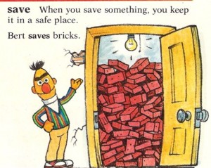 JM: I was given a lot of leeway on this project, too. Back when type was cut out with a blade and glued in place, I felt I needed to do all the type and graphic layout at the rough sketch stage in order to simply fit everything in, in a logical, nicely flowing way, giving some words more room than others. No one could have done that in advance for me. It took two and a half years to complete and it completely wiped me out, but it became the definitive point of reference, I am told, for all illustrators and art directors. If it was in the dictionary, it was official!
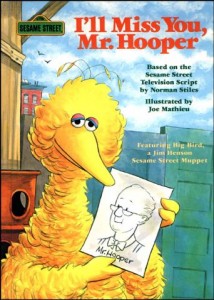
TP: You provided the artwork for books based on live-action episodes and specials like “Christmas Eve on Sesame Street“, “I’ll Miss You, Mr. Hooper“, and “Big Bird Visits the Dodos“. How did your approach to these books differ from your work on original stories?
JM: Very simply, I usually had to make up the visual using my imagination, while combining what I knew about the show. When it came to basing a book on an episode, I had to follow what was already created. The difficulty back then was that there were almost no video recorders so I had to watch the episode with a sketch pad in my lap. When the first video players came out, they didn’t have a good pause function, so I still had to draw from the moving image; at least I could play it over and over again.
 TP: What sort of tricks or techniques do you employ when drawing Muppets that differ from other types of projects?
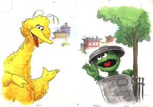
JM: The only thing I can think of for this question is that I had to keep my eye on how the characters evolved over the years. Big Bird, for example, got fatter and fatter as more feathers were added with each new version; they had to rebuild the characters from time to time as they wore out and they would change slightly with each new version. This is why the characters look different in the early books; they simply reflect what the characters looked like at the time. The show’s audience also got younger over the years, so the books became cuter.
TP: Have you ever had a book or illustration rejected? If so, did you have to recreate the art, or was it abandoned?
JM: Many drawings were rejected over the years, usually at the rough sketch stage, but not always. They just had to be redone. A particularly tough one was the cover for “Christmas Eve on Sesame Street”. Jon Stone wrote the show and the book and took complete charge of all aspects. Jon was a perfectionist! He saw the finished illustration and said that it “lacked a certain ephemeral quality”! I thought, my God, how am I going to fix that?! Anyway, I redid it and he liked it. The rejected piece is 26 in. by 18 in. I still have it.
 TP: Who are your artistic influences? Both from Sesame Street and otherwise.
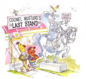
JM: I think the strongest artistic influence I had when I was a kid were the illustrations in the Saturday Evening Post and Sunday newspaper funnies. I loved the early Disney animations, too; I was drawing Peter Pan and Captain Hook when I was five years old. Later on I liked Al Capp and the Mad Magazine guys, like Jack Davis and Mort Drucker. Still later, Robert Crumb. One of my editors really made an impression on me by exposing me to the paintings of Peter Bruegel. My editor was Ole Risom, a legendary editor who thought Bruegel’s bird’s eye views of village life was just what I needed to see; and I think he was right. “Big Bird’s Big Book” is essentially my Sesame Street version of Bruegel. I used this approach in many of the books that I did with Ole. I would also add that a John Singer Sargent show that I saw in New York in 1986 had a lot to do with the Big Bird portrait on the cover of Big Bird’s Big Book!
TP: How do you view the “competition” in children’s literature now that there are so many different types of artists and children’¢s franchises that didn’t exist in the 1970s and 1980s?
 JM: I don’t know, I guess there is as much competition for shelf space in the stores as there is for the kids’ eyeballs at home. I think this results in a certain reluctance to do anything that won’t result in instant gratification. I mean Sesame Street doesn’t seem to do story books any longer; it’s almost exclusively novelty books featuring the same one or two characters. You can’t blame them, really; it’s tougher out there.
TP: How has the transition to digital art changed your style and process? How else has your style changed in recent years?
JM: As a result of all the afore mentioned, digital illustration is much more competitive in a world of slick, color saturated images. To be honest with you, though, I honestly love working digitally. I am capable of painting the Muppet characters with much softer, furrier textures and much more vivid color without such a reliance on a black outline. As far as the process, art directors today aren’t going to wait days for revisions when we can upload a revision to a finished piece almost instantly. The revisions can be done seamlessly, too, and faster than we ever would have dreamt a few years ago. All the rules have changed, and the illustrators who haven’t changed in kind are not working any longer.
 TP: In your opinion, do you see Sesame Street art moving further away from stylized interpretations of the characters and closer to one specific model for every artist to follow? How has this affected your approach to the characters and stories?
JM: There is definitely more of a trend to draw the Sesame Street characters according to specific, standardized models. There is a real style book today and we are expected to adhere to it. Jim Henson and Michael Frith encouraged each illustrator to find his own version, his own interpretation, of the characters. But I suppose that just doesn’t work in today’s marketplace.
TP: Finally, do you have a message you’d like to pass along to all the fans of your work?
JM: How lucky can anyone be? I have had a ball all these years! I have always felt that I was working with truly exceptional people, geniuses really, and that I just landed in the right place at the right time with just the right thing to offer. I’m glad I had little kids around in the early days; I would run everything by them to make sure that what I was trying to convey was clear. Basically, I’m really glad that I went into this field in the first place! Most people didn’t really think it was a particularly smart thing to attempt, but when I won an all New England award for the cartoons I did in my prep school newspaper, I just had to see how it would all come out! You really can’t predict the future; sometimes you just have to take a chance in life and do what you really want to do.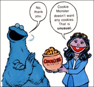
Many thanks to Joe Mathieu for joining us for this Q&A! For more about Joe, feel free to visit his website!
Click here to store your brick collection at the ToughPigs forum!
by Joe Hennes – Joe@ToughPigs.com
