We’re past the halfway mark in our coverage of Mighty Fine’s Muppet t-shirt design contest! And we’ve seen some good ones and a whole lotta bad ones, and even a few that border on the sacrilegious. So I really can’t think of any reason not to cover a few dozen more of these designs!
Be sure to register and sign in on Mighty Fine’s website so you’ll be able to vote for your favorites (or against your least favorites) and view the designs in a higher resolution. Registering is fast and free and why not just do it already?!
This is a neat design. I like the idea of a Muppet coat-of-arms, but I feel like we’re getting some conflicting themes here. Kermit with wings on his head, the chicken silhouette, and are those supposed to be stage hooks? And I really don’t know what the blue drippy circles in the background are supposed to be, but they’re giving me the overwhelming urge to wash my hands.
My rating: 3
There’s not enough Pigs in Space merchandise out there, so I applaud the artist on his attempt. I’m not crazy about his character designs, but at least he got the pink/purple costume color schemes right.
My rating: 3
Questions this design raises: Is it suggesting that Sam is a weirdo, or possibly that he inspires weirdos (as in, Obama inspires Hope)? Are we really okay with people submitting designs made in 2 seconds on this website? Does the artist think it’s still 2008??
My rating: 2
With the new prominence of Uncle Deadly in the new Muppet movie, I’m really hoping he makes it onto some cool merch. I’d love a stuffed animal, but I’d totally settle for a spooky t-shirt. This design does the trick, though the text at the bottom (which reads, “The Phantom of the Muppet Theater”, in case you can’t see it) is pretty unnecessary.
My rating: 4
If you really loved Kermit, you wouldn’t use YET ANOTHER piece of stolen stock photography.
My rating: 1
Ugh, didn’t we just see this?? I don’t feel like reviewing it again. Just look a few entries above this one for my comments.
My rating: 2
Why is there a reflection of the word “Muppets”, but not of Kermit? Maybe the floor is made of a substance that doesn’t reflect crappy clip-art.
My rating: 2
I feel like I should know what this is a parody of. My best guess: Godspell. And if that’s true, then they missed the opportunity to call this design “Gonzpell”. In any case, the design itself isn’t bad, but the placement is terrible, which makes the whole shirt look bad. Man, I just can’t win with this one, can I?
My rating: 3
Not a bad design, especially considering the colors are uneven and the artist substituted photos for original artwork (again!). But I like the simplicity of it, and the fact that the characters are easily recognizable. This design has passed the “Disney would probably print this shirt” test, though that bar isn’t set very high to begin with.
My rating: 3
Ditto what I just said about this being good enough for Disney to print. People don’t expect much out of their Beaker merch. Just a panicked look and a well-placed “Meep”.
My rating: 3
Kermit’s eyes and mouth look weird, Fozzie needs more ink on his outline, and the Studebaker has no wheels. And yet I kinda love this piece. Change Gonzo’s shirt and add Camilla to the back seat and you’ve got a highly recognizable scene from The Muppet Movie. Bonus points for Gonzo’s “belly flop onto a moving car.”
My rating: 4
I should like this one for its use of over-simplicity. But the rainbow curves look so much like stink lines, all I can think of is that Kermit smells like a unicorn fart.
My rating: 2
I get it, everyone loves the Sesame Street t-shirt designs that are just the characters’ eyes and mouth on a solid-colored shirt. And that has potential to work for Kermit too, but not like this. Either the collar needs to be lowered or Kermit needs to grow some sharp bottom teeth to match the design.
My rating: 2
But the idea doesn’t work for just any character. Unless your favorite character is a sad lady pig with a yellow snout. Blecch.
My rating: 2
Hey, it’s another “Words as Kermit’s Face” design! Albeit different enough from the one at the bottom of part 1 of our Mighty Fine coverage. The biggest difference is that here, Kermit’s head is filled with the text, which fills him out better, but makes his face look way too flat. And unfortunately, it’s just going to continue to be compared unfavorably to the last contest’s “Muppetational Mosaic“.
My rating: 3
Huh. So apparently the Muppets are electrifying, and rather than illustrate it with Crazy Harry or Beaker, we have a dancing Gonzo. Okay. Thanks for the danger warning, I guess.
My rating: 1
Oh thank Frog, we finally have a good one. What a great image, with fun and well-drawn characters, a couple good laughs, and some lovely symmetry. If they make this t-shirt, I hope they’d release matching pants, hat, socks, and jacket, because I’m going to want to match.
My rating: 5
Ooh, two good ones in a row! It must be Christmas! I wouldn’t necessarily see Kermit in the “Snoopy” role, but seeing as the resident Muppet dog is busy Schroedering, Kermit makes a great fill-in. A wonderful homage done by a talented artist.
My rating: 5
“Don’t feed the animals”, but please feed the animals don’t. Got that?
My rating: 2
There are some interesting ideas here (I like Fozzie’s lame attempt at graffiti and Gonzo’s “Muppets In Space” reference), but the art is just a little too sloppy to amount to much. But the thing that bothers me the most is that because of Fozzie’s property defacing, the balance of the piece is shifted to the left, making the Muppet Show logo look off-center. If I owned this shirt, I guarantee that would drive me crazy.
My rating: 2
I want to hate this. It’s a stock image with some added text and color. It doesn’t deserve to win any contests. But I’ll be damned if it isn’t a pretty t-shirt. And I would buy it. Dangit.
My rating: 4
Ohgodsoboring! Why isn’t there a laziness disclaimer on this contest???
My rating: 1
I am totally in love with the craziness of this picture. Chibi Kermit and Piggy! Ultragonzo vs. Animalzilla! Rowlf and Fozzie being all… Japanesey. Apparently there’s a hole in my life, and it’s in the shape of a Muppet/Japan combo.
My rating: 4
Here’s a perfect example of how the “Adventure” theme can ruin a perfectly good image. I really love the Piggy design, and it would make for a really pretty shirt. But is the text necessary? Does it even fit with the picture? But aside from all that, this design is fantastic.
My rating: 4
Don’t get me wrong, I love that “Closer Than You Thing” poster as much as any of us. But come on. Stop cutting and pasting, people. Even if it is artistic.
My rating: 1
This design was actually submitted for the Threadless contest (as seen here), making it ineligible for this contest. And I think I said something about liking it, but wanting to buy it in trading card-form instead. Yeah, that sounds like something I’d say.
My rating: 4
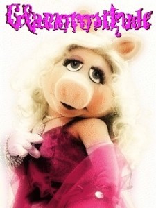
I love fonts. I love serifs and sans serifs, I like parsing through every font I have whenever I make a new design, and I love finding the perfect font that will compliment an image. So you can understand my blinding rage when a pretty photo of Miss Piggy is underneath an unintelligible mess of word vomit. I almost wish the artist had just given up and used Comic Sans. No, I don’t wish that on anyone…
My rating: 1
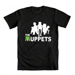
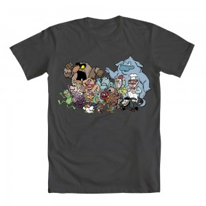
The next two are submissions from our pal Kenny Durkin. In the Threadless contest, I separated the entries for people we know personally, as to avoid any ethical dilemmas. But I just don’t care about ethics anymore, especially since Kenny made two of the best designs in the contest. This first one features a fun mix of characters, all looking great and having fun, and any of us would be proud to splay this on our chests.
My rating: 5
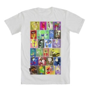
Kenny’s second design pairs two characters not generally seen together very often. But looking at them together here, they look to be natural friends. Really, this may be Crazy Harry’s best chance to make it onto some new Muppet merch.
My rating: 5
Wasted opportunity! When I saw the design, I was really hoping for some fan art of The Muppet Show’s “Muppet Melodrama“, starring Piggy, Wayne, and Uncle Deadly. Whatever ended up being in this design was destined to disappoint me.
My rating: 2
I guess Animal is the closest Muppet to a giant ape, so this design makes a lot of sense. (Plus, nobody would buy a shirt with Quongo on it.) This one’s really pretty and a little artsy and I’m guessing would actually sell really well to New York tourists.
My rating: 5
I feel like I’m constantly reminded that Lady Gaga’s 15 minutes aren’t up yet. And some of these t-shirt designers know it. Assuming this is actually an accurate parody, it’s not all bad. The font design is nice, the shading pops, and Piggy really captured that vacancy in Gaga’s eyes. So it’s not a bad shirt; it’s just not for me.
My rating: 4
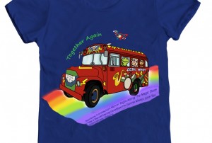
Sometimes artists will throw a lot of crap against the wall and hope that a little bit of their design will stick. There’s so much unnecessary noise in this sketch, and it might be pretty good if you remove some of the components. Take away all the text (with song titles from the original Muppet movie trilogy, for some reason), erase the oversized character heads in the windows, and get rid of the airborne Gonzo and you’ve got a neat illustration of the Electric Mayhem bus driving down Rainbow Road. And really, I could take or leave the rainbow.
My rating: 2
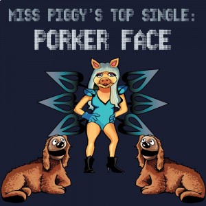
Oh boy, another Gaga reference. I don’t know what’s creepier: Miss Piggy with Lady Gaga’s body or Rowlf (Rowlves?) with actual dog proportions. The answer, of course, is all of the above.
My rating: 2
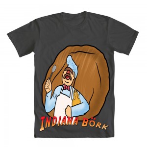
This one makes me laugh. Just imagine the Swedish Chef dodging booby traps, inching closer to the golden chicken idol, only to be thwarted by a giant, oh let’s say meatball. I only wish the illustration was as well-drawn as it is in my imagination, because it’s pretty funny (and way more clever) in my brain.
My rating: 2
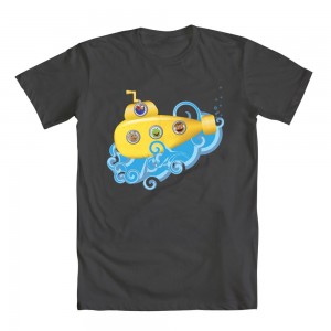
More cutting-and-pasting Muppet heads! Though I have to give a bonus point for Gonzo’s nose-periscope. I’m sure it doesn’t function properly, but it sure made me laugh.
My rating: 3
Now, here’s where using pre-existing images can actually work. (Note: I received an email from the artist, Danny Beckwith, who explained that the design was illustrated in pencil, then inked, and then colored digitally. No cutting-and-pasting-and-Photoshopping involved.) These are some old photos, mostly (or all?) from The Muppet Movie era, and the dotted line connects them in the order Kermit meets them through the course of the film. It’s like it tells the whole story of the movie between that and the tableau at the bottom. It’s great when one picture can convey a narrative of very heavy duty proportion.
My rating: 5
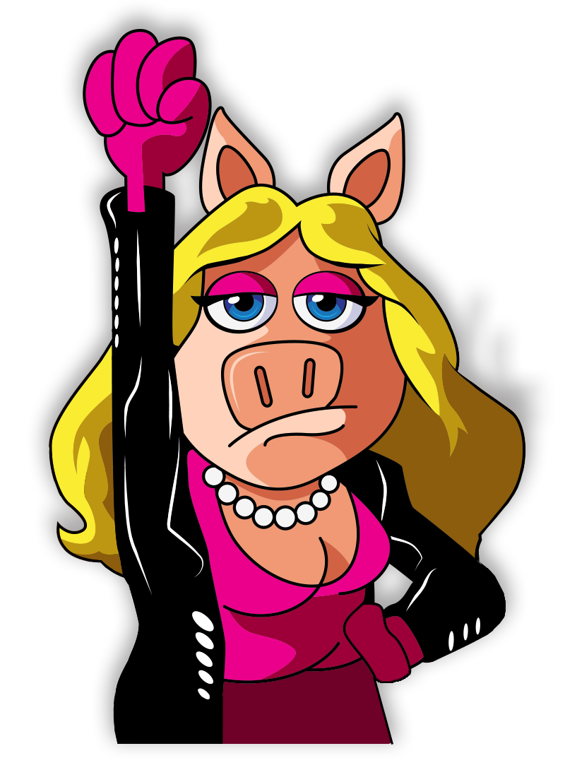
Is Miss Piggy a hero because the letters on her shirt signify her superhero status? Or is it because she knows the importance of wrapping one’s self in a dry towel after a bath? Or maybe because she’s a role model for face-tattoo enthusiasts everywhere?
My rating: 2
Let’s be honest. I have no more of an idea of what’s happening in this picture than you. Maybe Kermit’s in love with the Kirby Dots all around him, causing a heart-shape to emanate from his hand. Or maybe I should just shut up and enjoy the pretty picture.
My rating: 3
I should be knocking this design for its sloppy design work, but I actually find the immaturity of it all to be endearing. I don’t think I’d wear this shirt, but I can totally see myself buying it for my 2-year-old nephew. Bonus point for Fozzie’s upside-down map, which is hilarious. To me.
My rating: 4
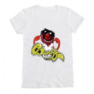
There’s something delightfully 1970s about the text. And Animal is kinda rockin’ that white t-shirt. The design itself is a little dull; maybe it could benefit from having a little something more going on. But y’know, not bad at all.
My rating: 4
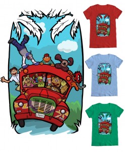
Ah, what a great design to end on. I love seeing the Electric Mayhem bus (despite the fact that Animal is the only Mayhem member in the picture), it’s easy to overlook some of the stock photos, and I’m happy to see Walter make an appearance. But more than anything, it’s just plain ol’ fun. And I like fun! I’m a fun fan.
My rating: 5
Keep an eye out for our final segment of the Mighty Fine Muppet t-shirt design contest in just a few more days! And remember to keep voting for your faves!
Click here to splay it on your chest on the ToughPigs forum!
by Joe Hennes – Joe@ToughPigs.com
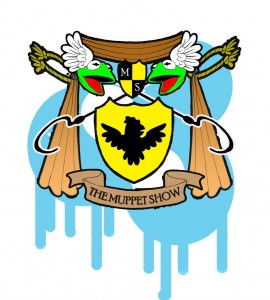 Muppet Graffix
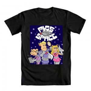 Pigs in Space!!!
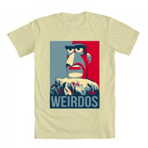 The American Way
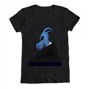 Uncle Deadly
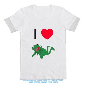 I Heart Kermit
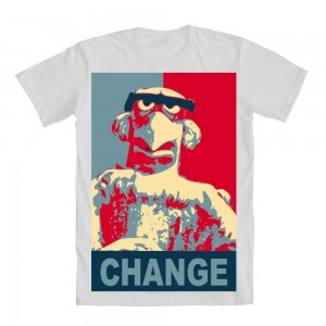 Change
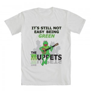 Still Not Easy
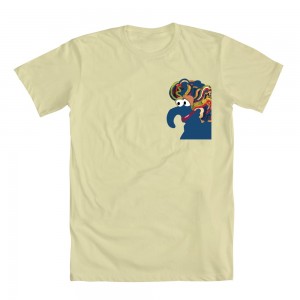 Gonzo a la Carte
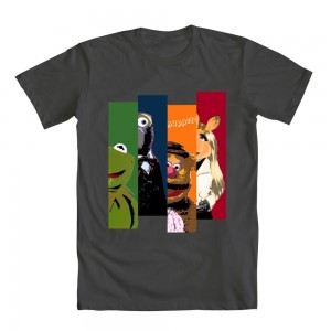 The Muppets
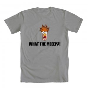 What the Meeep?
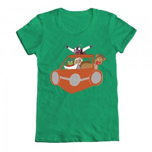 To Adventure
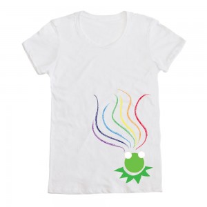 Connection
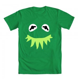 Funny Kermit
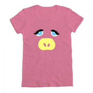 Fabulous Miss Piggy
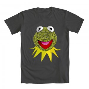 Kermitypography
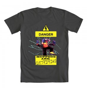 High Voltage
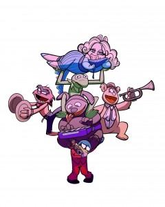 The Show Must Go On
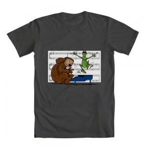 Muppets and Peanuts
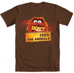 Feed the Animals!
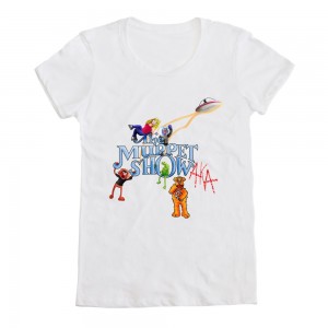 Classic Muppets
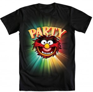 Party Animal
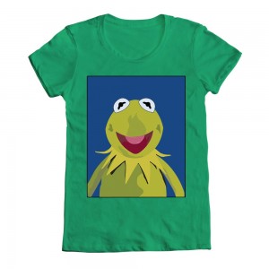 Kermit Portrait
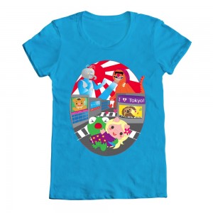 The Muppets in Tokyo
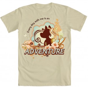 Ms. Piggy – Adventure
 Muppets
 The Muppets
 Glamorositude
 It’s Time
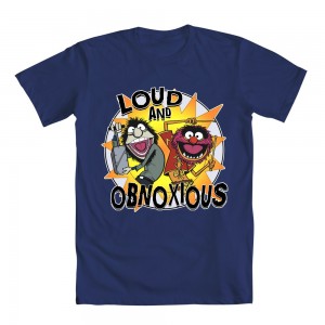
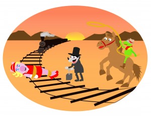 Wild Wild West
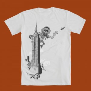 NEW YORK! NEW YORK!
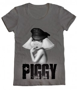 Piggy Gaga
 Together Again
 Porker Face
 Indiana Bork
 Muppet Submarine
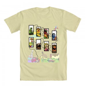 Movin’ Right Along
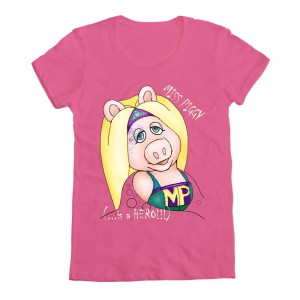 Miss Piggy – Hero!
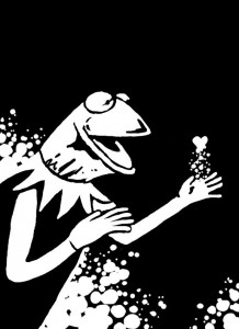 In Love
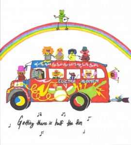 Moving Right Along
 Animal Swag
 Movin’ Right Along